Syncfusion.Blazor.Buttons
33.1.44
Prefix Reserved
dotnet add package Syncfusion.Blazor.Buttons --version 33.1.44
NuGet\Install-Package Syncfusion.Blazor.Buttons -Version 33.1.44
<PackageReference Include="Syncfusion.Blazor.Buttons" Version="33.1.44" />
<PackageVersion Include="Syncfusion.Blazor.Buttons" Version="33.1.44" />
<PackageReference Include="Syncfusion.Blazor.Buttons" />
paket add Syncfusion.Blazor.Buttons --version 33.1.44
#r "nuget: Syncfusion.Blazor.Buttons, 33.1.44"
#:package Syncfusion.Blazor.Buttons@33.1.44
#addin nuget:?package=Syncfusion.Blazor.Buttons&version=33.1.44
#tool nuget:?package=Syncfusion.Blazor.Buttons&version=33.1.44
Syncfusion® Blazor Button Components
A comprehensive suite of Blazor button and toggle components for building modern interactive user interfaces. Includes Button, CheckBox, Chips, Radio Button, Toggle Switch, Floating Action Button, and Speed Dial components.
Supported Components
This package includes the following components:
- Blazor Button
- Blazor CheckBox
- Blazor Chips
- Blazor Radio Button
- Blazor Toggle Switch
- Blazor Floating Action Button
- Blazor Speed Dial
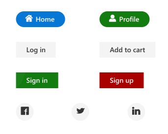
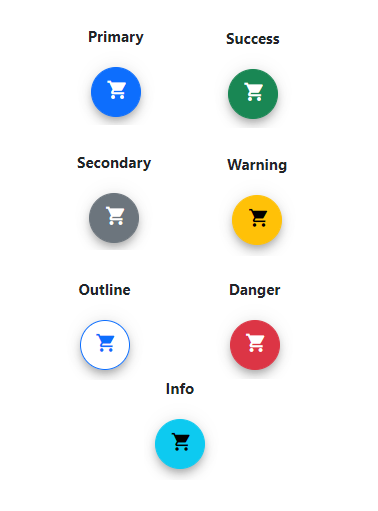
Blazor Button Component
The Blazor Button Component is a custom HTML5 button control with built-in features for icons, predefined styles, button types, sizes, and UI customization.
Key Features:
- Button Types: Basic, flat, outline, and rounded button styles
- Icon Support: Built-in Material, Bootstrap, and custom icon integration with flexible positioning
- Button States: Normal, hover, active, disabled, and focus states
- Sizing Options: Small, normal, and large predefined sizes with custom sizing
- Toggle Button: Enable/disable button toggle functionality for state management
- Accessibility: Full keyboard navigation and ARIA support
- UI Customization: Custom colors, themes, and CSS class integration
Documentation:
- Getting Started with Blazor Web App
- Getting Started with Blazor WebAssembly App
- Feature Overview
- Live Demos
- API Reference
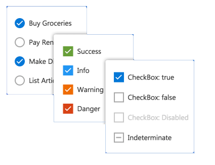
Blazor CheckBox Component
The Blazor CheckBox Component is a custom checkbox input component for selecting one or more options from a predefined list.
Key Features:
- Checkbox States: Checked, unchecked, indeterminate, and disabled states
- Multi-Select Support: Select multiple options from a list of predefined choices
- Indeterminate State: Mixed state for parent-child hierarchical selections
- Label Positioning: Flexible label placement (before, after) with custom text
- Size Options: Small, normal, and large predefined sizes with custom sizing
- Accessibility: Full keyboard navigation (Space to toggle) and ARIA labeling
- Event Handling: Change, focus, and blur events for reactive form handling
- Styling: Theme support and custom CSS class integration
Documentation:
- Getting Started with Blazor Web App
- Getting Started with Blazor WebAssembly App
- Feature Overview
- Live Demos
- API Reference
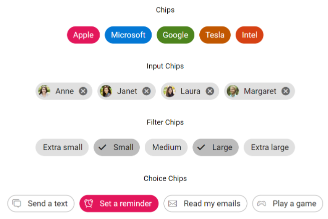
Blazor Chips Component
The Blazor Chips Component displays small blocks of information with optional avatars, images, and icons. Ideal for tagging, filtering, and multi-select scenarios.
Key Features:
- Content Types: Text, avatars, images, and icons in compact chip format
- Removable Chips: Built-in close button for dismissible chip removal
- Selection Modes: Single-select or multi-select chip collections
- Template Support: Custom templates for complex chip content
- Chip Variants: Outlined and filled chip styling options
- Size Options: Small, normal, and large predefined sizes
- Accessibility: Keyboard navigation and ARIA attributes for screen readers
Documentation:
- Getting Started with Blazor Web App
- Getting Started with Blazor WebAssembly App
- Feature Overview
- Live Demos
- API Reference
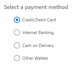
Blazor Radio Button Component
The Blazor Radio Button Component is a custom radio input component for selecting a single option from a group of choices.
Key Features:
- Single Selection: Mutually exclusive radio button groups for one-from-many selection
- Grouping Support: Automatic grouping by name attribute for cohesive behavior
- Radio States: Checked, unchecked, disabled, and focus states
- Label Positioning: Flexible label placement with custom text and styling
- Size Options: Small, normal, and large predefined sizes with custom sizing
- Value Binding: Two-way data binding for reactive form updates
- Accessibility: Full keyboard navigation (Arrow keys) and ARIA roles
- Event Handling: Change and focus events for form validation and submission
Documentation:
- Getting Started with Blazor Web App
- Getting Started with Blazor WebAssembly App
- Feature Overview
- Live Demos
- API Reference
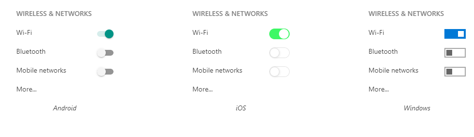
Blazor Toggle Switch Component
The Blazor Toggle Switch is a binary toggle component for on/off state control. Perfect for settings, preferences, and conditional feature activation.
Key Features:
- Binary States: On/Off toggle with checked and unchecked states
- Custom Labels: Text labels for both on and off states
- Disabled State: Support for disabled toggles in forms
- Size Options: Small, normal, and large predefined sizes with custom sizing
- Value Binding: Two-way data binding for reactive state management
- Animation: Smooth toggle animation between states
- Accessibility: Full keyboard navigation (Space to toggle) and ARIA attributes
- Styling Options: Multiple themes and custom CSS class integration
Documentation:
Blazor Floating Action Button Component
The Blazor Floating Action Button Component is a primary action button that floats above screen content. Commonly used for the main action on a page.
Key Features:
- Floating Overlay: Fixed positioning above all page content for primary actions
- Icon Integration: Built-in Material and Bootstrap icon support with custom icons
- Position Flexibility: Configurable positions (top-left, top-right, bottom-left, bottom-right)
- Size Options: Small, normal, and large predefined sizes with custom sizing
- Multiple Styles: Solid, outlined, and custom styling options
- Visibility Control: Show/hide animations and conditional rendering
- Icon Buttons: Support for multiple action buttons in a single FAB
- Accessibility: Full keyboard navigation and ARIA labeling for screen readers
Documentation:
- Getting Started with Blazor Web App
- Getting Started with Blazor WebAssembly App
- Feature Overview
- Live Demos
- API Reference
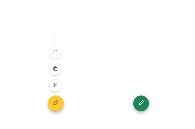
Blazor Speed Dial Component
The Blazor Speed Dial Component is an extension of the Floating Action Button that displays a list of related actions when clicked. Ideal for presenting multiple quick actions.
Key Features:
- Expandable Menu: Click to reveal a collection of related action items
- Multiple Items: Support for multiple action buttons with icons and labels
- Item Content: Icons, text labels, and badges for each action item
- Position Control: Customizable FAB positions (all four corners supported)
- Direction Options: Radial, linear (up, down, left, right) menu layouts
- Animation Effects: Smooth opening/closing animations and transitions
- Keyboard Navigation: Full keyboard support for menu interactions
- Accessibility: ARIA roles and labels for screen reader compatibility
Documentation:
- Getting Started with Blazor Web App
- Getting Started with Blazor WebAssembly App
- Feature Overview
- Live Demos
- API Reference
System Requirements
- .NET 8.0 or later (Blazor Web App, Blazor Server, Blazor WebAssembly and Blazor Hybrid)
- See full requirements: System Requirements
Installation
.NET CLI
dotnet add package Syncfusion.Blazor.Buttons
NuGet Package Manager
Install-Package Syncfusion.Blazor.Buttons
Add stylesheet and script references
- For Blazor Server App / Blazor Web App, add these to
Components/App.razororApp.razor. - For Blazor WebAssembly App: add these to
wwwroot/index.html.
<link href="_content/Syncfusion.Blazor.Themes/bootstrap5.css" rel="stylesheet" />
<script src="_content/Syncfusion.Blazor.Core/scripts/syncfusion-blazor.min.js" type="text/javascript"></script>
Quick Start
Register the Syncfusion® Blazor services in Program.cs:
using Syncfusion.Blazor;

builder.Services.AddSyncfusionBlazor();
Button
<SfButton>Button</SfButton>
CheckBox
<SfCheckBox Label="Default" @bind-Checked="isChecked"></SfCheckBox>

@code
{
    private bool isChecked = true;
}
Chips
@using Syncfusion.Blazor.Buttons

<SfChip>
    <ChipItems>
        <ChipItem Text="Janet Leverling"></ChipItem>
    </ChipItems>
</SfChip>
FAB
@using Syncfusion.Blazor.Buttons

<div id="target" style="min-height:200px; position:relative; width:300px; border:1px solid;">
    <SfFab Target="#target" Content="Add"></SfFab>
</div>
RadioButton
<SfRadioButton Label="Credit Card" Name="options" Value="card" @bind-Checked="stringChecked"></SfRadioButton>
<SfRadioButton Label="Debit Card" Name="options" Value="cash" @bind-Checked="stringChecked"></SfRadioButton>

@code {
    private string stringChecked = "cash";
}
Speed Dial
<div id="target" style="min-height:200px; position:relative; width:300px; border:1px solid;">
    <SfSpeedDial Target="#target" Position="FabPosition.BottomLeft" Mode="SpeedDialMode.Radial" OpenIconCss="e-icons e-edit">
        <SpeedDialRadialSettings OffSet="80px"/>
        <SpeedDialItems>
            <SpeedDialItem IconCss="e-icons e-cut"/>
            <SpeedDialItem IconCss="e-icons e-copy"/>
            <SpeedDialItem IconCss="e-icons e-paste"/>
        </SpeedDialItems>
    </SfSpeedDial>
    <SfSpeedDial Target="#target" Position="FabPosition.BottomRight" Mode="SpeedDialMode.Linear" OpenIconCss="e-icons e-edit">
        <SpeedDialItems>
            <SpeedDialItem IconCss="e-icons e-cut" Text="Cut"/>
            <SpeedDialItem IconCss="e-icons e-copy" Text="Copy"/>
            <SpeedDialItem IconCss="e-icons e-paste" Text="Paste"/>
        </SpeedDialItems>
    </SfSpeedDial>
</div>
Switch
<label for="checked" style="padding: 10px 10px 10px 0">USB Tethering</label>

<SfSwitch @bind-Checked="isChecked"></SfSwitch>

@code {
    private bool isChecked = true;
}
Support
License
This is a commercial product and requires a paid license for possession or use. Review the Syncfusion® EULA.
About Syncfusion®
Syncfusion® provides 1600+ UI components and frameworks for web, mobile, and desktop development across multiple platforms:
Web: Blazor | ASP.NET Core | ASP.NET MVC | JavaScript | Angular | React | Vue
Desktop: WinForms | WPF | WinUI
Learn more at www.syncfusion.com.
sales@syncfusion.com | Toll Free: 1-888-9-DOTNET
| Product | Versions Compatible and additional computed target framework versions. |
|---|---|
| .NET | net8.0 is compatible. net8.0-android was computed. net8.0-browser was computed. net8.0-ios was computed. net8.0-maccatalyst was computed. net8.0-macos was computed. net8.0-tvos was computed. net8.0-windows was computed. net9.0 is compatible. net9.0-android was computed. net9.0-browser was computed. net9.0-ios was computed. net9.0-maccatalyst was computed. net9.0-macos was computed. net9.0-tvos was computed. net9.0-windows was computed. net10.0 is compatible. net10.0-android was computed. net10.0-browser was computed. net10.0-ios was computed. net10.0-maccatalyst was computed. net10.0-macos was computed. net10.0-tvos was computed. net10.0-windows was computed. |
-
net10.0
- Syncfusion.Blazor.Core (>= 33.1.44)
-
net8.0
- Syncfusion.Blazor.Core (>= 33.1.44)
-
net9.0
- Syncfusion.Blazor.Core (>= 33.1.44)
NuGet packages (38)
Showing the top 5 NuGet packages that depend on Syncfusion.Blazor.Buttons:
| Package | Downloads |
|---|---|
|
Syncfusion.Blazor.Popups
Syncfusion® Provides Blazor popup and overlay components for building interactive dialogs and tooltips. Includes Dialog for modal and modeless windows with drag support, and Tooltip for contextual help with positioning and animations. |
|
|
Syncfusion.Blazor.Inputs
Comprehensive Blazor Syncfusion® input components including TextBox, MaskedTextBox, NumericTextBox, Color Picker, File Upload, Slider, Rating, Signature, OTP Input, and Speech To Text. Features data validation, formatting, keyboard navigation, and accessibility support for .NET 8+. |
|
|
Syncfusion.Blazor.SplitButtons
Syncfusion® Provides Blazor button components for building advanced button interfaces. Includes Button Group for grouped controls, Dropdown Menu with nested options, Split Button for dual-action triggers, and Progress Button with loading states and animations. |
|
|
Syncfusion.Blazor.Lists
Syncfusion® Blazor ListView component for displaying data in list format with advanced features including sorting, filtering, grouping, and custom templates. Part of Syncfusion® UI component library for .NET 8+. |
|
|
Syncfusion.Blazor.DropDowns
Provides Syncfusion® Blazor dropdown and selection components including AutoComplete, ComboBox, DropDownList, ListBox, and MultiSelect controls. Supports data binding, filtering, grouping, cascading, templates, and accessibility features for building robust selection interfaces. |
GitHub repositories
This package is not used by any popular GitHub repositories.
| Version | Downloads | Last Updated |
|---|---|---|
| 33.1.44 | 4,379 | 3/16/2026 |
| 32.2.9 | 6,277 | 3/9/2026 |
| 32.2.8 | 7,822 | 3/2/2026 |
| 32.2.7 | 10,507 | 2/23/2026 |
| 32.2.5 | 7,886 | 2/16/2026 |
| 32.2.4 | 8,482 | 2/10/2026 |
| 32.2.3 | 11,217 | 2/5/2026 |
| 32.1.25 | 13,700 | 1/26/2026 |
| 32.1.24 | 9,952 | 1/19/2026 |
| 32.1.23 | 14,115 | 1/13/2026 |
| 32.1.22 | 9,133 | 1/5/2026 |
| 32.1.21 | 8,601 | 12/29/2025 |
| 32.1.20 | 4,722 | 12/23/2025 |
| 32.1.19 | 15,741 | 12/16/2025 |
| 31.2.18 | 15,088 | 12/8/2025 |
| 31.2.16 | 15,713 | 12/1/2025 |
| 31.2.15 | 11,142 | 11/25/2025 |
| 31.2.12 | 13,409 | 11/18/2025 |
| 31.2.10 | 6,098 | 11/12/2025 |
| 31.2.5 | 12,723 | 11/3/2025 |