Syncfusion.Blazor.Buttons
32.2.9
Prefix Reserved
See the version list below for details.
dotnet add package Syncfusion.Blazor.Buttons --version 32.2.9
NuGet\Install-Package Syncfusion.Blazor.Buttons -Version 32.2.9
<PackageReference Include="Syncfusion.Blazor.Buttons" Version="32.2.9" />
<PackageVersion Include="Syncfusion.Blazor.Buttons" Version="32.2.9" />
<PackageReference Include="Syncfusion.Blazor.Buttons" />
paket add Syncfusion.Blazor.Buttons --version 32.2.9
#r "nuget: Syncfusion.Blazor.Buttons, 32.2.9"
#:package Syncfusion.Blazor.Buttons@32.2.9
#addin nuget:?package=Syncfusion.Blazor.Buttons&version=32.2.9
#tool nuget:?package=Syncfusion.Blazor.Buttons&version=32.2.9
Syncfusion® Blazor Button Components
This package contains Blazor Button, Blazor CheckBox, Blazor Chips, Blazor Radio Button, Blazor Toggle Switch Button, Blazor Floating Action Button and Blazor Speed Dial components for Blazor application.
System Requirements
Blazor Button
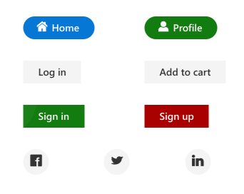
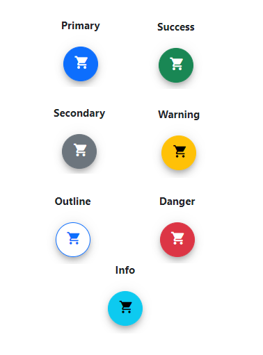
The Blazor Button is a custom HTML5 button control. It has several built-in features such as support for icons, predefined styles, different button types, different button sizes, and UI customization. Toggle and repeat button functionality can be achieved by handling a click event.
Getting Started
Resources
- Blazor Button Component Features Overview
- Blazor Button Component Documentation
- Blazor Button Component Demos
- Blazor Button Component Video Tutorials
Blazor CheckBox
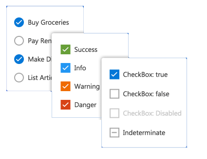
The Blazor Checkbox is a custom checkbox-type HTML5 input component for selecting one or more options from a list of predefined choices. It supports an indeterminate state, different sizes, custom labels and positions, and UI customization.
Getting Started
Resources
- Blazor CheckBox Component Features Overview
- Blazor CheckBox Component Documentation
- Blazor CheckBox Component Demos
- Blazor CheckBox Component Video Tutorials
Blazor Chips
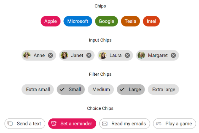
The Blazor Chips is a feature-rich component that provides small blocks of text information. Blazor Chips can also contain avatars, images, letters, and close icons. They can be used as tags when filtering contacts and mail inbox, selecting single or multiple choices from available options, and providing input to an application.
Getting Started
Resources
- Blazor Chips Component Features Overview
- Blazor Chips Component Documentation
- Blazor Chips Component Demos
Blazor Radio Button
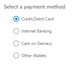
The Blazor Radio Button is a custom radio-type HTML5 input component for selecting one option from a list of predefined choices. It supports different states, sizes, labels, label positions, and UI customizations.
Getting Started
- Getting Started with Blazor Radio Button in Web App
- Getting Started with Blazor Radio Button in WASM App
Resources
- Blazor Radio Button Component Features Overview
- Blazor Radio Button Component Documentation
- Blazor Radio Button Component Demos
- Blazor Radio Button Component Video Tutorials
Blazor Toggle Switch Button
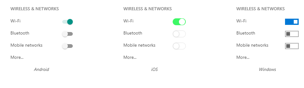
The Blazor Toggle Switch Button is a custom HTML5 input-type checkbox component that allows you to perform a toggle (on/off) action between checked and unchecked states. It supports different sizes, labels, label positions, and UI customization.
Getting Started
- Getting Started with Blazor Toggle Switch Button in Web App
- Getting Started with Blazor Toggle Switch Button in WASM App
Resources
- Blazor Toggle Switch Button Component Features Overview
- Blazor Toggle Switch Button Component Documentation
- Blazor Toggle Switch Button Component Demos
- Blazor Toggle Switch Button Component Video Tutorials
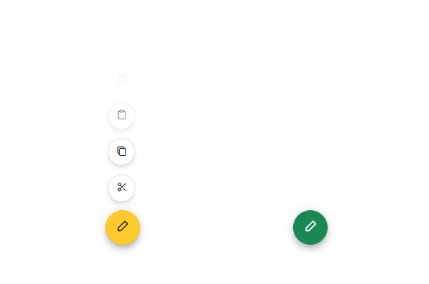
Blazor Floating Action Button
The Blazor Floating Action Button component performs the primary action that appears in front of all screen contents. It has several built-in features such as support for icons, predefined styles, positions, and UI customization.
Getting Started
- Getting Started with Blazor Floating Action Button in Web App
- Getting Started with Blazor Floating Action Button WASM App
Resources
- Blazor Floating Action Button Component Features Overview
- Blazor Floating Action Button Component Documentation
- Blazor Floating Action Button Component Demos
- Blazor Floating Action Button Component Video Tutorials
Blazor Speed Dial
The Blazor Speed Dial component is an extension of the floating action button that displays a list of action buttons when clicked. It has several built-in features such as support for items, predefined styles, positions, and UI customization.
Getting Started
- Getting Started with Blazor Speed Dial in Web App
- Getting Started with Blazor Speed Dial in WASM App
Resources
- Blazor Speed Dial Component Features Overview
- Blazor Speed Dial Component Documentation
- Blazor Speed Dial Component Demos
- Blazor Speed Dial Component Video Tutorials
Support and feedback
- For any other queries, reach our Syncfusion® support team or post the queries through the community forums.
- Provide feature request through the Syncfusion® feedback portal
License
This is a commercial product and requires a paid license for possession or use. Syncfusion® licensed software, including this component, is subject to the terms and conditions of Syncfusion® EULA. You can purchase a license here or start a free 30-day trial here.
About Syncfusion®
Founded in 2001 and headquartered in Research Triangle Park, N.C., Syncfusion® has more than 29,000 customers and more than 1 million users, including large financial institutions, Fortune 500 companies, and global IT consultancies.
Today, we provide 1800+ components and frameworks for web (Blazor, ASP.NET Core, ASP.NET MVC, ASP.NET WebForms, JavaScript, Angular, React, Vue, and Flutter), mobile (Xamarin, Flutter, UWP, and JavaScript), and desktop development (WinForms, WPF, WinUI, Flutter and UWP). We provide ready-to-deploy enterprise software for dashboards, reports, data integration, and big data processing. Many customers have saved millions in licensing fees by deploying our software.
sales@syncfusion.com | www.syncfusion.com | Toll Free: 1-888-9 DOTNET
| Product | Versions Compatible and additional computed target framework versions. |
|---|---|
| .NET | net8.0 is compatible. net8.0-android was computed. net8.0-browser was computed. net8.0-ios was computed. net8.0-maccatalyst was computed. net8.0-macos was computed. net8.0-tvos was computed. net8.0-windows was computed. net9.0 is compatible. net9.0-android was computed. net9.0-browser was computed. net9.0-ios was computed. net9.0-maccatalyst was computed. net9.0-macos was computed. net9.0-tvos was computed. net9.0-windows was computed. net10.0 is compatible. net10.0-android was computed. net10.0-browser was computed. net10.0-ios was computed. net10.0-maccatalyst was computed. net10.0-macos was computed. net10.0-tvos was computed. net10.0-windows was computed. |
-
net10.0
- Syncfusion.Blazor.Core (>= 32.2.9)
-
net8.0
- Syncfusion.Blazor.Core (>= 32.2.9)
-
net9.0
- Syncfusion.Blazor.Core (>= 32.2.9)
NuGet packages (38)
Showing the top 5 NuGet packages that depend on Syncfusion.Blazor.Buttons:
| Package | Downloads |
|---|---|
|
Syncfusion.Blazor.Popups
Syncfusion® Provides Blazor popup and overlay components for building interactive dialogs and tooltips. Includes Dialog for modal and modeless windows with drag support, and Tooltip for contextual help with positioning and animations. |
|
|
Syncfusion.Blazor.Inputs
Comprehensive Blazor Syncfusion® input components including TextBox, MaskedTextBox, NumericTextBox, Color Picker, File Upload, Slider, Rating, Signature, OTP Input, and Speech To Text. Features data validation, formatting, keyboard navigation, and accessibility support for .NET 8+. |
|
|
Syncfusion.Blazor.SplitButtons
Syncfusion® Provides Blazor button components for building advanced button interfaces. Includes Button Group for grouped controls, Dropdown Menu with nested options, Split Button for dual-action triggers, and Progress Button with loading states and animations. |
|
|
Syncfusion.Blazor.Lists
Syncfusion® Blazor ListView component for displaying data in list format with advanced features including sorting, filtering, grouping, and custom templates. Part of Syncfusion® UI component library for .NET 8+. |
|
|
Syncfusion.Blazor.DropDowns
Provides Syncfusion® Blazor dropdown and selection components including AutoComplete, ComboBox, DropDownList, ListBox, and MultiSelect controls. Supports data binding, filtering, grouping, cascading, templates, and accessibility features for building robust selection interfaces. |
GitHub repositories
This package is not used by any popular GitHub repositories.
| Version | Downloads | Last Updated |
|---|---|---|
| 33.1.44 | 4,379 | 3/16/2026 |
| 32.2.9 | 6,277 | 3/9/2026 |
| 32.2.8 | 7,822 | 3/2/2026 |
| 32.2.7 | 10,507 | 2/23/2026 |
| 32.2.5 | 7,886 | 2/16/2026 |
| 32.2.4 | 8,482 | 2/10/2026 |
| 32.2.3 | 11,217 | 2/5/2026 |
| 32.1.25 | 13,700 | 1/26/2026 |
| 32.1.24 | 9,952 | 1/19/2026 |
| 32.1.23 | 14,115 | 1/13/2026 |
| 32.1.22 | 9,133 | 1/5/2026 |
| 32.1.21 | 8,601 | 12/29/2025 |
| 32.1.20 | 4,722 | 12/23/2025 |
| 32.1.19 | 15,741 | 12/16/2025 |
| 31.2.18 | 15,088 | 12/8/2025 |
| 31.2.16 | 15,713 | 12/1/2025 |
| 31.2.15 | 11,142 | 11/25/2025 |
| 31.2.12 | 13,409 | 11/18/2025 |
| 31.2.10 | 6,098 | 11/12/2025 |
| 31.2.5 | 12,723 | 11/3/2025 |