evol-colorpicker
3.4.3-alpha1
See the version list below for details.
dotnet add package evol-colorpicker --version 3.4.3-alpha1
NuGet\Install-Package evol-colorpicker -Version 3.4.3-alpha1
<PackageReference Include="evol-colorpicker" Version="3.4.3-alpha1" />
<PackageVersion Include="evol-colorpicker" Version="3.4.3-alpha1" />
<PackageReference Include="evol-colorpicker" />
paket add evol-colorpicker --version 3.4.3-alpha1
#r "nuget: evol-colorpicker, 3.4.3-alpha1"
#:package evol-colorpicker@3.4.3-alpha1
#addin nuget:?package=evol-colorpicker&version=3.4.3-alpha1&prerelease
#tool nuget:?package=evol-colorpicker&version=3.4.3-alpha1&prerelease
evol-colorpicker · 

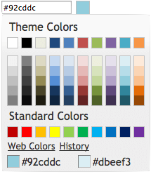
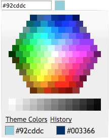
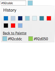
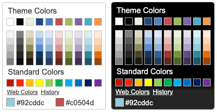
evol-colorpicker is a web color picker which looks like the one in Microsoft Office 2010. It can be used inline or as a popup bound to a text box. It comes with several color palettes, can track selection history and supports "transparent" color. It is a full jQuery UI widget, supporting various configurations and themes.


Check the online demo for several examples.
Table of Contents
<a name="Installation"></a>
Installation
Download or fork evol-colorpicker at GitHub.
git clone https://github.com/evoluteur/colorpicker
or use the npm package:
npm install evol-colorpicker
or install with Bower:
bower install evol-colorpicker
or use the nuget package:
dotnet add package evol-colorpicker
<a name="Usage"></a>
Usage
First, load jQuery (v3.1 or greater), jQuery UI (v1.12.1 or greater), and the plugin (for earlier version of jQuery-UI, use an earlier version of Colorpicker).
<script
  src="https://ajax.googleapis.com/ajax/libs/jquery/3.6.0/jquery.min.js"
  type="text/javascript"
  charset="utf-8"
></script>
<script
  src="https://ajax.googleapis.com/ajax/libs/jqueryui/1.12.1/jquery-ui.min.js"
  type="text/javascript"
  charset="utf-8"
></script>
<script
  src="js/evol-colorpicker.min.js"
  type="text/javascript"
  charset="utf-8"
></script>
The widget requires a jQuery UI theme to be present, as well as its own included base CSS file (evol-colorpicker.css). Here we use the "ui-lightness" theme as an example:
<link
  rel="stylesheet"
  type="text/css"
  href="http://ajax.googleapis.com/ajax/libs/jqueryui/1.12.1/themes/ui-lightness/jquery-ui.css"
/>
<link href="css/evol-colorpicker.css" rel="stylesheet" type="text/css" />
Now, let's attach it to an existing <input> tag:
<script type="text/javascript">
  $(document).ready(function () {
    $("#mycolor").colorpicker();
  });
</script>

<input style="width:100px;" id="mycolor" />
This will wrap it into a "holder" <div> and add another <div> beside it for the color box:
<div style="width:128px;">
  <input style="width:100px;" id="mycolor" class="colorPicker evo-cp0" />
  <div class="evo-colorind" style="background-color:#8db3e2"></div>
</div>
Using the same syntax, the widget can also be instanciated on a <div> or a <span> tag to show inline. In that case the generated HTML is the full palette.
<a name="Theming"></a>
Theming
evol-colorpicker is as easily themeable as any jQuery UI widget, using one of the jQuery UI themes or your own custom theme made with Themeroller.

<a name="Options"></a>
Options
evol-colorpicker provides several options to customize its behaviour:
color (String)
Used to set the color value.
$("#mycolor").colorpicker({
  color: "#ffffff",
});
Defaults to null.
defaultPalette (String)
Used to set the default color palette. Possible values are "theme" or "web".
$("#mycolor").colorpicker({
  defaultPalette: "web",
});
Defaults to theme.
displayIndicator (Boolean)
Used to show color value on hover and click inside the palette.
$("#mycolor").colorpicker({
  displayIndicator: false,
});
Defaults to true.
hideButton (Boolean)
When binding the colorpicker to a textbox, a colored button will be added to the right of the textbox unless hideButton is set to true. This option doens't have any effect if the colorpicker is bound to a DIV.
$("#mycolor").colorpicker({
  hideButton: true,
});
Defaults to false.
history (Boolean)
Used to track selection history (shared among all instances of the colorpicker). The history keeps the last 28 colors selections.
$("#mycolor").colorpicker({
  history: false,
});
Defaults to true.
initialHistory (Array strings)
Used to provide a color selection history. Colors are provided as strings of hexadecimal color values.
$("#mycolor").colorpicker({
  initialHistory: ["#ff0000", "#00ff00", "#0000ff"],
});
Defaults to null.
showOn (String)
Have the colorpicker appear automatically when the field receives focus ("focus"), appear only when a button is clicked ("button"), or appear when either event takes place ("both"). This option only takes effect when the color picker is instanciated on a textbox.
$("#mycolor").colorpicker({
  showOn: "button",
});
Defaults to "both".
strings (String)
Used to translate the widget. It is a coma separated list of all labels used in the UI.
$("#mycolor").colorpicker({
  strings:
    "Couleurs de themes,Couleurs de base,Plus de couleurs,Moins de couleurs,Palette,Historique,Pas encore d'historique.",
});
Defaults to "Theme Colors,Standard Colors,Web Colors,Theme Colors,Back to Palette,History,No history yet.".
transparentColor (Boolean)
Allow for selection of the "transparent color". The hexadecimal value for the transparent color is "#0000ffff".
$("#mycolor").colorpicker({
  transparentColor: true,
});
Defaults to false.
<a name="Methods"></a>
Methods
clear()
Clears the color value (and close the popup palette if opened).
$("#mycolor").colorpicker("clear");
enable()
Get the currently selected color value (returned as a string).
$("#mycolor").colorpicker("enable");
disable()
Get the currently selected color value (returned as a string).
$("#mycolor").colorpicker("disable");
isDisabled()
Get the currently selected color value (returned as a string).
$("#mycolor").colorpicker("isDisabled");
val([color])
Get or set the currently selected color value (as a string, ie. "#d0d0d0").
var colorValue = $("#mycolor").colorpicker("val");

$("#mycolor").colorpicker("val", "#d0d0d0");
showPalette()
Show the palette (when using the widget as a popup).
$("#mycolor").colorpicker("showPalette");
hidePalette()
Hide the palette (when using the widget as a popup).
$("#mycolor").colorpicker("hidePalette");
<a name="Events"></a>
Events
change.color
This event is triggered when a color is selected.
$("#mycolor").on("change.color", function (event, color) {
  $("#title").css("background-color", color);
});
mouseover.color
This event is triggered when the mouse moves over a color box on the palette.
$("#mycolor").on("mouseover.color", function (event, color) {
  $("#title").css("background-color", color);
});
<a name="License"></a>
License
Copyright (c) 2024 Olivier Giulieri.
evol-colorpicker is released under the MIT license.
Learn more about Target Frameworks and .NET Standard.
This package has no dependencies.
NuGet packages
This package is not used by any NuGet packages.
GitHub repositories
This package is not used by any popular GitHub repositories.
| Version | Downloads | Last Updated |
|---|---|---|
| 3.4.4 | 237 | 12/20/2024 |
| 3.4.3 | 216 | 7/26/2024 |
| 3.4.3-alpha1 | 165 | 7/26/2024 |