Plugin.Maui.Calendar
3.1.0
dotnet add package Plugin.Maui.Calendar --version 3.1.0
NuGet\Install-Package Plugin.Maui.Calendar -Version 3.1.0
<PackageReference Include="Plugin.Maui.Calendar" Version="3.1.0" />
<PackageVersion Include="Plugin.Maui.Calendar" Version="3.1.0" />
<PackageReference Include="Plugin.Maui.Calendar" />
paket add Plugin.Maui.Calendar --version 3.1.0
#r "nuget: Plugin.Maui.Calendar, 3.1.0"
#:package Plugin.Maui.Calendar@3.1.0
#addin nuget:?package=Plugin.Maui.Calendar&version=3.1.0
#tool nuget:?package=Plugin.Maui.Calendar&version=3.1.0
<div align="center">
<img src="https://raw.githubusercontent.com/yurkinh/Plugin.Maui.Calendar/main/nuget.png" alt="Plugin.Maui.Calendar" width="130" />
Calendar Plugin for .NET MAUI
Highly customizable Calendar control for .NET MAUI — events, selection modes, localization, theming and custom day cells.




</div>
A calendar control built from .NET MAUI views only, with no platform-specific code, so it looks and behaves the same on Android, iOS, Mac Catalyst and Windows. It started as a .NET MAUI port of the Xamarin.Forms Calendar Plugin by lilcodelab.
Features
- Layouts: a month, two weeks or one week
- Selection: a single day, several separate days, a range of days or a whole week
- Events: dots (up to five colors per day) or a colored day background, and a list of the selected day's events under the calendar
- Date limits: minimum and maximum dates, and single disabled dates
- Localization: month and day names from any
CultureInfo, native digits and any first day of the week - Styling: colors and styles for every part, a light and a dark theme through
AppThemeBinding, and shaded weekend columns - Templates: your own header, footer, event list and fully custom day cells (
DayViewTemplate)
Contents
- Screenshots
- Getting started
- Showing and navigating dates
- Selecting dates
- Events
- Layouts
- Localization
- Colors
- Styles
- Dark mode and themes
- Header and footer
- Custom day cells: DayViewTemplate
- Swipe gestures
- API reference
- Good to know
- Sample app
- For AI coding assistants
- Changelog, contributing and license
Screenshots
| Android | iOS | Windows | Mac |
|---|---|---|---|
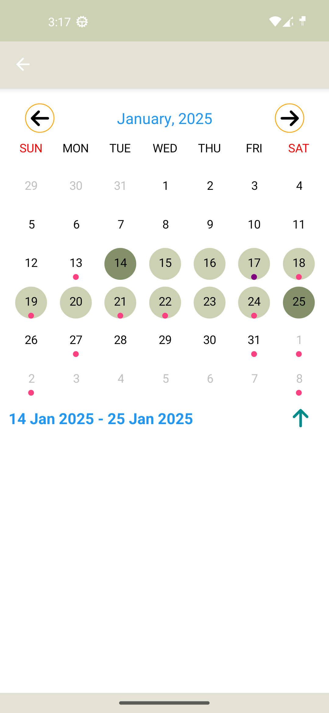 |
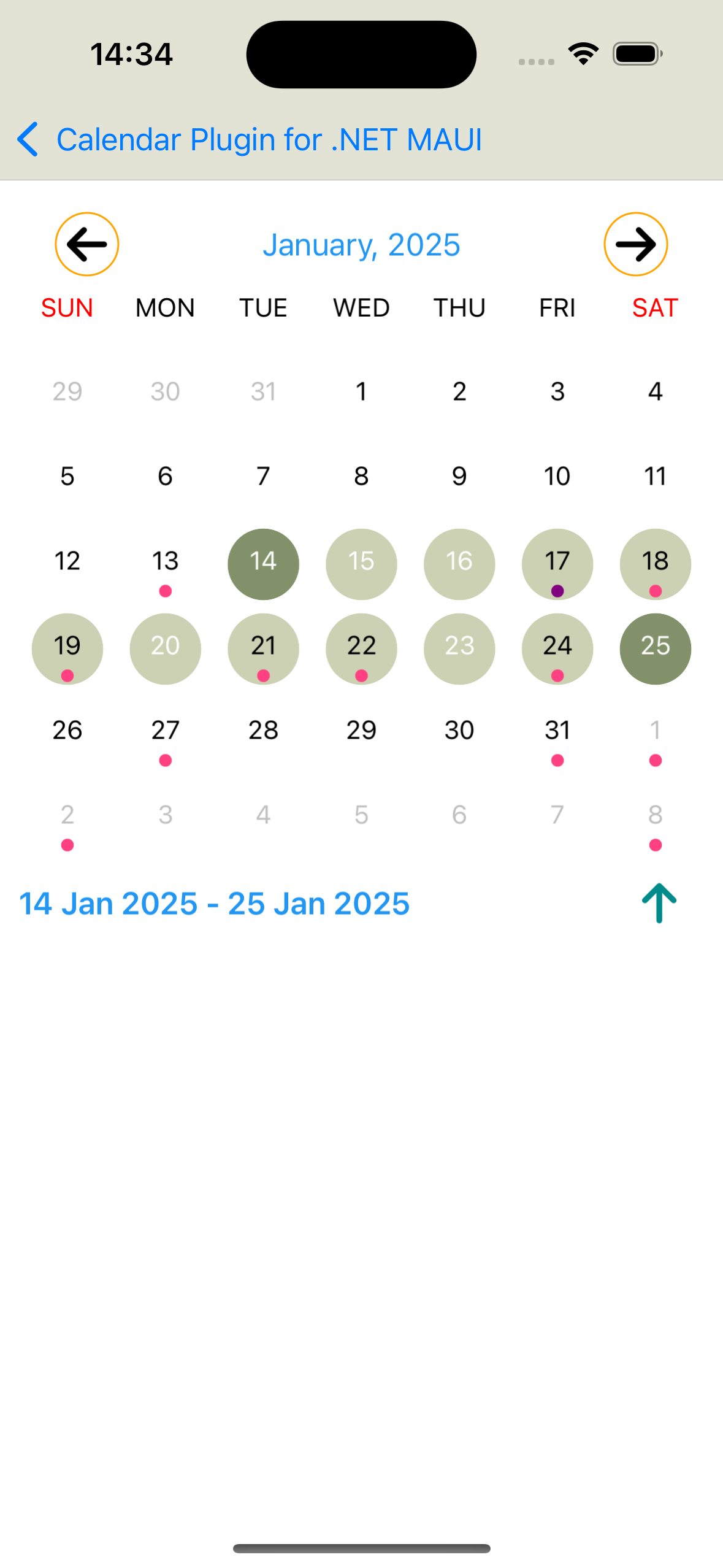 |
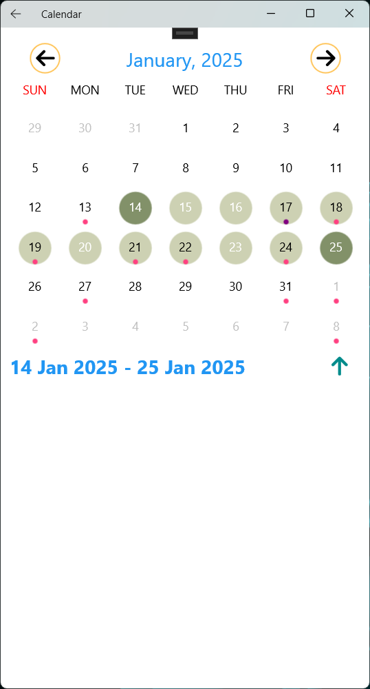 |
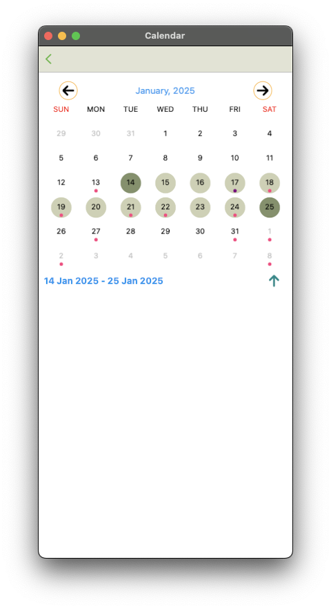 |
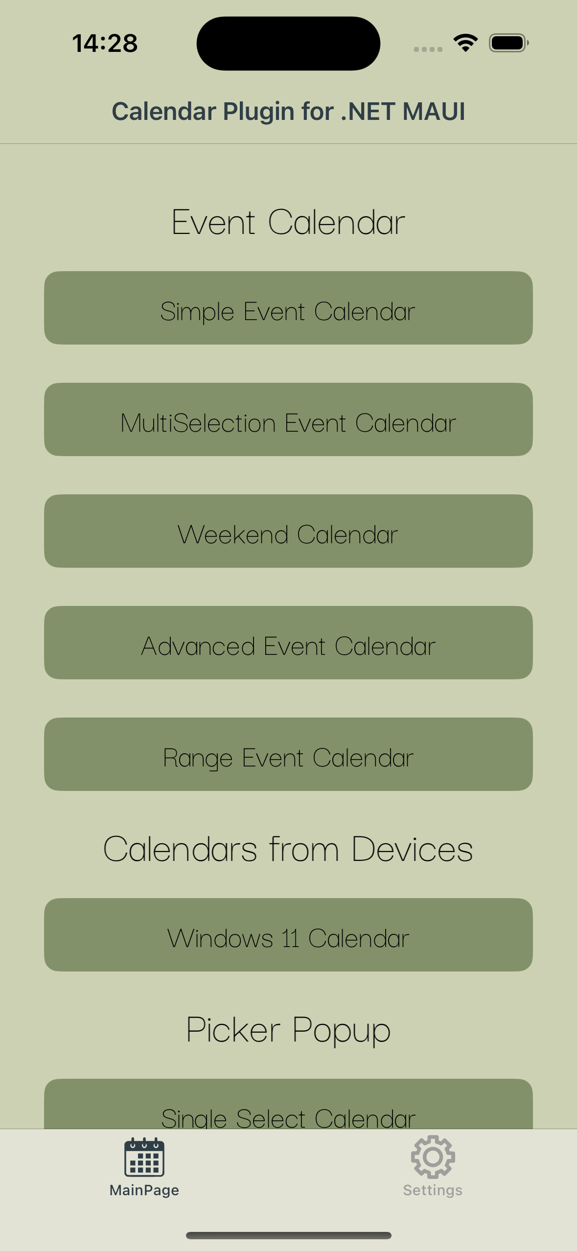
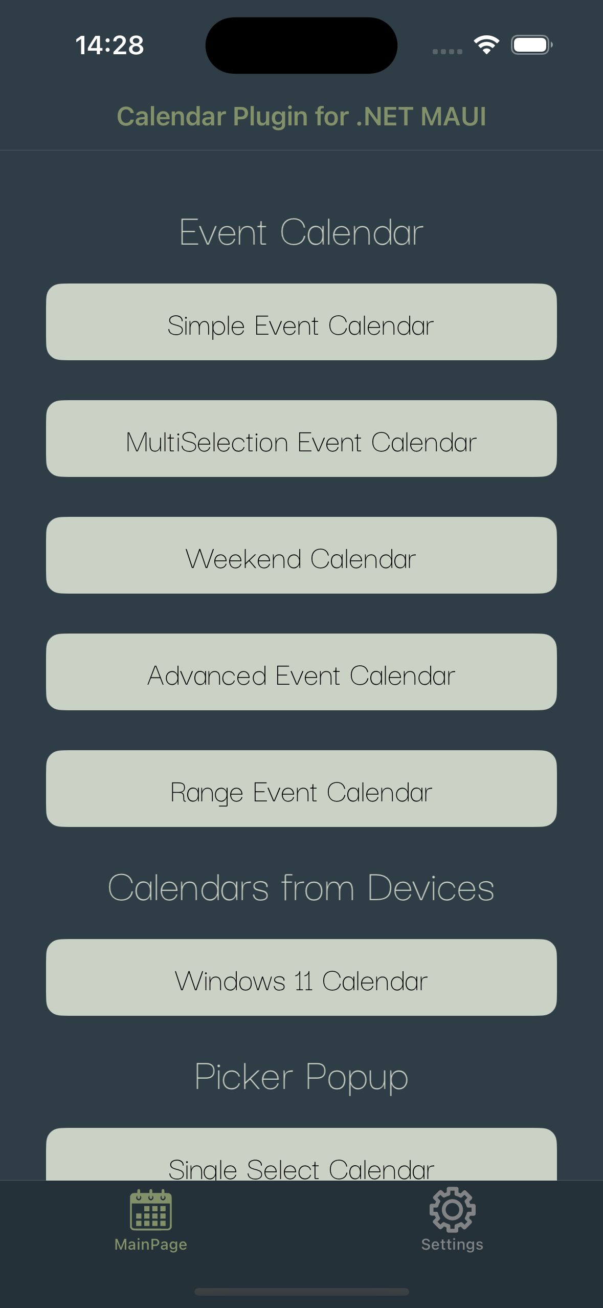
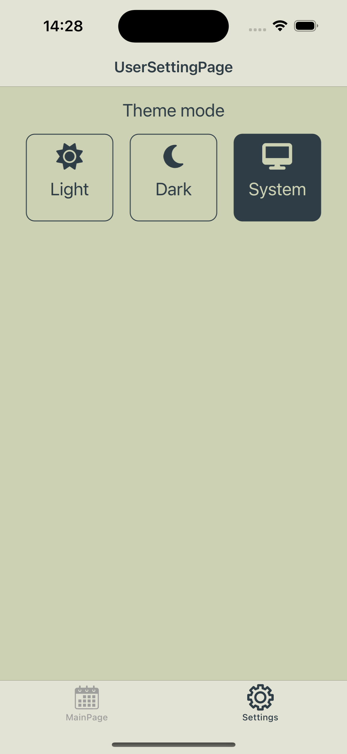
The sample app in a light and a dark theme, and its settings:
| Light | Dark | Settings |
|---|---|---|
 |
 |
 |
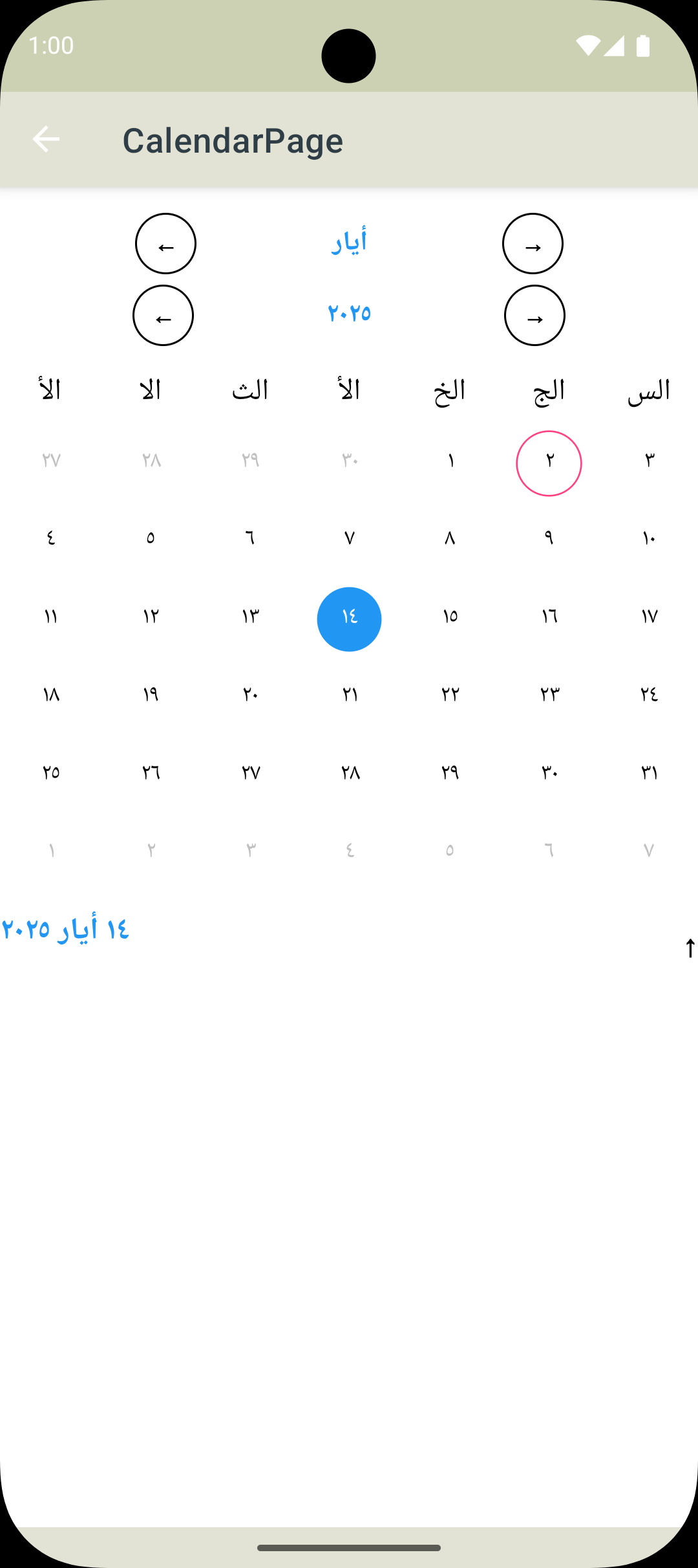
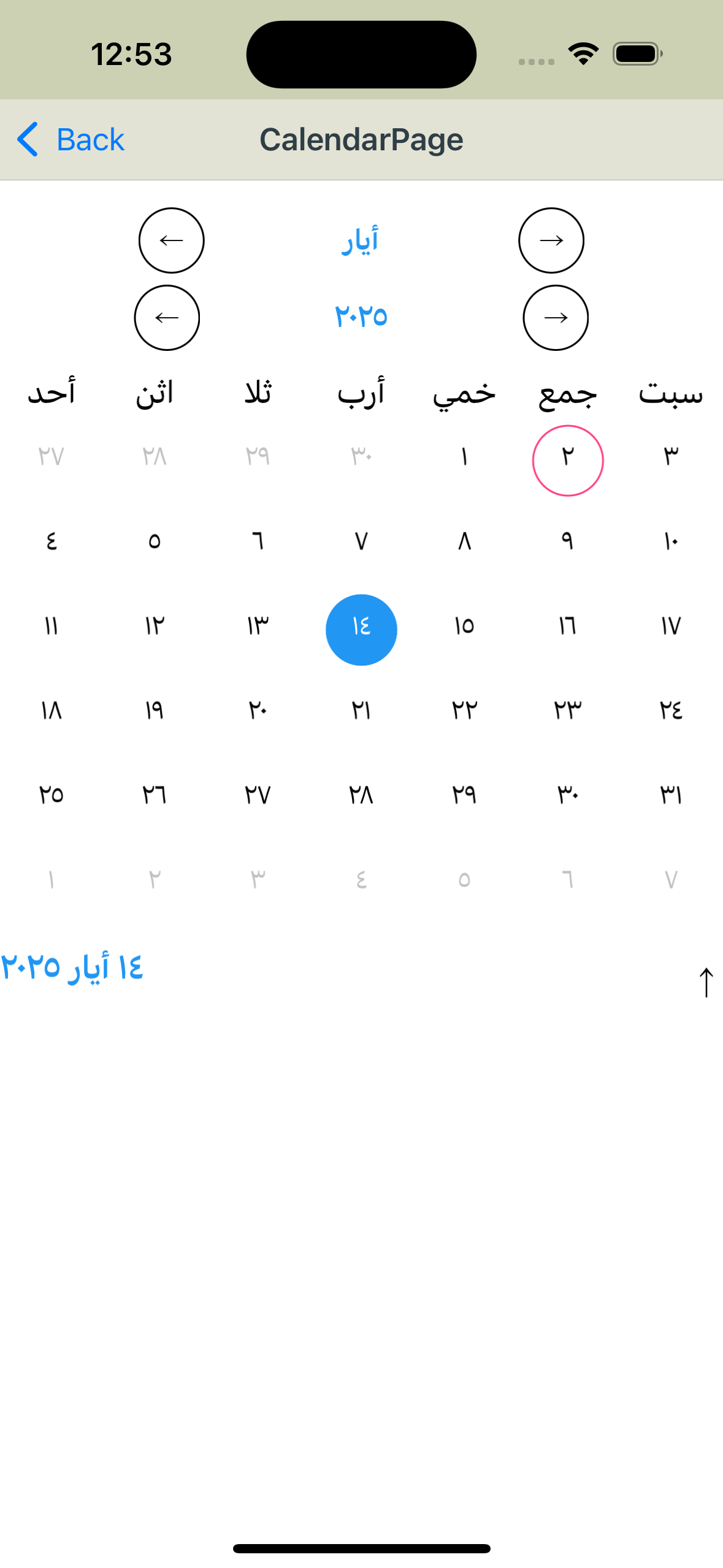
Another culture:
| Android | iOS |
|---|---|
 |
 |
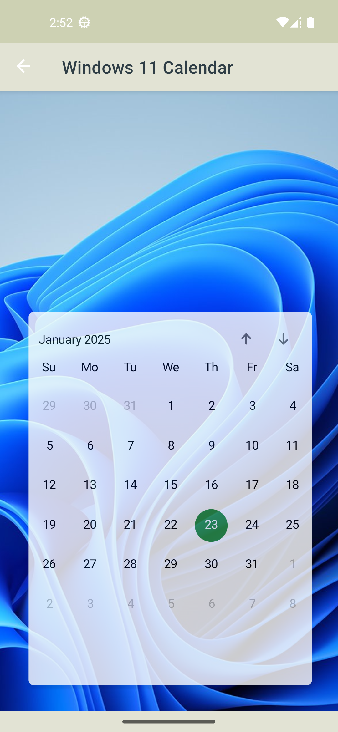
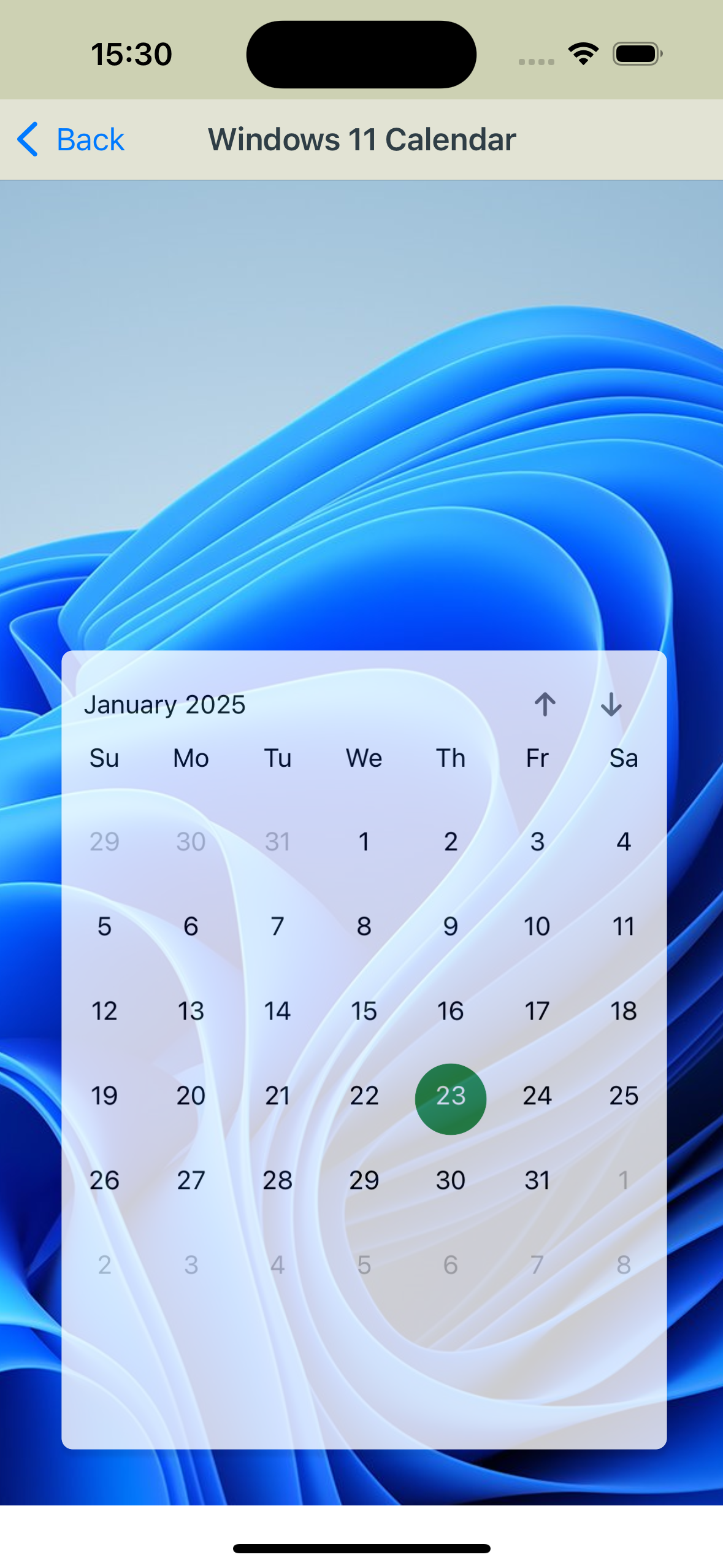
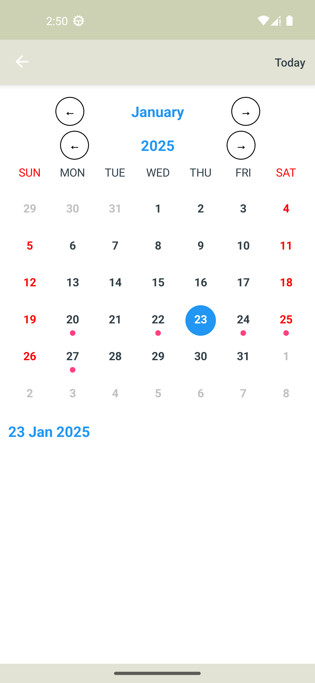
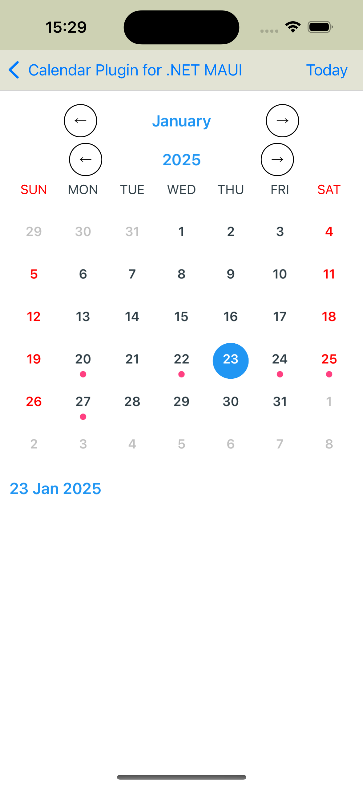
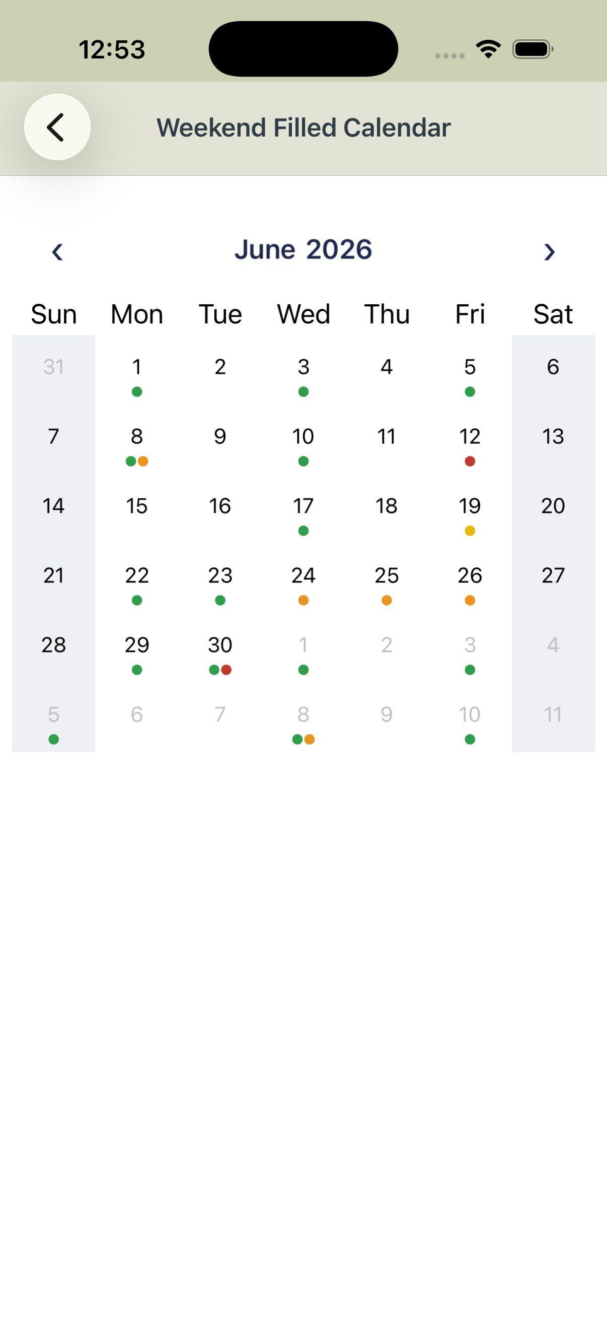
A look-alike of the Windows 11 calendar flyout, and weekend calendars (the filled one uses WeekendDayBackgroundColor, a soft selected-day background and a custom header template):
| Windows 11 (Android) | Windows 11 (iOS) | Weekend (Android) | Weekend (iOS) | Weekend filled |
|---|---|---|---|---|
 |
 |
 |
 |
 |
Getting started
Requirements
| Minimum | |
|---|---|
| .NET | .NET 10 with the .NET MAUI workload |
| Android | API 21 (Android 5.0) |
| iOS | 15.0 |
| Mac Catalyst | 15.2 |
| Windows | 10.0.17763 |
Tizen is not tested.
Install
dotnet add package Plugin.Maui.Calendar
No registration in MauiProgram.cs is needed.
Add a calendar
Add the namespace to your page and place the control:
<ContentPage
    xmlns="http://schemas.microsoft.com/dotnet/2021/maui"
    xmlns:x="http://schemas.microsoft.com/winfx/2009/xaml"
    xmlns:plugin="clr-namespace:Plugin.Maui.Calendar.Controls;assembly=Plugin.Maui.Calendar"
    x:Class="MyApp.CalendarPage">

    <plugin:Calendar
        Culture="{Binding Culture}"
        Events="{Binding Events}"
        EventsScrollViewVisible="True"
        SelectedDate="{Binding SelectedDate}" />
</ContentPage>
using System.Globalization;
using Plugin.Maui.Calendar.Models;

public class CalendarViewModel
{
    public CultureInfo Culture { get; } = CultureInfo.CurrentCulture;

    public DateTime? SelectedDate { get; set; } = DateTime.Today;

    public EventCollection Events { get; } = new()
    {
        [DateTime.Today] = new List<MyEvent> { new("Design review"), new("Lunch") },
        [DateTime.Today.AddDays(3)] = new List<MyEvent> { new("Release") },
    };
}

public record MyEvent(string Name);
Culture defaults to CultureInfo.InvariantCulture, which shows English names, so set it for your users. The events of the selected day appear under the calendar; see Events to template them.
Showing and navigating dates
The calendar shows the month (or week) of ShownDate. Day, Month and Year are its parts, and all four are two-way bindable, so use whichever fits your view model:
<plugin:Calendar ShownDate="{Binding ShownDate}" />
<plugin:Calendar Day="14" Month="5" Year="2026" />
The user moves between months with the arrows of the header or by swiping left and right. After each move:
MonthChangedis raised andMonthChangedCommandis executed with aMonthChangedEventArgs(OldMonthandNewMonth, bothDateOnly). They are raised by the month (or week) arrows, swipes andAutoChangeMonthOnDayTap, but not by the year arrows or when you setShownDate,MonthorYearfrom code.OnShownDateChangedCommandis executed with the newShownDate. It also runs when the shown date is set from code.
VisibleStartDate and VisibleEndDate are the first and the last date on screen, including the days of the previous and next month. Whenever they change, ShownDatesChanged is raised and ShownDatesChangedCommand is executed with a ShownDatesChangedEventArgs. That is the moment to load the events of the visible range:
<plugin:Calendar ShownDatesChangedCommand="{Binding LoadEventsCommand}" />
[RelayCommand]
async Task LoadEvents(ShownDatesChangedEventArgs range) =>
    await eventService.LoadAsync(range.VisibleStartDate, range.VisibleEndDate);
The first range can be set while the calendar is created, before your handler or command is attached, so read VisibleStartDate and VisibleEndDate once the calendar is loaded to get it.
Selecting dates
Four controls share every property of Calendar and differ in what a tap selects:
| Control | A tap… | Read the selection from |
|---|---|---|
Calendar |
selects the day (a second tap deselects it) | SelectedDate |
MultiSelectionCalendar |
adds or removes the day | SelectedDates |
RangeSelectionCalendar |
starts a range, then sets its other end | SelectedStartDate, SelectedEndDate, SelectedDates |
WeekSelectionCalendar |
selects the whole week of the day (from FirstDayOfWeek) |
SelectedDates |
<plugin:Calendar SelectedDate="{Binding SelectedDate}" />

<plugin:MultiSelectionCalendar SelectedDates="{Binding SelectedDates}" />

<plugin:RangeSelectionCalendar
    SelectedEndDate="{Binding EndDate}"
    SelectedStartDate="{Binding StartDate}" />

<plugin:WeekSelectionCalendar SelectedDates="{Binding SelectedDates}" />
SelectedDatesis anObservableCollection<DateTime>and is two-way. The calendar assigns a new collection after every tap, so read the property again instead of keeping the old instance. From code, assign a new collection or add and remove dates in the bound one; the calendar follows both.SelectedDateis the first date ofSelectedDatesin every control, andnullwhen nothing is selected.- In a
RangeSelectionCalendarthe first tap sets both ends to that day. The next tap moves the start when it is on or before it, or sets the end otherwise. The tap after that starts a new range.SelectedDatesholds every day of the range except disabled ones. Bind eitherSelectedStartDate/SelectedEndDateorSelectedDates, not both. AllowDeselecting="False"keeps a selected day selected when it is tapped again.DayTappedCommandis executed with the tappedDateTimewhen an enabled day is tapped, before the selection changes (not for a tap thatAllowDeselecting="False"ignores).AutoChangeMonthOnDayTap="True"shows the month of a tapped day of the previous or next month.ClearSelection()removes the selection from code.
Date limits
<plugin:Calendar
    DisabledDates="{Binding HolidayDates}"
    MaximumDate="{Binding MaximumDate}"
    MinimumDate="{Binding MinimumDate}" />
Days before MinimumDate, after MaximumDate or in DisabledDates are shown in DisabledDayColor and can't be selected. Only the date part of MinimumDate and MaximumDate counts. DisabledDates is a List<DateTime>: put dates without a time in it (DateTime.Today.AddDays(2), not DateTime.Now.AddDays(2)), and assign a new list to change it, because changes inside the list are not observed.
Events
Events is an EventCollection: a dictionary from a date to a collection of your own event objects. Only the date part of the key is used.
using Plugin.Maui.Calendar.Models;

Events = new EventCollection
{
    [DateTime.Today] = new List<MyEvent> { new("Design review"), new("Lunch") },
    [DateTime.Today.AddDays(5)] = new List<MyEvent> { new("Release") },
};

// Later: add, replace or remove whole days; the calendar updates right away
Events.Add(DateTime.Today.AddDays(1), new List<MyEvent> { new("Workshop") });
Events[DateTime.Today] = new List<MyEvent> { new("Moved review") };
Events.Remove(DateTime.Today.AddDays(5));
Always use it through the EventCollection type: the calendar is notified by its own Add, Remove, indexer and Clear, and a reference typed as Dictionary<DateTime, ICollection> bypasses them. Adding to or removing from the collection already stored for a day is not seen by the day cell: assign the day again (Events[date] = events) to update its dots.
The event list
Set EventsScrollViewVisible="True" to show the events of the selected day (or days) under the calendar. EventTemplate draws one event, with your event object as its binding context, and EmptyTemplate is shown when there are none:
<plugin:Calendar Events="{Binding Events}" EventsScrollViewVisible="True">
    <plugin:Calendar.EventTemplate>
        <DataTemplate x:DataType="models:MyEvent">
            <Label Padding="16,8" Text="{Binding Name}" />
        </DataTemplate>
    </plugin:Calendar.EventTemplate>
    <plugin:Calendar.EmptyTemplate>
        <DataTemplate>
            <Label Padding="16" HorizontalTextAlignment="Center" Text="No events" />
        </DataTemplate>
    </plugin:Calendar.EmptyTemplate>
</plugin:Calendar>
Without an EventTemplate each event is shown with its ToString(). To show the events somewhere else, bind SelectedDayEvents with Mode=OneWayToSource.
Event indicators
EventIndicatorType sets how a day with events is marked:
| Value | Look |
|---|---|
BottomDot (default) |
Dots under the day number |
TopDot |
Dots above the day number |
Background |
The day's background in EventIndicatorColor |
BackgroundFull |
The whole cell in EventIndicatorColor |
EventIndicatorColor and EventIndicatorSelectedColor color the indicator, and EventIndicatorTextColor and EventIndicatorSelectedTextColor color the number of a day with events.
Colors per day
The collection stored for a day can bring its own colors. The calendar checks it for two interfaces from Plugin.Maui.Calendar.Interfaces:
IPersonalizableDayEvent:EventIndicatorColor,EventIndicatorSelectedColor,EventIndicatorTextColor,EventIndicatorSelectedTextColor. Anullcolor falls back to the calendar's color.IMultiEventDay:Colors, up to five dot colors for the day (for example one per event).
The package doesn't ship a collection type for this, so add one to your app:
using Plugin.Maui.Calendar.Interfaces;

public class DayEventCollection<T> : List<T>, IPersonalizableDayEvent, IMultiEventDay
{
    public DayEventCollection() { }
    public DayEventCollection(IEnumerable<T> events) : base(events) { }

    public Color EventIndicatorColor { get; set; }
    public Color EventIndicatorSelectedColor { get; set; }
    public Color EventIndicatorTextColor { get; set; }
    public Color EventIndicatorSelectedTextColor { get; set; }

    public IReadOnlyList<Color> Colors { get; set; }
}
// One purple dot
Events[DateTime.Today] = new DayEventCollection<MyEvent>([new("Design review")])
{
    EventIndicatorColor = Colors.Purple,
};

// One dot per event
Events[DateTime.Today.AddDays(1)] = new DayEventCollection<MyEvent>([new("Shift"), new("Leave")])
{
    Colors = [Colors.Green, Colors.Orange],
};
Layouts
<plugin:Calendar CalendarLayout="Week" WeekViewUnit="WeekNumber" />
CalendarLayout:Month(default),TwoWeekorWeek. The arrows and swipes then move by a month, two weeks or a week.WeekViewUnit: the header shows the month name (MonthName, default) or the week number (WeekNumber). The week number is counted with the first day of the week ofCultureand the first-four-day-week rule.OtherMonthDayIsVisible="False"hides the days of the previous and next month in the month layout;OtherMonthWeekIsVisible="False"hides the rows that only have such days.HeaderSectionVisible,FooterSectionVisibleandCalendarSectionShownshow or hide the header, the footer and the days.
Localization
<plugin:Calendar
    Culture="{Binding Culture}"
    DaysTitleMaximumLength="TwoChars"
    FirstDayOfWeek="Monday"
    SelectedDateTextFormat="dddd, d MMMM"
    UseNativeDigits="True" />
Culture(defaultInvariantCulture) gives the month names, the weekday titles and the formatting of numbers and of the selected date.FirstDayOfWeek(defaultSunday) is independent of the culture; set it fromCulture.DateTimeFormat.FirstDayOfWeekif you want the culture's.UseNativeDigits="True"writes numbers in the culture's own digits, for example Arabic-Indic digits.- Weekday titles are the culture's day names shortened to
DaysTitleMaximumLengthcharacters (OneChar,TwoChars,ThreeCharsby default, orNone), preferring the culture's own abbreviation when it fits.UseAbbreviatedDayNames="True"uses the culture'sAbbreviatedDayNamesas they are and ignoresDaysTitleMaximumLength. Titles are upper case unlessDaysTitleLabelFirstUpperRestLower="True". SelectedDateTextFormat(defaultd MMM yyyy) formatsSelectedDateText, the text of the footer.
Colors
| Property | Default | Colors |
|---|---|---|
DeselectedDayTextColor |
Black |
Day numbers |
SelectedDayTextColor |
White |
The selected day's number |
SelectedDayBackgroundColor |
#2196F3 |
The selected day's background |
SelectedTodayTextColor |
White |
Today's number when selected (Transparent uses SelectedDayTextColor) |
TodayTextColor |
Black |
Today's number (Transparent uses DeselectedDayTextColor) |
TodayOutlineColor |
#FF4081 |
The outline of today when it is not selected |
TodayFillColor |
Transparent |
Today's background when it is not selected |
WeekendDayColor |
Black |
Saturday and Sunday numbers (Transparent uses DeselectedDayTextColor) |
OtherMonthDayColor |
Silver |
Days of the previous and next month |
OtherMonthSelectedDayColor |
Silver |
A selected day of the previous or next month |
DisabledDayColor |
#ECECEC |
Days outside the date limits and disabled dates |
EventIndicatorColor |
#FF4081 |
Event dots or background |
EventIndicatorSelectedColor |
#FF4081 |
Event dots or background on a selected day |
EventIndicatorTextColor |
Black |
Numbers of days with events |
EventIndicatorSelectedTextColor |
Black |
Numbers of selected days with events |
WeekendDayBackgroundColor |
Transparent |
The background of the weekend columns |
SelectedDatesRangeBackgroundColor |
SelectedDayBackgroundColor |
The days between the ends of a range (RangeSelectionCalendar only) |
A day number takes the first color that applies, in this order: disabled → selected day of another month → day of another month → selected with events → selected today → selected → with events → today → weekend → any other day. So a day with events uses EventIndicatorTextColor even when it is today or a weekend day.
Weekend columns
WeekendDayBackgroundColor fills a box behind every Saturday and Sunday cell. The weekday titles stay uncovered, and the boxes of one column touch each other. WeekendDayBackgroundCornerRadius rounds each box.
<plugin:Calendar
    WeekendDayBackgroundColor="#EEF0F4"
    WeekendDayBackgroundCornerRadius="12" />
Styles
Text and buttons are styled with Style properties. Base your style on the matching default from Plugin.Maui.Calendar.Styles.DefaultStyles to change only some setters:
xmlns:styles="clr-namespace:Plugin.Maui.Calendar.Styles;assembly=Plugin.Maui.Calendar"

<Style x:Key="MyDaysTitleLabelStyle"
       BasedOn="{x:Static styles:DefaultStyles.DefaultDaysTitleLabelStyle}"
       TargetType="Label">
    <Setter Property="FontSize" Value="13" />
    <Setter Property="TextColor" Value="Gray" />
</Style>

<plugin:Calendar DaysTitleLabelStyle="{StaticResource MyDaysTitleLabelStyle}" />
| Property | Target | Default (DefaultStyles.) |
Styles |
|---|---|---|---|
DaysLabelStyle |
Label |
DefaultLabelStyle |
Day numbers (their color comes from Colors) |
DaysTitleLabelStyle |
Label |
DefaultDaysTitleLabelStyle |
Weekday titles |
WeekendTitleStyle |
Label |
DefaultWeekendTitleStyle |
Saturday and Sunday titles |
MonthLabelStyle |
Label |
DefaultMonthLabelStyle |
The month of the default header |
YearLabelStyle |
Label |
DefaultYearLabelStyle |
The year of the default header |
PreviousMonthArrowButtonStyle |
Button |
DefaultPreviousMonthArrowButtonStyle |
Previous month (or week) button of the default header |
NextMonthArrowButtonStyle |
Button |
DefaultNextMonthArrowButtonStyle |
Next month (or week) button |
PreviousYearArrowButtonStyle |
Button |
DefaultPreviousYearArrowButtonStyle |
Previous year button |
NextYearArrowButtonStyle |
Button |
DefaultNextYearArrowButtonStyle |
Next year button |
SelectedDateLabelStyle |
Label |
DefaultSelectedDateLabelStyle |
Selected date text of the default footer |
FooterArrowLabelStyle |
Label |
DefaultFooterArrowLabelStyle |
Show/hide arrow of the default footer |
DayViewSize (default 40) is the width and height of a day cell, DayViewCornerRadius (default 20) rounds the selection, today and event backgrounds, and DayViewBorderMargin insets them in the cell.
Dark mode and themes
The default colors and styles are made for a light background: black numbers, and white arrow buttons with a black border. For a dark theme, give the colors light and dark values with AppThemeBinding, and keep them in one style so every calendar in your app shares them:
<Style x:Key="ThemedCalendarStyle" TargetType="plugin:Calendar">
    <Setter Property="DeselectedDayTextColor" Value="{AppThemeBinding Light=#1B211D, Dark=#E7EBE5}" />
    <Setter Property="WeekendDayColor" Value="{AppThemeBinding Light=#1B211D, Dark=#E7EBE5}" />
    <Setter Property="TodayTextColor" Value="{AppThemeBinding Light=#4E6B3A, Dark=#A7C28A}" />
    <Setter Property="TodayOutlineColor" Value="{AppThemeBinding Light=#4E6B3A, Dark=#A7C28A}" />
    <Setter Property="SelectedDayBackgroundColor" Value="{AppThemeBinding Light=#4E6B3A, Dark=#A7C28A}" />
    <Setter Property="SelectedDayTextColor" Value="{AppThemeBinding Light=White, Dark=#16200F}" />
    <Setter Property="SelectedTodayTextColor" Value="{AppThemeBinding Light=White, Dark=#16200F}" />
    <Setter Property="OtherMonthDayColor" Value="{AppThemeBinding Light=#A9B0AA, Dark=#58615B}" />
    <Setter Property="DisabledDayColor" Value="{AppThemeBinding Light=#A9B0AA, Dark=#58615B}" />
    <Setter Property="EventIndicatorColor" Value="{AppThemeBinding Light=#4E6B3A, Dark=#A7C28A}" />
    <Setter Property="EventIndicatorSelectedColor" Value="{AppThemeBinding Light=White, Dark=#16200F}" />
    <Setter Property="EventIndicatorTextColor" Value="{AppThemeBinding Light=#1B211D, Dark=#E7EBE5}" />
    <Setter Property="EventIndicatorSelectedTextColor" Value="{AppThemeBinding Light=White, Dark=#16200F}" />
    <Setter Property="DaysTitleLabelStyle" Value="{StaticResource MyDaysTitleLabelStyle}" />

</Style>

<plugin:Calendar Style="{StaticResource ThemedCalendarStyle}" />
Set every color that applies to your calendar: for example EventIndicatorTextColor still paints the numbers of days with events black in a dark theme. The sample app's Styles.xaml has a complete style (SampleCalendarStyle) for both themes.
Header and footer
The header (month and year with arrows) and the footer (the selected date and a show/hide arrow) can be replaced with your own DataTemplate. Their binding context is the calendar itself, so a template binds to its properties and commands:
| Member | Use |
|---|---|
PrevLayoutUnitCommand, NextLayoutUnitCommand |
Show the previous or next month (or week) |
PrevYearCommand, NextYearCommand |
Show the same month a year earlier or later |
ShowHideCalendarCommand |
Hide or show the days (toggles CalendarSectionShown) |
LayoutUnitText |
The month name, or the week number with WeekViewUnit="WeekNumber" |
LocalizedYear |
The shown year, formatted with Culture |
SelectedDateText |
The selected date(s), formatted with SelectedDateTextFormat |
CalendarSectionShown |
Whether the days are shown |
<plugin:Calendar>
    <plugin:Calendar.HeaderSectionTemplate>
        <DataTemplate x:DataType="plugin:Calendar">
            <Grid Padding="8" ColumnDefinitions="Auto,*,Auto">
                <Button Command="{Binding PrevLayoutUnitCommand}" Text="‹" />
                <Label Grid.Column="1" HorizontalOptions="Center" VerticalOptions="Center">
                    <Label.FormattedText>
                        <FormattedString>
                            <Span Text="{Binding LayoutUnitText}" />
                            <Span Text=" " />
                            <Span Text="{Binding LocalizedYear}" />
                        </FormattedString>
                    </Label.FormattedText>
                </Label>
                <Button Grid.Column="2" Command="{Binding NextLayoutUnitCommand}" Text="›" />
            </Grid>
        </DataTemplate>
    </plugin:Calendar.HeaderSectionTemplate>

    <plugin:Calendar.FooterSectionTemplate>
        <DataTemplate x:DataType="plugin:Calendar">
            <Grid Padding="8" ColumnDefinitions="*,Auto">
                <Label Text="{Binding SelectedDateText}" VerticalOptions="Center" />
                <Label Grid.Column="1" Text="⌃" VerticalOptions="Center" />
                <Grid.GestureRecognizers>
                    <TapGestureRecognizer Command="{Binding ShowHideCalendarCommand}" />
                </Grid.GestureRecognizers>
            </Grid>
        </DataTemplate>
    </plugin:Calendar.FooterSectionTemplate>
</plugin:Calendar>
With the default header, ShowMonthPicker and ShowYearPicker hide its month and year rows. With the default footer, FooterArrowVisible hides the arrow; tapping the footer still hides and shows the days.
A swipe up hides the days (see Swipe gestures), and a tap on the default footer shows them again. If your footer has no ShowHideCalendarCommand, or the footer is hidden, set SwipeUpToHideEnabled="False"; otherwise the days can't be shown again.
Custom day cells: DayViewTemplate
Set DayViewTemplate to draw every day cell yourself. The template's BindingContext is an ICalendarDay (namespace Plugin.Maui.Calendar.Interfaces), so the cell can react to the day's date, selection, events and state.
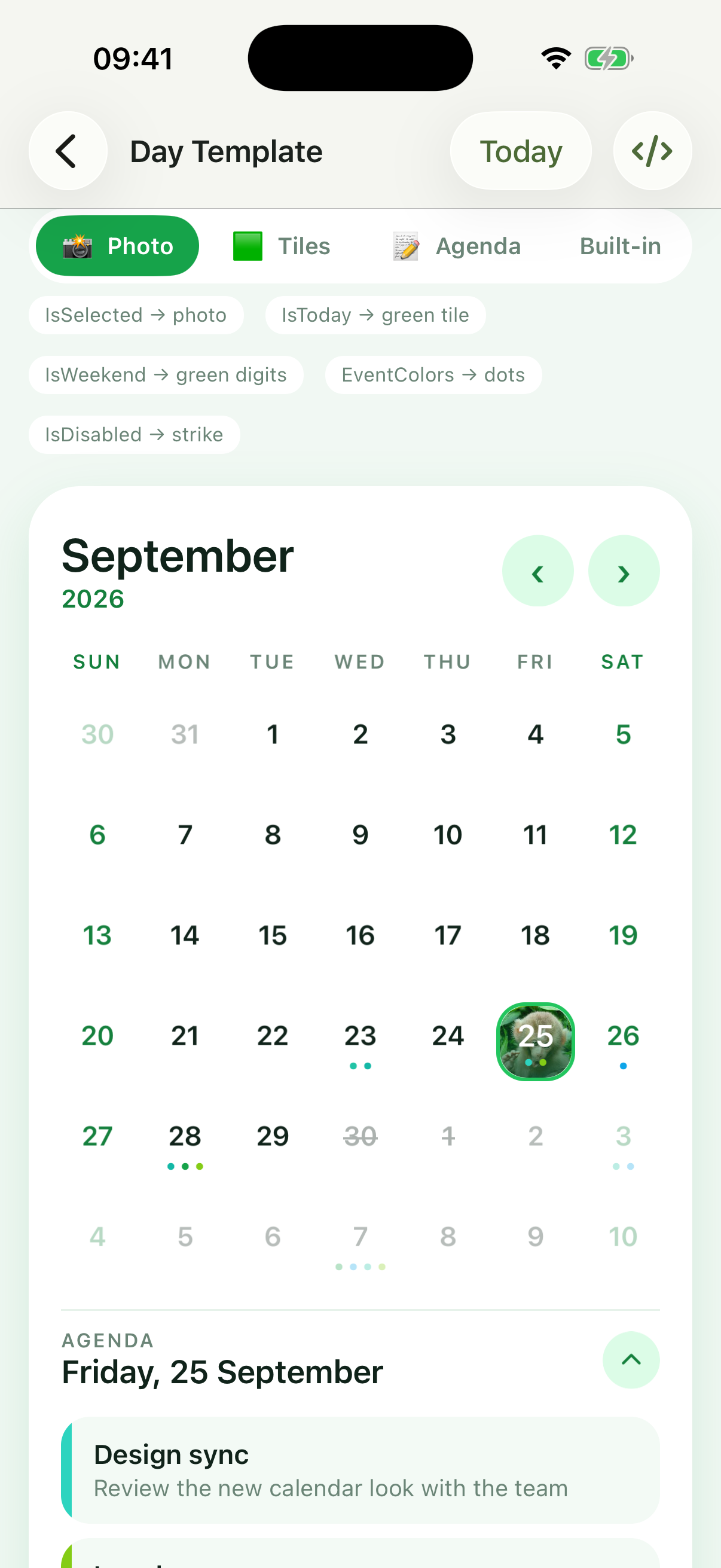
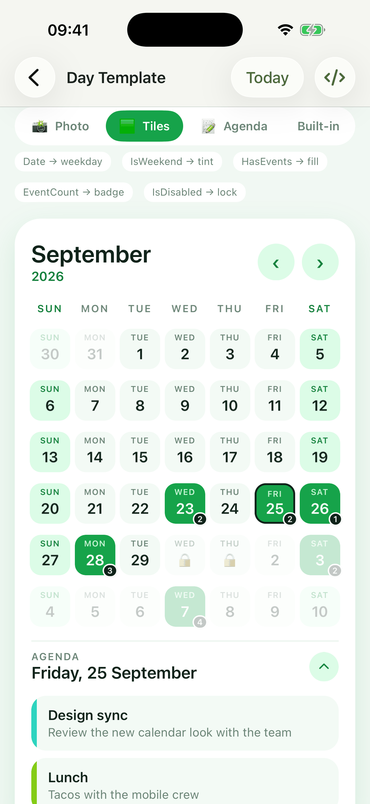
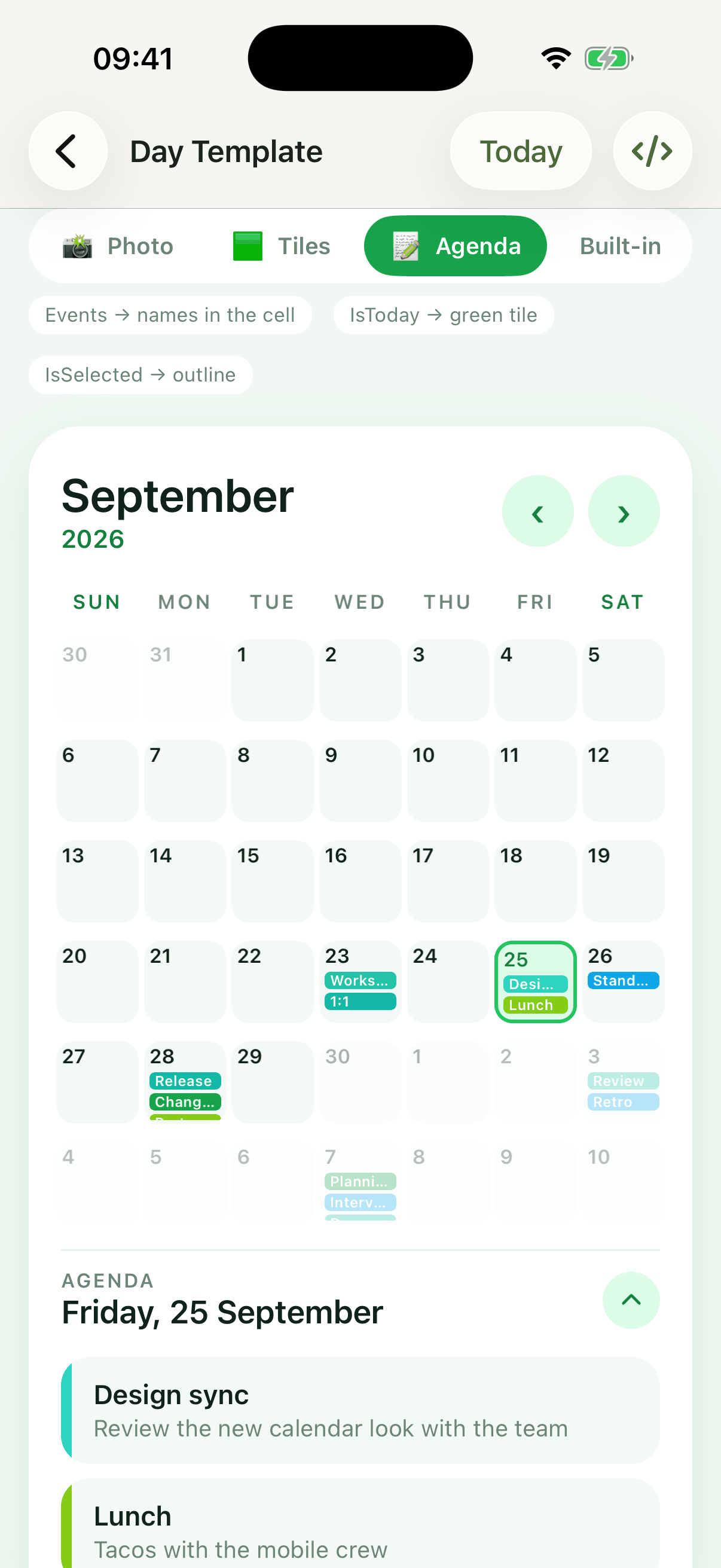
The Day Template page of the sample app switches between three templates at runtime:
| Photo | Tiles | Agenda | Photo, dark theme |
|---|---|---|---|
 |
 |
 |
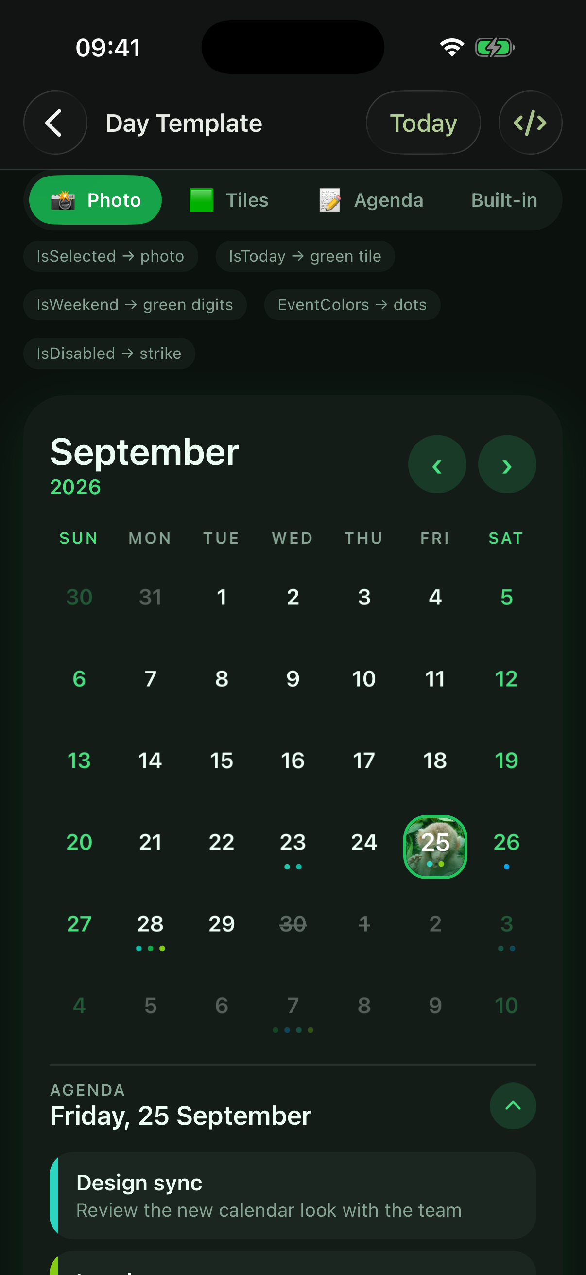 |
The example below is a trimmed version of the "Photo" template from the sample app's DayViewTemplatePage.xaml: the selected day shows a picture, today gets a tinted tile, weekend numbers are green, disabled days are struck out and event days get one dot per event color. monkey.png is an image in the app's Resources/Images folder.
xmlns:plugin="clr-namespace:Plugin.Maui.Calendar.Controls;assembly=Plugin.Maui.Calendar"
xmlns:interfaces="clr-namespace:Plugin.Maui.Calendar.Interfaces;assembly=Plugin.Maui.Calendar"
...
<plugin:Calendar x:Name="calendar" DayViewSize="50">
    <plugin:Calendar.DayViewTemplate>
        <DataTemplate x:DataType="interfaces:ICalendarDay">
            <Border Margin="3" Stroke="Transparent" StrokeShape="RoundRectangle 16" StrokeThickness="0">
                <Border.Triggers>
                    <DataTrigger TargetType="Border" Binding="{Binding IsThisMonth}" Value="False">
                        <Setter Property="Opacity" Value="0.3" />
                    </DataTrigger>
                    <DataTrigger TargetType="Border" Binding="{Binding IsToday}" Value="True">
                        <Setter Property="BackgroundColor" Value="#DCFCE7" />
                    </DataTrigger>
                    <DataTrigger TargetType="Border" Binding="{Binding IsSelected}" Value="True">
                        <Setter Property="Stroke" Value="#22C55E" />
                        <Setter Property="StrokeThickness" Value="2" />
                        <Setter Property="Opacity" Value="1" />
                    </DataTrigger>
                </Border.Triggers>
                <Grid>

                    <Image Aspect="AspectFill" IsVisible="{Binding IsSelected}" Source="monkey.png" />
                    <BoxView IsVisible="{Binding IsSelected}" Color="#80064E2B" />
                    <Grid Padding="0,4,0,6" RowDefinitions="*,Auto">
                        <Label FontAttributes="Bold" HorizontalOptions="Center" Text="{Binding Day}" VerticalOptions="Center">
                            <Label.Triggers>
                                <DataTrigger TargetType="Label" Binding="{Binding IsDisabled}" Value="True">
                                    <Setter Property="TextDecorations" Value="Strikethrough" />
                                </DataTrigger>

                                <DataTrigger TargetType="Label" Binding="{Binding IsWeekend}" Value="True">
                                    <Setter Property="TextColor" Value="#15803D" />
                                </DataTrigger>
                                <DataTrigger TargetType="Label" Binding="{Binding IsSelected}" Value="True">
                                    <Setter Property="TextColor" Value="White" />
                                </DataTrigger>
                            </Label.Triggers>
                        </Label>

                        <HorizontalStackLayout Grid.Row="1" BindableLayout.ItemsSource="{Binding EventColors}"
                                               HeightRequest="5" HorizontalOptions="Center" Spacing="3">
                            <BindableLayout.ItemTemplate>
                                <DataTemplate x:DataType="Color">
                                    <Ellipse Fill="{Binding .}" HeightRequest="5" WidthRequest="5" />
                                </DataTemplate>
                            </BindableLayout.ItemTemplate>
                        </HorizontalStackLayout>
                    </Grid>
                </Grid>
            </Border>
        </DataTemplate>
    </plugin:Calendar.DayViewTemplate>
</plugin:Calendar>
The sample page also has a "Tiles" template (weekday name from Date, weekend tint from IsWeekend, an EventCount badge, a lock on disabled days), an "Agenda" template that writes the day's event names inside the cell (Events), and switches between the templates at runtime.
Showing the day's events inside the cell
Events holds the objects you stored for the day, so a template can write their text right in the cell:
<DataTemplate x:DataType="interfaces:ICalendarDay">
    <VerticalStackLayout Padding="2" Spacing="1">
        <Label FontAttributes="Bold" HorizontalOptions="Center" Text="{Binding Day}" />
        <VerticalStackLayout BindableLayout.ItemsSource="{Binding Events}" Spacing="1">
            <BindableLayout.ItemTemplate>
                <DataTemplate x:DataType="model:EventModel">
                    <Label FontSize="8" LineBreakMode="TailTruncation" MaxLines="1" Text="{Binding Name}" />
                </DataTemplate>
            </BindableLayout.ItemTemplate>
        </VerticalStackLayout>
    </VerticalStackLayout>
</DataTemplate>
ICalendarDay members
| Member | Type | Description |
|---|---|---|
Date |
DateTime |
The date the cell shows |
Day |
string |
The day-of-month text ("1".."31"), formatted with Culture and UseNativeDigits |
IsSelected |
bool |
The day is selected. In a RangeSelectionCalendar this is true for every day of the range, both ends included |
IsToday |
bool |
The day is today. Moves to the new day at midnight while the calendar is shown |
IsWeekend |
bool |
The day is a Saturday or a Sunday. Does not depend on WeekendDayColor or FirstDayOfWeek |
IsThisMonth |
bool |
The day belongs to the shown month. Always true in the Week and TwoWeek layouts |
IsDisabled |
bool |
The day is before MinimumDate, after MaximumDate or in DisabledDates. Disabled days can't be selected |
HasEvents |
bool |
Events has an entry for the day (even an empty one) |
EventCount |
int |
The number of events in the day's Events entry; 0 when there is none. Changes inside that entry's own collection are not observed: assign the entry again (Events[date] = dayEvents) to refresh the count |
Events |
IReadOnlyList<object> |
The day's events: the objects stored in its Events entry, in order, or an empty list. Use it to show event text inside the cell. Like EventCount, assign the entry again to refresh it after changing the entry's own collection |
EventColors |
IReadOnlyList<Color> |
The day's event indicator colors: up to five from an event collection that implements IMultiEventDay and provides colors, otherwise the single indicator color. Empty when the day has no events |
IsRangeStart |
bool |
The day is the first day of the selected range. Only set by RangeSelectionCalendar, false in the other calendars |
IsRangeEnd |
bool |
The day is the last day of the selected range. Only set by RangeSelectionCalendar, false in the other calendars. For a one-day range both IsRangeStart and IsRangeEnd are true |
Day cells are reused: navigating to another month or week gives the same cells new dates. The calendar assigns the members whenever it updates its days, and every member raises PropertyChanged when it changes, so bind to the members (or use triggers) instead of reading them once in code.
Switching templates at runtime
DayViewTemplate can be changed at any time. Only the content of each cell is replaced; the shown month and the selection are kept. Setting it to null restores the built-in cell.
calendar.DayViewTemplate = (DataTemplate)Resources["TileDayTemplate"];

// back to the built-in day cell
calendar.DayViewTemplate = null;
DataTemplateSelector
DayViewTemplate also accepts a DataTemplateSelector. The selector receives the ICalendarDay as item and the day cell as container:
public class EventDayTemplateSelector : DataTemplateSelector
{
    public DataTemplate PlainDayTemplate { get; set; }
    public DataTemplate EventDayTemplate { get; set; }

    protected override DataTemplate OnSelectTemplate(object item, BindableObject container) =>
        ((ICalendarDay)item).HasEvents ? EventDayTemplate : PlainDayTemplate;
}
- The selector is asked when a cell is created and again for every cell each time the calendar updates its days: after navigating, and when the selection, the events, the disabled dates, the minimum or maximum date or today (at midnight) change.
- It always sees the complete, current state of the day, so it can choose by any
ICalendarDaymember. - A cell only replaces its content when the selector returns a different template instance. Return the same instances every time (like the properties above) and keep the selector cheap.
- Returning
nullshows the built-in cell for that day.
Day template notes
- The root of the template must be a
View, such as aGrid,BorderorLabel. Any other root (for example aViewCell) throws anInvalidOperationExceptionwhen the cell is created. - The calendar still sizes every cell to
DayViewSize(the template fills that square), hides the days thatOtherMonthDayIsVisibleandOtherMonthWeekIsVisiblehide, selects a day when its cell is tapped (DayTappedCommand,AllowDeselectingandAutoChangeMonthOnDayTapwork as usual) and drawsWeekendDayBackgroundColorbehind the cells. EventIndicatorColorandEventIndicatorSelectedColorstill provideEventColorsfor days whose events don't set their own colors.- These properties only style the built-in cell and are ignored when a template is set:
DaysLabelStyle,DayViewCornerRadius,DayViewBorderMargin,EventIndicatorType(including theBackgroundFullcell background),SelectedDayBackgroundColor,SelectedDayTextColor,SelectedTodayTextColor,DeselectedDayTextColor,TodayOutlineColor,TodayFillColor,TodayTextColor,WeekendDayColor,OtherMonthDayColor,OtherMonthSelectedDayColor,DisabledDayColor,EventIndicatorTextColor,EventIndicatorSelectedTextColor, andSelectedDatesRangeBackgroundColoronRangeSelectionCalendar. Draw these states in the template from theICalendarDaymembers. - Taps are handled by the cell around the template. A child that handles input itself, such as a
Button, aCheckBoxor a view with its own gesture recognizers, takes the tap and the day is not selected. SetInputTransparent="True"on such a child if tapping it should select the day. - In the
WeekandTwoWeeklayoutsIsThisMonthis alwaystrue, so a template that fades other-month days shows every day normally there. - In a
RangeSelectionCalendar, style the whole range withIsSelectedand its first and last days withIsRangeStartandIsRangeEnd.
Swipe gestures
By default a swipe left or right shows the next or previous month (or week), and a swipe up hides or shows the days.
<plugin:Calendar
    SwipeLeftCommand="{Binding NextCommand}"
    SwipeToChangeMonthEnabled="False"
    SwipeUpToHideEnabled="False" />
SwipeToChangeMonthEnabled="False"andSwipeUpToHideEnabled="False"turn off the default actions.SwipeLeftCommand,SwipeRightCommandandSwipeUpCommandrun on the swipe, together with the default action. TheSwipedLeft,SwipedRight,SwipedUpandSwipedDownevents are raised as well; a swipe down has no default action.SwipeDetectionDisabled="True"adds no swipe recognizers at all, for example when the calendar is inside a view that handles swipes itself. Set it before the calendar is shown.
API reference
All types are in the Plugin.Maui.Calendar assembly:
| Namespace | Types |
|---|---|
Plugin.Maui.Calendar.Controls |
Calendar, MultiSelectionCalendar, RangeSelectionCalendar, WeekSelectionCalendar |
Plugin.Maui.Calendar.Models |
EventCollection, MonthChangedEventArgs, ShownDatesChangedEventArgs |
Plugin.Maui.Calendar.Interfaces |
ICalendarDay, IPersonalizableDayEvent, IMultiEventDay |
Plugin.Maui.Calendar.Enums |
WeekLayout, WeekViewUnit, EventIndicatorType, DaysTitleMaxLength |
Plugin.Maui.Calendar.Styles |
DefaultStyles |
The tables list every bindable property of Calendar, which the other three controls inherit. Colors and styles are in Colors and Styles.
Dates and navigation
| Property | Type | Default | Description |
|---|---|---|---|
ShownDate |
DateTime |
Today | The date whose month (or week) is shown. Two-way |
Day, Month, Year |
int |
Today | The parts of ShownDate. Two-way. Month must be 1 to 12 |
MinimumDate |
DateTime |
DateTime.MinValue |
Earlier days are disabled. Only the date part counts |
MaximumDate |
DateTime |
DateTime.MaxValue |
Later days are disabled. Only the date part counts |
DisabledDates |
List<DateTime> |
Empty | Days that can't be selected. Assign a new list to change it |
VisibleStartDate |
DateTime |
Read-only | The first date on screen |
VisibleEndDate |
DateTime |
Read-only | The last date on screen |
AutoChangeMonthOnDayTap |
bool |
false |
Tapping a day of another month shows that month |
OnShownDateChangedCommand |
ICommand |
null |
Executed with the new ShownDate when it changes |
MonthChangedCommand |
ICommand |
null |
Executed with MonthChangedEventArgs when the user moves to another month or week |
ShownDatesChangedCommand |
ICommand |
null |
Executed with ShownDatesChangedEventArgs when the visible range changes |
Selection
| Property | Type | Default | Description |
|---|---|---|---|
SelectedDate |
DateTime? |
null |
The selected day, or the first one of several. Two-way |
SelectedDates |
ObservableCollection<DateTime> |
Empty | All selected days. Two-way; a new collection after every tap |
AllowDeselecting |
bool |
true |
A tap on a selected day deselects it |
DayTappedCommand |
ICommand |
null |
Executed with the tapped DateTime, before the selection changes |
SelectedStartDate |
DateTime? |
null |
RangeSelectionCalendar: the first day of the range. Two-way |
SelectedEndDate |
DateTime? |
null |
RangeSelectionCalendar: the last day of the range. Two-way |
Events
| Property | Type | Default | Description |
|---|---|---|---|
Events |
EventCollection |
Empty | The events by date |
EventsScrollViewVisible |
bool |
false |
Shows the list of the selected days' events |
EventTemplate |
DataTemplate |
null |
One event of the list; the binding context is your event object |
EmptyTemplate |
DataTemplate |
null |
Shown in the list when there are no events |
SelectedDayEvents |
ICollection |
Set by the calendar | The events of the selected days. Bind with Mode=OneWayToSource |
EventIndicatorType |
EventIndicatorType |
BottomDot |
BottomDot, TopDot, Background or BackgroundFull |
Layout and sections
| Property | Type | Default | Description |
|---|---|---|---|
CalendarLayout |
WeekLayout |
Month |
Month, TwoWeek or Week |
WeekViewUnit |
WeekViewUnit |
MonthName |
The header shows the MonthName or the WeekNumber |
FirstDayOfWeek |
DayOfWeek |
Sunday |
The first column |
OtherMonthDayIsVisible |
bool |
true |
Shows the days of the previous and next month |
OtherMonthWeekIsVisible |
bool |
true |
Shows the rows that only have days of another month |
HeaderSectionVisible |
bool |
true |
Shows the header |
FooterSectionVisible |
bool |
true |
Shows the footer |
CalendarSectionShown |
bool |
true |
Shows the days. Toggled by ShowHideCalendarCommand, the default footer and a swipe up |
ShowMonthPicker |
bool |
true |
Shows the month row of the default header |
ShowYearPicker |
bool |
true |
Shows the year row of the default header |
FooterArrowVisible |
bool |
true |
Shows the arrow of the default footer |
HeaderSectionTemplate |
DataTemplate |
Built-in header | See Header and footer |
FooterSectionTemplate |
DataTemplate |
Built-in footer | See Header and footer |
DayViewTemplate |
DataTemplate |
null |
See Custom day cells |
DayViewSize |
double |
40 |
Width and height of a day cell |
DayViewCornerRadius |
float |
20 |
Corner radius of the selection, today and event backgrounds |
DayViewBorderMargin |
Thickness |
0 |
Inset of those backgrounds in the cell |
WeekendDayBackgroundCornerRadius |
float |
0 |
Corner radius of the weekend column boxes |
Culture and text
| Property | Type | Default | Description |
|---|---|---|---|
Culture |
CultureInfo |
InvariantCulture |
Month and day names, number and date formats. Two-way |
UseNativeDigits |
bool |
false |
Numbers in the culture's own digits |
DaysTitleMaximumLength |
DaysTitleMaxLength |
ThreeChars |
OneChar, TwoChars, ThreeChars or None |
UseAbbreviatedDayNames |
bool |
false |
Weekday titles are the culture's AbbreviatedDayNames; DaysTitleMaximumLength is ignored |
DaysTitleLabelFirstUpperRestLower |
bool |
false |
"Mon" instead of "MON" |
SelectedDateTextFormat |
string |
"d MMM yyyy" |
Format of SelectedDateText |
SelectedDateText |
string |
Set by the calendar | The selected date; for a range or week "start - end", for several days a comma-separated list |
LayoutUnitText |
string |
Set by the calendar | The month name or the week number |
LocalizedYear |
string |
Read-only | The year of ShownDate, formatted with Culture |
Swipes
| Property | Type | Default | Description |
|---|---|---|---|
SwipeToChangeMonthEnabled |
bool |
true |
A swipe left or right shows the next or previous month (or week) |
SwipeUpToHideEnabled |
bool |
true |
A swipe up hides or shows the days |
SwipeLeftCommand, SwipeRightCommand, SwipeUpCommand |
ICommand |
null |
Executed on the swipe |
SwipeDetectionDisabled |
bool |
false |
No swipe recognizers; set it before the calendar is shown |
Commands, events and methods
| Member | Kind | Description |
|---|---|---|
PrevLayoutUnitCommand, NextLayoutUnitCommand |
Command | Show the previous or next month (or week) |
PrevYearCommand, NextYearCommand |
Command | Show the same month a year earlier or later |
ShowHideCalendarCommand |
Command | Toggle CalendarSectionShown |
MonthChanged |
EventHandler<MonthChangedEventArgs> |
The user moved to another month or week (OldMonth, NewMonth) |
ShownDatesChanged |
EventHandler<ShownDatesChangedEventArgs> |
The visible range changed (VisibleStartDate, VisibleEndDate) |
SwipedLeft, SwipedRight, SwipedUp, SwipedDown |
EventHandler |
A swipe over the calendar |
ClearSelection() |
Method | Removes the selection |
Dispose() |
Method | Stops observing Events and the midnight timer. Called for you when the calendar's handler disconnects |
Good to know
- Set
Culture. It defaults toCultureInfo.InvariantCulture, which shows English month and day names. SelectedDatesis replaced after every tap. Bind it two-way and read the property again rather than keeping the previous collection.DisabledDatesis a plainList<DateTime>: assign a new list to change it, and store dates without a time.- Events update when you add, replace or remove a day of the
EventCollection, not when you change the collection stored for a day. Assign the day again (Events[date] = events). MonthChangedandMonthChangedCommandreport the user's navigation only. UseOnShownDateChangedCommandorShownDatesChangedto also see changes made from code.- Weekend means Saturday and Sunday for
WeekendDayColor,WeekendTitleStyle,WeekendDayBackgroundColorandICalendarDay.IsWeekend, whatever the culture. - A swipe up hides the days. Keep a way to show them again (the default footer or
ShowHideCalendarCommand), or setSwipeUpToHideEnabled="False". - Dark mode needs your colors; the defaults are for a light background. See Dark mode and themes.
Sample app
samples/SampleApp shows every feature:
| Group | Samples |
|---|---|
| Basics | Default calendar, events with date limits, custom header, footer and event templates |
| Selection | Multi selection, range selection, week selection |
| Styling | Weekend colors, shaded weekend columns, custom day cells (DayViewTemplate) |
| Week view | One week, two weeks |
| Picker popups | A date picker and two range pickers in a popup |
| Device look-alikes | The Windows 11 calendar flyout |
Every sample page has a </> button that shows the XAML of its calendar, and the Settings tab switches the theme, the language and the first day of the week of all samples. Open Plugin.Maui.Calendar.slnx and run the SampleApp project, or run it from the command line:
dotnet build samples/SampleApp/SampleApp.csproj -t:Run -f net10.0-android
For AI coding assistants
llms-full.txt is a single file with everything an AI coding assistant needs to use this package correctly: the API, the behavior and the common mistakes. It is also included in the NuGet package, next to this readme, so it always matches the version you installed. llms.txt is the short index in the llms.txt format.
To make your assistant use it, add a line like this to your project's AGENTS.md, CLAUDE.md or .github/copilot-instructions.md:
For Plugin.Maui.Calendar, follow https://raw.githubusercontent.com/yurkinh/Plugin.Maui.Calendar/main/llms-full.txt
Changelog, contributing and license
- CHANGELOG.md lists the changes of every version, including the breaking changes of 2.0.
- Bugs and ideas are welcome in the issues, and pull requests too.
- A video walkthrough is on YouTube.
- Licensed under the MIT License.
| Product | Versions Compatible and additional computed target framework versions. |
|---|---|
| .NET | net10.0 is compatible. net10.0-android was computed. net10.0-android36.0 is compatible. net10.0-browser was computed. net10.0-ios was computed. net10.0-ios26.0 is compatible. net10.0-maccatalyst was computed. net10.0-maccatalyst26.0 is compatible. net10.0-macos was computed. net10.0-tvos was computed. net10.0-windows was computed. net10.0-windows10.0.19041 is compatible. |
-
net10.0
- CommunityToolkit.Mvvm (>= 8.4.2)
- Microsoft.Maui.Controls (>= 10.0.110)
-
net10.0-android36.0
- CommunityToolkit.Mvvm (>= 8.4.2)
- Microsoft.Maui.Controls (>= 10.0.110)
-
net10.0-ios26.0
- CommunityToolkit.Mvvm (>= 8.4.2)
- Microsoft.Maui.Controls (>= 10.0.110)
-
net10.0-maccatalyst26.0
- CommunityToolkit.Mvvm (>= 8.4.2)
- Microsoft.Maui.Controls (>= 10.0.110)
-
net10.0-windows10.0.19041
- CommunityToolkit.Mvvm (>= 8.4.2)
- Microsoft.Maui.Controls (>= 10.0.110)
NuGet packages
This package is not used by any NuGet packages.
GitHub repositories
This package is not used by any popular GitHub repositories.
| Version | Downloads | Last Updated |
|---|---|---|
| 3.1.0 | 75 | 9/28/2026 |
| 3.0.3 | 2,712 | 6/25/2026 |
| 3.0.2 | 2,159 | 5/8/2026 |
| 3.0.1 | 6,963 | 1/26/2026 |
| 3.0.0 | 1,989 | 1/2/2026 |
| 2.0.12 | 6,663 | 12/1/2025 |
| 2.0.11 | 3,243 | 10/28/2025 |
| 2.0.10 | 4,579 | 9/16/2025 |
| 2.0.9 | 3,835 | 8/22/2025 |
| 2.0.8 | 761 | 8/6/2025 |
| 2.0.7 | 5,815 | 6/25/2025 |
| 2.0.6 | 977 | 5/30/2025 |
| 2.0.5 | 3,167 | 5/8/2025 |
| 2.0.3 | 1,754 | 4/15/2025 |
| 2.0.2 | 459 | 4/14/2025 |
| 2.0.1 | 424 | 4/11/2025 |
| 2.0.0 | 2,157 | 4/4/2025 |
| 1.2.6 | 9,807 | 1/28/2025 |
| 1.2.5 | 3,786 | 1/14/2025 |
| 1.2.4 | 2,363 | 12/17/2024 |
* Added DayViewTemplate: draw every day cell with your own DataTemplate or DataTemplateSelector (null restores the built-in cell; the template can be switched at runtime)
* Added the public ICalendarDay interface, the binding context of DayViewTemplate: Date, Day, IsSelected, IsToday, IsWeekend, IsThisMonth, IsDisabled, HasEvents, EventCount, Events, EventColors, IsRangeStart, IsRangeEnd
* Added Day Template sample page
* Fix: the today highlight now moves to the new day at midnight while the calendar is shown, and is re-checked when the app resumes
* Fix: adding, replacing or removing entries of the EventCollection at runtime now refreshes the day cells (event dots and colors) right away, also after the calendar's page was shown again
* Fix: changing DisabledDates, MinimumDate, MaximumDate, OtherMonthDayIsVisible or OtherMonthWeekIsVisible at runtime (or through a binding) now updates the visible days
* Fix: EventIndicatorType TopDot now draws the event dots above the day number (they were always drawn below it)
* Fix: EventIndicatorType BackgroundFull no longer paints hidden other-month days and follows a runtime change of EventIndicatorType
* Fix: with two calendars on screen, tapping a day in one no longer selects that date in the other
* Fix: calendars no longer share one default Events collection and one default DisabledDates list
* Fix: a day whose event collection implements IMultiEventDay without providing Colors shows its event dot again (in the indicator color)
* Fix: RangeSelectionCalendar keeps SelectedDatesRangeBackgroundColor on the range after a color, theme or layout change, and applies a new SelectedDatesRangeBackgroundColor right away
* Fix: RangeSelectionCalendar no longer ignores SelectedStartDate/SelectedEndDate set from code after the range was extended at its start
* Fix: HeaderSectionTemplate/FooterSectionTemplate are no longer modified when their content is created (the template kept a reference to the Calendar), and a BindingContext set on the template root is now kept