PinCodes.Authorization.Maui
1.0.1
The new version offers you more options to customize the code page
See the version list below for details.
dotnet add package PinCodes.Authorization.Maui --version 1.0.1
NuGet\Install-Package PinCodes.Authorization.Maui -Version 1.0.1
<PackageReference Include="PinCodes.Authorization.Maui" Version="1.0.1" />
paket add PinCodes.Authorization.Maui --version 1.0.1
#r "nuget: PinCodes.Authorization.Maui, 1.0.1"
// Install PinCodes.Authorization.Maui as a Cake Addin #addin nuget:?package=PinCodes.Authorization.Maui&version=1.0.1 // Install PinCodes.Authorization.Maui as a Cake Tool #tool nuget:?package=PinCodes.Authorization.Maui&version=1.0.1
Creating a Customizable Pin Code Page in .NET MAUI
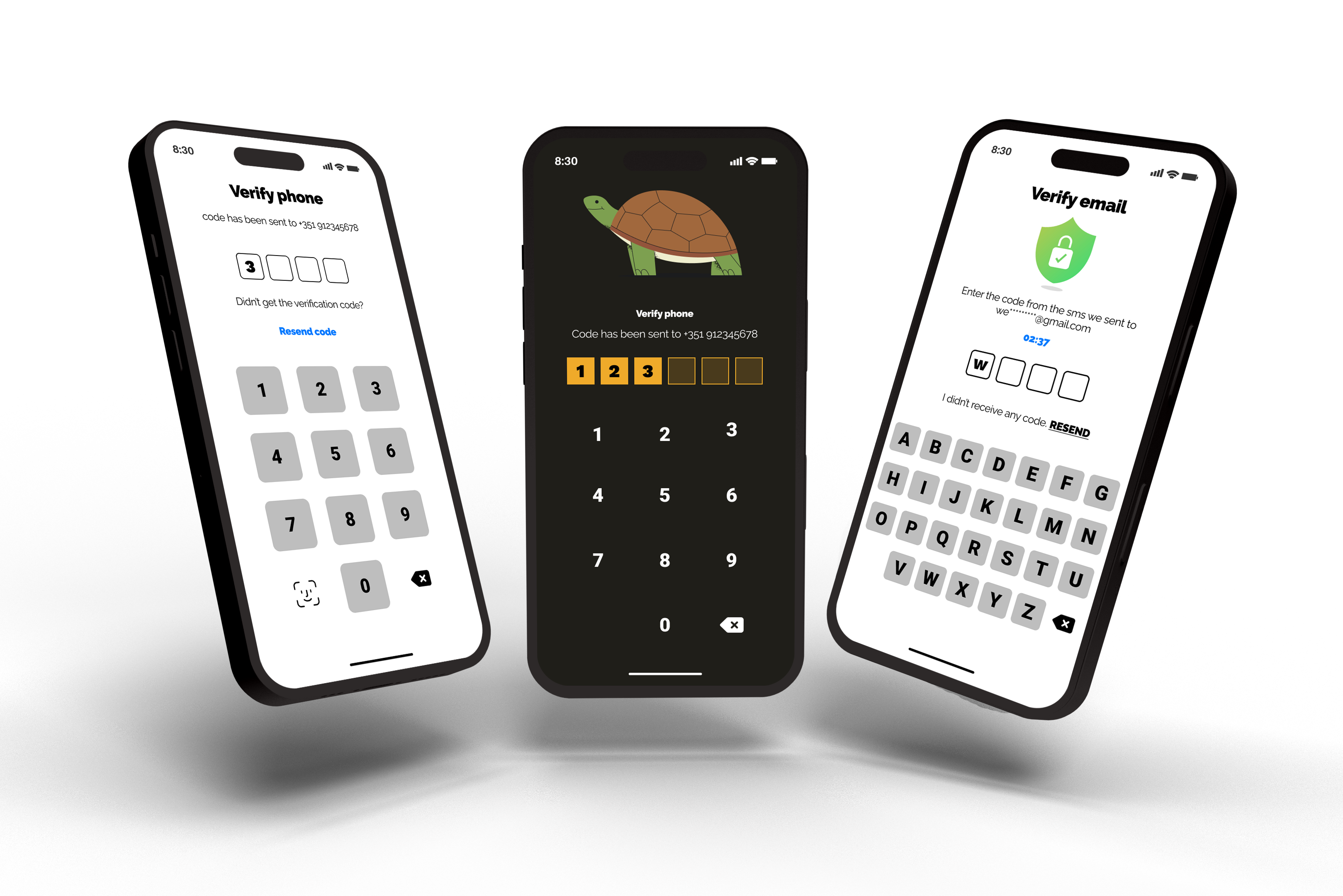
This library provides developers with an easy way to add a customizable PIN Code page to their .NET MAUI applications. With just a few lines of code, you can create a secure page that requires a PIN Code to access.

Compatibility
| Platform | Version | Availability |
|---|---|---|
| iOS | 14.0 and higher | ✅ |
| Android | 5.0 and higher | ✅ |
| Windows | 10.0.17763.0 and higher | ✅ |
| macOS | 10.15 and higher | ✅ |
Features
- Keyboards: offers a variety of keyboard options to choose from.
- Code viewer: includes several different options for customization.
- Headline: you have the flexibility to fully customize the headline phrases.
- Color customization: giving you complete control over the look and feel of your keyboard and code viewer.
- Customize the length of your code: adjust the amount of digits (default is 4).
- and others.
Getting Started
Installation
To use this package, simply install the NuGet package PinCodes.Authorization.Maui in your .NET MAUI project. In Visual Studio, you can do this by right-clicking on your project and selecting "Manage NuGet Packages". From there, search for "PinCodes.Authorization.Maui" and install the latest version.
dotnet add package PinCodes.Authorization.Maui
Once the package is installed, you can add a PIN Code Page to your application.
Usage
Create a new ContentPage in your .NET MAUI project and add a reference to the CodePage namespace in your file:
xmlns:codePage="clr-namespace:MauiCodes.Views.Pages;assembly=PinCodes.Authorization.Maui"
Now, instead of having a ContentPage in your XAML file, you need to change it to:
<?xml version="1.0" encoding="utf-8" ?>
<codePage:CodePage
    xmlns="http://schemas.microsoft.com/dotnet/2021/maui"
    xmlns:x="http://schemas.microsoft.com/winfx/2009/xaml"
    xmlns:codePage="clr-namespace:MauiCodes.Views.Pages;assembly=PinCodes.Authorization.Maui"
    x:Class="MAUI.App.Views.MyPinCodePage">

</codePage:CodePage>
And the code-behind to:
public partial class MyPinCodePage : MauiCodes.Views.Pages.CodePage
{
   public MyPinCodePage()
   {
      InitializeComponent();
   }
}
Command callback
REMEMBER, be sure to provide a command callback. It will be automatically triggered once the user has provided the entire code. So your XAML file will look like:
<codePage:CodePage
    xmlns="http://schemas.microsoft.com/dotnet/2021/maui"
    xmlns:x="http://schemas.microsoft.com/winfx/2009/xaml"
    xmlns:codePage="clr-namespace:MauiCodes.Views.Pages;assembly=PinCodes.Authorization.Maui"
    x:Class="MAUI.App.Views.MyPinCodePage"
    CallbackCodeFinished="{Binding UserEndTheCodeCommand}">

</codePage:CodePage>
And your ViewModel will look like:
[RelayCommand]
public void UserEndTheCode(string code)
{
    //do something with the code response
}
The equivalent C# code is:
var pinCodePage = new CodePage();

pinCodePage.CallbackCodeFinished = new Command((code) =>
{
    //do something with the code response
});

await Navigation.PushAsync(pinCodePage);
Customizing the Appearance
This package provides several ways to customize the appearance of the PIN Code Page to fit the look and feel of your application. You can customize the colors and the page's elements.
Headline & Image
You have the option to customize the headline, subheadline, and image on your page. However, I understand that not all developers may want to include these properties. That's why these properties can be null or empty. Of course, I encourage you to experiment with different combinations of these properties to create a truly unique and engaging experience for your users.
<?xml version="1.0" encoding="utf-8" ?>
<codePage:CodePage
    xmlns="http://schemas.microsoft.com/dotnet/2021/maui"
    xmlns:x="http://schemas.microsoft.com/winfx/2009/xaml"
    xmlns:codePage="clr-namespace:MauiCodes.Views.Pages;assembly=PinCodes.Authorization.Maui"
    x:Class="MAUI.App.Views.MyPinCodePage"
    CallbackCodeFinished="{Binding UserEndTheCodeCommand}"
    Headline="YOUR HEADLINE HERE"
    SubHeadline="YOUR SUBHEADLINE HERE">

    <codePage:CodePage.Illustration>
        <Image Source="illustration_dog.png" HeightRequest="80"/>
    </codePage:CodePage.Illustration>

</codePage:CodePage>
The equivalent C# code is:
var pinCodePage = new CodePage();

pinCodePage.Headline = "YOUR HEADLINE HERE";

pinCodePage.SubHeadline = "YOUR SUBHEADLINE HERE";

pinCodePage.Illustration = new Image { Source = ImageSource.FromFile(path), HeightRequest = 80 };
Code Viewer

You can choose to hide or show the PIN Code, as well as select from a variety of shapes, including circles or squares. It is important for you to make a decision to hide or show the code in order to add the correct namespace on XAML.
If you want to hide it, add:
xmlns:codeViewer="clr-namespace:MauiCodes.Views.Components.CodeViewers.Hide;assembly=PinCodes.Authorization.Maui"
but if you want to show the PIN Code, use:
xmlns:codeViewer="clr-namespace:MauiCodes.Views.Components.CodeViewers.Show;assembly=PinCodes.Authorization.Maui"
Whether you prefer a minimalist or more elaborate design, my library has you covered.
Here's an example showing the PIN Code with a circle shape:
<?xml version="1.0" encoding="utf-8" ?>
<codePage:CodePage
    xmlns="http://schemas.microsoft.com/dotnet/2021/maui"
    xmlns:x="http://schemas.microsoft.com/winfx/2009/xaml"
    xmlns:codePage="clr-namespace:MauiCodes.Views.Pages;assembly=PinCodes.Authorization.Maui"
    xmlns:codeViewer="clr-namespace:MauiCodes.Views.Components.CodeViewers.Show;assembly=PinCodes.Authorization.Maui"
    x:Class="MAUI.App.Views.MyPinCodePage"
    CallbackCodeFinished="{Binding UserEndTheCodeCommand}">

    <codePage:CodePage.CodeViewer>
        <codeViewer:CircleShowingCodeViewer />
    </codePage:CodePage.CodeViewer>


</codePage:CodePage>
The equivalent C# code is:
var pinCodePage = new CodePage();

pinCodePage.CodeViewer = new CircleHidingCodeViewer();
Customizable properties
- CodeLength: allows you to set the desired length (amount of digits) of your PIN Code.
- Color: allows you to set the color of the PIN Code shape.
- Size: allows you to set the size of the PIN Code shape.
If you choose to show the PIN Code, you can use the following properties too:
- FontSize: allows you to set the font size for the numbers.
- TextColor: allows you to set the text color for the numbers.
- FontFamily: allows you to set the font family for the numbers.
<codePage:CodePage.CodeViewer>
    <codeViewer:CircleShowingCodeViewer
        Size="40"
        TextColor="{AppThemeBinding Light=White, Dark=Black}"
        Color="{AppThemeBinding Light=Black,Dark=White}"
        FontSize="25"
        FontFamily="RalewayBlack"
        CodeLength="6"
        Margin="0,0,0,40"/>
</codePage:CodePage.CodeViewer>
Keyboard

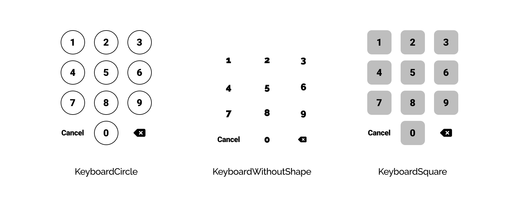
You can select from a keyboard a circle shape, a keyboard without shape, or a square shape, depending on the look and feel you want to achieve. Don't forget to add the namespace on your XAML file:
xmlns:keyboard="clr-namespace:MauiCodes.Views.Components.Keyboards;assembly=PinCodes.Authorization.Maui"
Here's an example:
<?xml version="1.0" encoding="utf-8" ?>
<codePage:CodePage
    xmlns="http://schemas.microsoft.com/dotnet/2021/maui"
    xmlns:x="http://schemas.microsoft.com/winfx/2009/xaml"
    xmlns:codePage="clr-namespace:MauiCodes.Views.Pages;assembly=PinCodes.Authorization.Maui"
    xmlns:keyboard="clr-namespace:MauiCodes.Views.Components.Keyboards;assembly=PinCodes.Authorization.Maui"
    x:Class="MAUI.App.Views.MyPinCodePage"
    CallbackCodeFinished="{Binding UserEndTheCodeCommand}">

    <codePage:CodePage.KeyboardViewer>
        <keyboard:KeyboardSquare />
    </codePage:CodePage.KeyboardViewer>

</codePage:CodePage>
The equivalent C# code is:
var pinCodePage = new CodePage();

pinCodePage.KeyboardViewer = new KeyboardSquare();
Customizable properties
- Size: allows you to set the size of the PIN Code shape.
- FontSize: allows you to set the font size for the numbers.
- CancelTextFontSize: allows you to set the font size for the text "Cancel".
- TextColor: allows you to set the text color for the numbers.
- CancelTextColor: allows you to set the text color for the text "Cancel".
- CancelText: allows you to set the string to show if the user wants to cancel the operation. This is useful for translation, for example.
- BackspaceColor: allows you to set the color of backspace button.
If you choose the keyboard with a shape (circle or square), you can use the following property too:
- ShapeColor: allows you to set the color for the shape.
<codePage:CodePage.KeyboardViewer>
    <keyboard:KeyboardCircle
        ShapeColor="{AppThemeBinding Light=Black, Dark=White}"
        CancelTextColor="{AppThemeBinding Light=Black, Dark=White}"
        FontSize="25"
        Size="70"
        CancelTextFontSize="18"
        CancelText="CANCEL"
        TextColor="{AppThemeBinding Light=Black, Dark=White}"/>
</codePage:CodePage.CodeViewer>
Full code
<?xml version="1.0" encoding="utf-8" ?>
<codePage:CodePage
    xmlns="http://schemas.microsoft.com/dotnet/2021/maui"
    xmlns:x="http://schemas.microsoft.com/winfx/2009/xaml"
    xmlns:codePage="clr-namespace:MauiCodes.Views.Pages;assembly=PinCodes.Authorization.Maui"
    xmlns:codeViewer="clr-namespace:MauiCodes.Views.Components.CodeViewers.Show;assembly=PinCodes.Authorization.Maui"
    xmlns:keyboard="clr-namespace:MauiCodes.Views.Components.Keyboards;assembly=PinCodes.Authorization.Maui"
    x:Class="MAUI.App.Views.MyPinCodePage"
    CallbackCodeFinished="{Binding UserEndTheCodeCommand}"
    Headline="YOUR HEADLINE HERE"
    SubHeadline="YOUR SUBHEADLINE HERE">

    <codePage:CodePage.Illustration>
        <Image Source="illustration_dog.png" HeightRequest="80"/>
    </codePage:CodePage.Illustration>

    <codePage:CodePage.CodeViewer>
        <codeViewer:CircleShowingCodeViewer
            Size="40"
            TextColor="{AppThemeBinding Light=White, Dark=Black}"
            Color="{AppThemeBinding Light=Black,Dark=White}"
            FontSize="25"
            FontFamily="RalewayBlack"
            CodeLength="6"
            Margin="0,0,0,40"/>
    </codePage:CodePage.CodeViewer>

  <codePage:CodePage.KeyboardViewer>
      <keyboard:KeyboardCircle
          ShapeColor="{AppThemeBinding Light=Black, Dark=White}"
          CancelTextColor="{AppThemeBinding Light=Black, Dark=White}"
          FontSize="25"
          Size="70"
          CancelTextFontSize="18"
          CancelText="CANCEL"
          TextColor="{AppThemeBinding Light=Black, Dark=White}"/>
  </codePage:CodePage.CodeViewer>

</codePage:CodePage>
License
MauiCodes is released under the MIT License. See LICENSE.txt for details.
| Product | Versions Compatible and additional computed target framework versions. |
|---|---|
| .NET | net7.0 is compatible. net7.0-android was computed. net7.0-android33.0 is compatible. net7.0-ios was computed. net7.0-ios16.1 is compatible. net7.0-maccatalyst was computed. net7.0-maccatalyst16.1 is compatible. net7.0-macos was computed. net7.0-tvos was computed. net7.0-windows was computed. net7.0-windows10.0.19041 is compatible. net8.0 was computed. net8.0-android was computed. net8.0-browser was computed. net8.0-ios was computed. net8.0-maccatalyst was computed. net8.0-macos was computed. net8.0-tvos was computed. net8.0-windows was computed. net9.0 was computed. net9.0-android was computed. net9.0-browser was computed. net9.0-ios was computed. net9.0-maccatalyst was computed. net9.0-macos was computed. net9.0-tvos was computed. net9.0-windows was computed. |
-
net7.0
- No dependencies.
-
net7.0-android33.0
- No dependencies.
-
net7.0-ios16.1
- No dependencies.
-
net7.0-maccatalyst16.1
- No dependencies.
-
net7.0-windows10.0.19041
- No dependencies.
NuGet packages
This package is not used by any NuGet packages.
GitHub repositories
This package is not used by any popular GitHub repositories.