Neptus.Maui.PinEntry
2.1.1-preview
dotnet add package Neptus.Maui.PinEntry --version 2.1.1-preview
NuGet\Install-Package Neptus.Maui.PinEntry -Version 2.1.1-preview
<PackageReference Include="Neptus.Maui.PinEntry" Version="2.1.1-preview" />
<PackageVersion Include="Neptus.Maui.PinEntry" Version="2.1.1-preview" />
<PackageReference Include="Neptus.Maui.PinEntry" />
paket add Neptus.Maui.PinEntry --version 2.1.1-preview
#r "nuget: Neptus.Maui.PinEntry, 2.1.1-preview"
#:package Neptus.Maui.PinEntry@2.1.1-preview
#addin nuget:?package=Neptus.Maui.PinEntry&version=2.1.1-preview&prerelease
#tool nuget:?package=Neptus.Maui.PinEntry&version=2.1.1-preview&prerelease
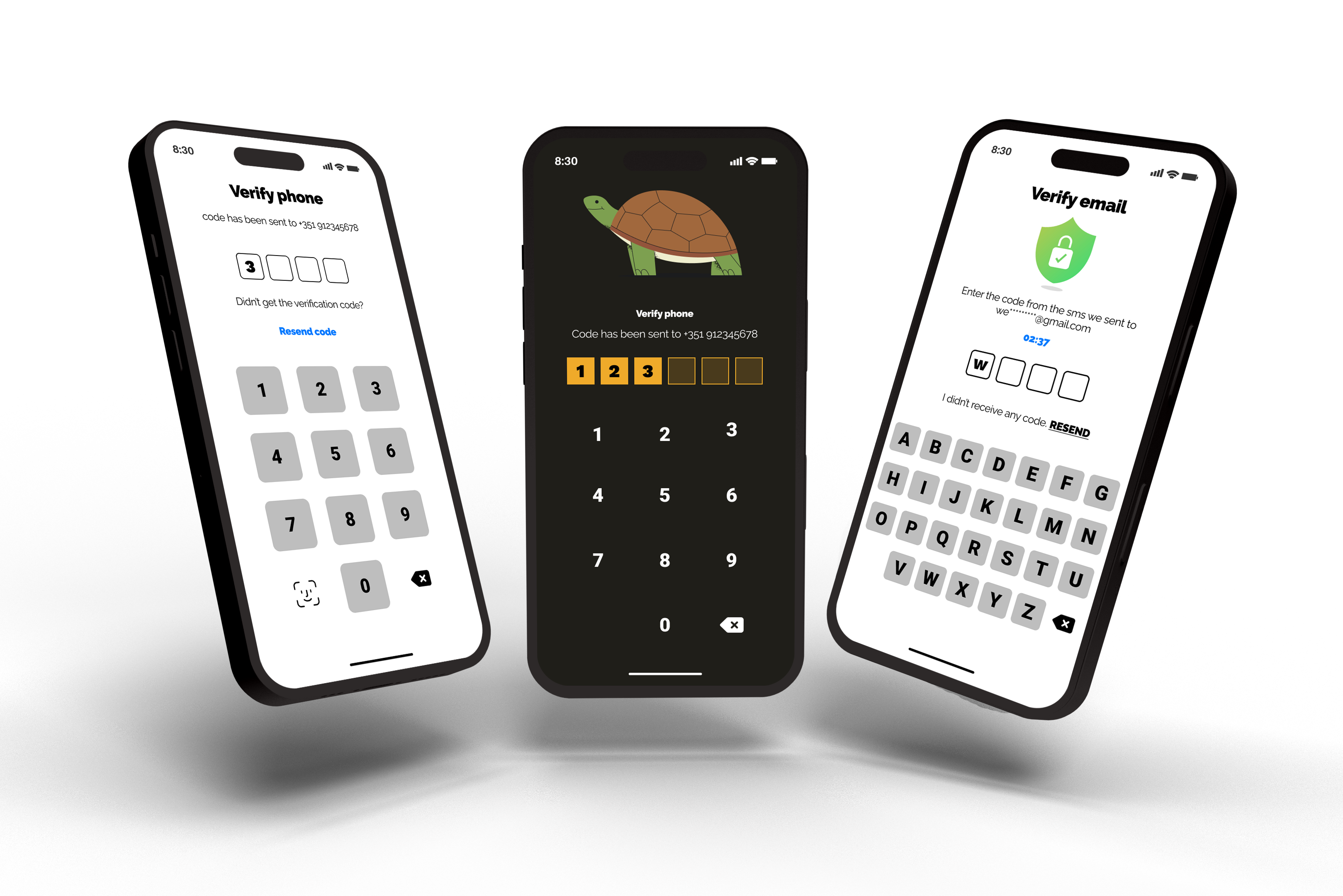
Creating a Customizable Pin Code Page in .NET MAUI
This library provides developers with an easy way to add a customizable PIN Code page to their .NET MAUI applications. With just a few lines of code, you can create a secure page that requires a PIN Code to access.
Compatibility
| Platform | Version | Availability |
|---|---|---|
| iOS | 14.0 and higher | ✅ |
| Android | 5.0 and higher | ✅ |
| Windows | 10.0.17763.0 and higher | ✅ |
| macOS | 10.15 and higher | ✅ |
Features
- Keyboards: customize buttons by defining their appearance, including shape, color, size, and other properties.
- Code viewer: fully customizable, allowing developers to define a Shape (e.g., ellipse, rectangle) and other properties for a tailored viewing experience.
- Headers: complete flexibility, allowing developers incorporate images, labels, and various other elements to suit their needs.
- Customize the length of your code: adjust the amount of digits (default is 4).
- and others.
Getting Started
Installation
To use this package, simply install the NuGet package PinCodes.Authorization.Maui in your .NET MAUI project. In Visual Studio, you can do this by right-clicking on your project and selecting "Manage NuGet Packages". From there, search for "PinCodes.Authorization.Maui" and install the latest version.
dotnet add package PinCodes.Authorization.Maui
Once the package is installed, you can add a PIN Code Page to your application.
Usage
Create a new ContentPage in your .NET MAUI project and add a reference to the CodePage namespace in your file:
xmlns:pinCodeAuthorization="clr-namespace:PinCodes.Authorization.Views.Pages;assembly=PinCodes.Authorization.Maui"
Now, instead of having a ContentPage in your XAML file, you need to change it to:
<?xml version="1.0" encoding="utf-8" ?>
<pinCodeAuthorization:CodePage
    xmlns="http://schemas.microsoft.com/dotnet/2021/maui"
    xmlns:x="http://schemas.microsoft.com/winfx/2009/xaml"
    xmlns:pinCodeAuthorization="clr-namespace:PinCodes.Authorization.Views.Pages;assembly=PinCodes.Authorization.Maui"
    x:Class="MAUI.App.Views.MyPinCodePage">

</pinCodeAuthorization:CodePage>
And the code-behind to:
public partial class MyPinCodePage : PinCodes.Authorization.Views.Pages.CodePage
{
   public MyPinCodePage()
   {
      InitializeComponent();
   }
}
Command Callback
REMEMBER, be sure to provide a command callback. It will be automatically triggered once the user has provided the entire code. So your XAML file will look like:
<pinCodeAuthorization:CodePage
    xmlns="http://schemas.microsoft.com/dotnet/2021/maui"
    xmlns:x="http://schemas.microsoft.com/winfx/2009/xaml"
    xmlns:viewModel="clr-namespace:Packages.MAUI.App.ViewModels.PinCodes"
    x:DataType="viewModel:PinCodeViewModel"
    CallbackCodeFinished="{Binding UserCompletedCodeCommand}">


</pinCodeAuthorization:CodePage>
And your ViewModel will look like:
public partial class PinCodeViewModel : ObservableObject
{
    [RelayCommand]
    public void UserCompletedCode(string code)
    {
        //do something with the code response
    }
}
Customizing the Appearance
This package provides several ways to customize the appearance of the PIN Code Page to fit the look and feel of your application. You can customize the colors and the page's elements.
Header
Above the PinCode Viewer
You can customize the header on your page by passing it as a StackLayout (e.g., VerticalStackLayout, HorizontalStackLayout), giving you the flexibility to tailor its appearance and functionality to your needs. This allows you to include images, labels, commands, and other UI elements, providing complete control over the header's content and layout. To set up your header, use the Header property within CodePage.
<pinCodeAuthorization:CodePage.Header>
    <VerticalStackLayout Margin="0,20,0,40" Spacing="5">
        <Label
            FontAttributes="Bold"
            FontSize="36"
            HorizontalOptions="Center"
            HorizontalTextAlignment="Center"
            Text="Verify Phone"
            TextColor="{AppThemeBinding Light=Black,
                                        Dark=White}" />

        <Label
            FontAttributes="Italic"
            FontSize="14"
            HorizontalOptions="Center"
            Text="code has been sent to +351 912345678"
            TextColor="{AppThemeBinding Light=Black,
                                        Dark=White}" />
    </VerticalStackLayout>
</pinCodeAuthorization:CodePage.Header>
SubHeader
Below the PinCode Viewer
You have the option to add a subheader to display more information beneath the code viewer component. Utilize the StackLayout (such as VerticalStackLayout or HorizontalStackLayout) to customize the subheader's look and functionality according to your requirements. This feature allows you to incorporate images, labels, commands, and various UI elements, providing comprehensive control over the subheader's content and structure. To add a subheader, simply assign your customized layout to the SubHeader property within CodePage.
<pinCodeAuthorization:CodePage.SubHeader>
    <VerticalStackLayout Margin="0,30,0,20" HorizontalOptions="Center">
        <Label
            Margin="0,0,0,20"
            FontSize="16"
            Text="Didn’t get the verification code?" />

        <VerticalStackLayout
            Padding="0,5,0,5"
            HeightRequest="40"
            HorizontalOptions="Center">
            <VerticalStackLayout.GestureRecognizers>
                <TapGestureRecognizer Command="{Binding ResendCodeCommand}" />
            </VerticalStackLayout.GestureRecognizers>
            <Label
                FontAttributes="Bold"
                FontSize="20"
                HorizontalOptions="Center"
                Text="Resend code"
                TextColor="{AppThemeBinding Light=#007AFF,
                                            Dark=#19B5FE}" />
        </VerticalStackLayout>
    </VerticalStackLayout>
</pinCodeAuthorization:CodePage.SubHeader>
Code Viewer
The first step is to reference the CodeViewer component namespace in your XAML file:
xmlns:codeViewer="clr-namespace:PinCodes.Authorization.Views.Components.CodeViewers;assembly=PinCodes.Authorization.Maui"
Now it's time to use the CodeViewer property. It's important to decide whether you want to hide or show the code, as this will determine which component to use in the XAML.
If you want to hide it, add:
<pinCodeAuthorization:CodePage.CodeViewer>
    <codeViewer:HideCodeViewer>

    </codeViewer:HideCodeViewer>
</pinCodeAuthorization:CodePage.CodeViewer>
but if you want to show the PIN Code, use:
<pinCodeAuthorization:CodePage.CodeViewer>
    <codeViewer:ShowCodeViewer>

    </codeViewer:ShowCodeViewer>
</pinCodeAuthorization:CodePage.CodeViewer>
Let's discuss the customization of the CodeViewer. Whether you choose to hide or show the code, the following properties are the same for both options:
| Option | Type | Purpose |
|---|---|---|
| CodeLength | ushort | Specifies the size of the code (default is 4). |
| Spacing | ushort | Defines the spacing between elements that represent each character of the code. |
| ShapeViewer | Shape | An abstract class that enables you to draw a shape on the screen. You can pass a concrete type like Ellipse, Rectangle, etc. |
| CodeColor | Color | Specifies the color to fill the shape when there is a code character for the component. By default, the color specified for the shape will be used when the element representing the code character is empty. |
| CodeStrokeColor | Color | Specifies the color for the shape stroke when there is a code character for the component. By default, the color stroke specified for the shape will be used when the element representing the code character is empty. |
If you choose to show the code as the user types, you need to use the PinCharacterLabel property. This is a label that you must pass to the library to specify how you want to display the number. Feel free to use all properties available on the label, such as FontSize, FontColor, etc.
Below is an example demonstrating how easy it is to define the properties:
<pinCodeAuthorization:CodePage.CodeViewer>
    <codeViewer:ShowCodeViewer CodeColor="{AppThemeBinding Light=White, Dark={StaticResource DarkModeColor}}" CodeStrokeColor="{AppThemeBinding Light=Black, Dark=White}">
        <codeViewer:ShowCodeViewer.ShapeViewer>
            <RoundRectangle
                CornerRadius="10"
                Fill="{AppThemeBinding Light=White,
                                       Dark={StaticResource DarkModeColor}}"
                HeightRequest="50"
                Stroke="{AppThemeBinding Light=Black,
                                         Dark=White}"
                StrokeThickness="5"
                WidthRequest="50" />
        </codeViewer:ShowCodeViewer.ShapeViewer>

        <codeViewer:ShowCodeViewer.PinCharacterLabel>
            <Label
                FontAttributes="Bold"
                FontSize="16"
                HorizontalOptions="Center"
                TextColor="{AppThemeBinding Light=Black,
                                            Dark=White}"
                VerticalOptions="Center" />
        </codeViewer:ShowCodeViewer.PinCharacterLabel>
    </codeViewer:ShowCodeViewer>
</pinCodeAuthorization:CodePage.CodeViewer>
Masked Code Viewer
The MaskedCodeViewer follows the same setup as the ShowCodeViewer with one property and two optional attributes:
<pinCodeAuthorization:CodePage.CodeViewer>
    <codeViewer:MaskedCodeViewer CodeColor="{AppThemeBinding Light=White, Dark={StaticResource DarkModeColor}}" CodeStrokeColor="{AppThemeBinding Light=Black, Dark=White}" MaskTimeout="250" MaskAppearanceSpeed="100">


        <codeViewer:MaskedCodeViewer.MaskShape>
            <Ellipse
                WidthRequest="20"
                HeightRequest="20"
                Fill="Black"
                Stroke="Black"
                StrokeThickness="1"
                HorizontalOptions="Center"
                VerticalOptions="Center"/>
        </codeViewer:MaskedCodeViewer.MaskShape>

    </codeViewer:MaskedCodeViewer>
</pinCodeAuthorization:CodePage.CodeViewer>
The mask shape will appear after 250 milliseconds and will translate from the bottom to the center of the entry using the Easing.CubicIn easing function. This can be customized by changing the MaskTimeout and MaskAppearanceSpeed properties:
| Option | Type | Purpose |
|---|---|---|
| MaskTimeout | int | Specifies the time to wait before the new pin digit entered by the user is automatically masked. If the provided MaskTimout is less than 250 the timeout is disabled and the digits will not be hidden until the user enters the next digit. |
| MaskAppearanceSpeed | int | Defines the speed of appearence of the mask shape (translates from bottom to to center using TranslateTo with Easing.CubicIn). If the provided MaskAppearanceSpeed is less than 100, the animation is disabled. |
Keyboard
You must use the Keyboard property available on the CodePage to select the appearance of the keyboard buttons, depending on the look and feel you want to achieve. Don't forget to add the namespace on your XAML file:
xmlns:keyboardViewer="clr-namespace:PinCodes.Authorization.Views.Components.Keyboards;assembly=PinCodes.Authorization.Maui"
The keyboard view has several properties for customization, with two being mandatory (ShapeViewer & BackspaceViewer) and the others optional:
| Option | Type | Purpose |
|---|---|---|
| ShapeViewer | Button | Use this property to define the appearance of the buttons for the numbers. Feel free to choose the size, colors, etc. |
| BackspaceViewer | Button or ImageButton | You can pass a Button or an ImageButton to be displayed as the backspace option for the keyboard. |
| LeftSideButtonShapeViewer | Button or ImageButton | You can pass a Button or an ImageButton to be displayed as an option on the left side of the number 0. This button is optional; if you don't pass it, the left side of the number 0 will be empty. |
| RowSpacing | ushort | Defines the spacing between each line of the keyboard. |
| ColumnSpacing | ushort | Defines the spacing between each column of the keyboard. |
Below is an example demonstrating how easy it is to define the properties:
<pinCodeAuthorization:CodePage.Keyboard>
    <keyboardViewer:KeyboardViewer ColumnSpacing="40" RowSpacing="20">
        <keyboardViewer:KeyboardViewer.ShapeViewer>
            <Button
                BackgroundColor="Transparent"
                FontAttributes="Bold"
                FontSize="24"
                HeightRequest="80"
                TextColor="{AppThemeBinding Light=Black,
                                            Dark=White}"
                WidthRequest="80" />
        </keyboardViewer:KeyboardViewer.ShapeViewer>

        <keyboardViewer:KeyboardViewer.BackspaceViewer>
            <ImageButton
                Padding="22"
                BackgroundColor="{AppThemeBinding Light=White,
                                                  Dark={StaticResource DarkModeColor}}"
                Source="illustration_delete.png" />
        </keyboardViewer:KeyboardViewer.BackspaceViewer>

        <keyboardViewer:KeyboardViewer.LeftSideButtonShapeViewer>
            <ImageButton
                Padding="22"
                BackgroundColor="{AppThemeBinding Light=White,
                                                  Dark={StaticResource DarkModeColor}}"
                Command="{Binding FaceIdCommand}"
                Source="illustration_faceid.png" />
        </keyboardViewer:KeyboardViewer.LeftSideButtonShapeViewer>
    </keyboardViewer:KeyboardViewer>
</pinCodeAuthorization:CodePage.Keyboard>
| Component | Is it Require? |
|---|---|
| Header | ⛔ No, it's optional |
| SubHeader | ⛔ No, it's optional |
| CodeViewer | ✅ Yes, it's mandatory |
| Keyboard | ✅ Yes, it's mandatory |
How to Clear the Pin Code
Imagine that when you receive the code via the callback command, you determine that the code is incorrect. You will want to clear the PIN code and prompt the user to input it again, right? To achieve this, simply call the following line of code from your ViewModel or in the Page with CodeBehind (both methods work):
PinCodeAuthorizationCenter.ClearPinCode();
Full XAML code
<?xml version="1.0" encoding="utf-8" ?>
<pinCodeAuthorization:CodePage
    x:Class="Packages.MAUI.App.Views.PinCodes.PinCodePage"
    xmlns="http://schemas.microsoft.com/dotnet/2021/maui"
    xmlns:x="http://schemas.microsoft.com/winfx/2009/xaml"
    xmlns:codeViewer="clr-namespace:PinCodes.Authorization.Views.Components.CodeViewers;assembly=PinCodes.Authorization.Maui"
    xmlns:keyboardViewer="clr-namespace:PinCodes.Authorization.Views.Components.Keyboards;assembly=PinCodes.Authorization.Maui"
    xmlns:pinCodeAuthorization="clr-namespace:PinCodes.Authorization.Views.Pages;assembly=PinCodes.Authorization.Maui"
    xmlns:viewModel="clr-namespace:Packages.MAUI.App.ViewModels.PinCodes"
    x:DataType="viewModel:PinCodeViewModel"
    CallbackCodeFinished="{Binding BindingContext.UserCompletedCodeCommand, Source={x:Reference PagePinCode}}">

    <pinCodeAuthorization:CodePage.Header>
        <VerticalStackLayout Margin="0,20,0,40" Spacing="5">
            <Label
                FontAttributes="Bold"
                FontSize="36"
                HorizontalOptions="Center"
                HorizontalTextAlignment="Center"
                Text="Verify Phone"
                TextColor="{AppThemeBinding Light=Black,
                                            Dark=White}" />

            <Label
                FontAttributes="Italic"
                FontSize="14"
                HorizontalOptions="Center"
                Text="code has been sent to +351 912345678"
                TextColor="{AppThemeBinding Light=Black,
                                            Dark=White}" />
        </VerticalStackLayout>
    </pinCodeAuthorization:CodePage.Header>

    <pinCodeAuthorization:CodePage.SubHeader>
        <VerticalStackLayout Margin="0,30,0,20" HorizontalOptions="Center">
            <Label
                Margin="0,0,0,20"
                FontSize="16"
                Text="Didn’t get the verification code?" />

            <VerticalStackLayout
                Padding="0,5,0,5"
                HeightRequest="40"
                HorizontalOptions="Center">
                <VerticalStackLayout.GestureRecognizers>
                    <TapGestureRecognizer Command="{Binding ResendCodeCommand}" />
                </VerticalStackLayout.GestureRecognizers>
                <Label
                    FontAttributes="Bold"
                    FontSize="20"
                    HorizontalOptions="Center"
                    Text="Resend code"
                    TextColor="{AppThemeBinding Light=#007AFF,
                                                Dark=#19B5FE}" />
            </VerticalStackLayout>
        </VerticalStackLayout>
    </pinCodeAuthorization:CodePage.SubHeader>

    <pinCodeAuthorization:CodePage.CodeViewer>
        <codeViewer:ShowCodeViewer CodeColor="{AppThemeBinding Light=White, Dark={StaticResource DarkModeColor}}" CodeStrokeColor="{AppThemeBinding Light=Black, Dark=White}">
            <codeViewer:ShowCodeViewer.ShapeViewer>
                <RoundRectangle
                    CornerRadius="10"
                    Fill="{AppThemeBinding Light=White,
                                           Dark={StaticResource DarkModeColor}}"
                    HeightRequest="50"
                    Stroke="{AppThemeBinding Light=Black,
                                             Dark=White}"
                    StrokeThickness="5"
                    WidthRequest="50" />
            </codeViewer:ShowCodeViewer.ShapeViewer>

            <codeViewer:ShowCodeViewer.PinCharacterLabel>
                <Label
                    FontAttributes="Bold"
                    FontSize="16"
                    HorizontalOptions="Center"
                    TextColor="{AppThemeBinding Light=Black,
                                                Dark=White}"
                    VerticalOptions="Center" />
            </codeViewer:ShowCodeViewer.PinCharacterLabel>
        </codeViewer:ShowCodeViewer>
    </pinCodeAuthorization:CodePage.CodeViewer>

    <pinCodeAuthorization:CodePage.Keyboard>
        <keyboardViewer:KeyboardViewer ColumnSpacing="40" RowSpacing="20">
            <keyboardViewer:KeyboardViewer.ShapeViewer>
                <Button
                    BackgroundColor="Transparent"
                    FontAttributes="Bold"
                    FontSize="24"
                    HeightRequest="80"
                    TextColor="{AppThemeBinding Light=Black,
                                                Dark=White}"
                    WidthRequest="80" />
            </keyboardViewer:KeyboardViewer.ShapeViewer>

            <keyboardViewer:KeyboardViewer.BackspaceViewer>
                <ImageButton
                    Padding="22"
                    BackgroundColor="{AppThemeBinding Light=White,
                                                      Dark={StaticResource DarkModeColor}}"
                    Source="illustration_delete.png" />
            </keyboardViewer:KeyboardViewer.BackspaceViewer>

            <keyboardViewer:KeyboardViewer.LeftSideButtonShapeViewer>
                <ImageButton
                    Padding="22"
                    BackgroundColor="{AppThemeBinding Light=White,
                                                      Dark={StaticResource DarkModeColor}}"
                    Command="{Binding FaceIdCommand}"
                    Source="illustration_faceide.png" />
            </keyboardViewer:KeyboardViewer.LeftSideButtonShapeViewer>
        </keyboardViewer:KeyboardViewer>
    </pinCodeAuthorization:CodePage.Keyboard>

</pinCodeAuthorization:CodePage>
License
PinCodes.Authorization.Maui is released under the MIT License. See LICENSE.txt for details.
| Product | Versions Compatible and additional computed target framework versions. |
|---|---|
| .NET | net8.0-android34.0 is compatible. net8.0-ios18.0 is compatible. net8.0-maccatalyst18.0 is compatible. net8.0-windows10.0.19041 is compatible. net9.0-android was computed. net9.0-ios was computed. net9.0-maccatalyst was computed. net9.0-windows was computed. net10.0-android was computed. net10.0-ios was computed. net10.0-maccatalyst was computed. net10.0-windows was computed. |
-
net8.0-android34.0
- CommunityToolkit.Mvvm (>= 8.2.2)
- Microsoft.Maui.Controls (>= 8.0.70)
- Microsoft.Maui.Controls.Compatibility (>= 8.0.70)
-
net8.0-ios18.0
- CommunityToolkit.Mvvm (>= 8.2.2)
- Microsoft.Maui.Controls (>= 8.0.70)
- Microsoft.Maui.Controls.Compatibility (>= 8.0.70)
-
net8.0-maccatalyst18.0
- CommunityToolkit.Mvvm (>= 8.2.2)
- Microsoft.Maui.Controls (>= 8.0.70)
- Microsoft.Maui.Controls.Compatibility (>= 8.0.70)
-
net8.0-windows10.0.19041
- CommunityToolkit.Mvvm (>= 8.2.2)
- Microsoft.Maui.Controls (>= 8.0.70)
- Microsoft.Maui.Controls.Compatibility (>= 8.0.70)
NuGet packages
This package is not used by any NuGet packages.
GitHub repositories
This package is not used by any popular GitHub repositories.
| Version | Downloads | Last Updated |
|---|---|---|
| 2.1.1-preview | 205 | 3/31/2025 |
| 2.1.0-preview | 448 | 3/24/2025 |