Majorsoft.Blazor.Components.Inputs
2.3.0
dotnet add package Majorsoft.Blazor.Components.Inputs --version 2.3.0
NuGet\Install-Package Majorsoft.Blazor.Components.Inputs -Version 2.3.0
<PackageReference Include="Majorsoft.Blazor.Components.Inputs" Version="2.3.0" />
<PackageVersion Include="Majorsoft.Blazor.Components.Inputs" Version="2.3.0" />
<PackageReference Include="Majorsoft.Blazor.Components.Inputs" />
paket add Majorsoft.Blazor.Components.Inputs --version 2.3.0
#r "nuget: Majorsoft.Blazor.Components.Inputs, 2.3.0"
#:package Majorsoft.Blazor.Components.Inputs@2.3.0
#addin nuget:?package=Majorsoft.Blazor.Components.Inputs&version=2.3.0
#tool nuget:?package=Majorsoft.Blazor.Components.Inputs&version=2.3.0
Blazor Components Inputs controls



About
Blazor components that renders an HTML <input>, <textarea> elements also extending InputText and InputTextArea Blazor provided components with maxlength set and counter to show remaining characters.
The package also ships a MarkdownEditor and a Word-like RichTextEditor that share a customizable sectioned toolbar and a Markdown engine, and a DateTimePicker with a calendar (and optional time) editor shown in a Popover.
All components work with WebAssembly and Server hosted models.
For code examples see usage.
You can try it out by using the demo app.
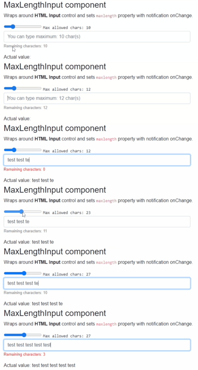
Components
MaxLengthInput: wraps and renders HTML<input>field and setsmaxlengthproperty with notification onChange.MaxLengthInputText: extendsInputTextBlazor provided component (it supports form validation and@bind-Value=) and setsmaxlengthproperty with notification onChange.MaxLengthTextarea: wraps and renders HTML<textarea>field and setsmaxlengthproperty with notification onChange.MaxLengthInputTextArea: extendsInputTextAreaBlazor provided component (it supports form validation and@bind-Value=) and setsmaxlengthproperty with notification onChange.MarkdownEditor: Markdown source editor with a customizable sectioned toolbar and a live HTML preview (Edit / Split / Preview views).RichTextEditor: Word-like WYSIWYG editor that applies formatting inline on acontenteditablesurface while keeping the bound value as Markdown, so it round-trips cleanly withMarkdownEditor.PasswordInput: secret text input with a customizable mask character (dot, star, bullet, etc.), a customizable layout and a reveal (eye) button that shows or hides the entered value.DateTimePicker: text input with a calendar (and optional time) editor shown in aPopover. Supports culture or custom format string based formatting/parsing, Date or DateTime mode, min/max limits, week numbers and full CSS customization.
MaxLengthInput and MaxLengthInputText components
Blazor components that are wrapping around standard HTML <input>, <textarea> elements and sets maxlength property with notification onChange.
Can fit for any Blazor App e.g. when DB field has limited length and on UI same limited chars should be set. And on each chars entered the remaining allowed chars counter will be shown.
MaxLengthTextarea and MaxLengthInputTextArea components
Blazor components that are wrapping around standard exiting Blazor components. Rendered HTML result will be standard <input>, <textarea> as well.
Can fit for any Blazor App but use this only when you need Blazor provided FROM validation as well.
Properties
All components have exactly the same features only rendering different HTML elements, hence they have the same properties, events and functions as well.
Value:string? { get; set; }<br /> Value of the rendered HTML element. Initial field value can be set to given string or omitted (leave empty). Also control actual value can be read out. <br />* Note: in case ofDebounceInputTextandDebounceInputTextAreathis property is inherited from Blazor component and requires slightly different code with@bind, see usage example differences.MaxAllowedChars:int { get; set; }(default: 50) <br /> Maximum allowed characters to type in.CountdownText:string { get; set; }(default: "Remaining characters: ") <br /> Countdown label text to change or localize message.ShowRemainingChars:bool { get; set; }(default: true) <br /> Should show remaining character values at the end of theCountdownTextor not. Note: RemainingCharacters value can be acquired fromOnRemainingCharsChangedevent parameter.CountdownTextClass:string { get; set; }(default: "") <br /> Countdown label and value CSS class property to style message.InnerElementReference:ElementReference { get; }<br /> Exposes a BlazorElementReferenceof the wrapped around HTML element. It can be used e.g. for JS interop, etc.
Arbitrary HTML attributes e.g.: id="input1" class="form-control w-25" will be passed to the corresponding rendered HTML element <input> or <textarea>.
<MaxLengthInput
	id="in1"
	class="form-control w-25"
	placeholder="@($"You can type maximum: {_maxLengthInputTextAreaAllowed} char(s)")"
	... />
Will be rendered to:
<input id="in1" class="form-control w-25" placeholder="You can type maximum: 20 char(s)" ... />
Events
OnValueChanged:EventCallback<string>delegate <br /> Callback function called when value was changed.OnRemainingCharsChanged:EventCallback<int>delegate <br /> Callback function called when HTML control received keyboard inputs remaining allowed chars calculated and sent as even args. Can be used to style or change the Countdown message.
MarkdownEditor and RichTextEditor components
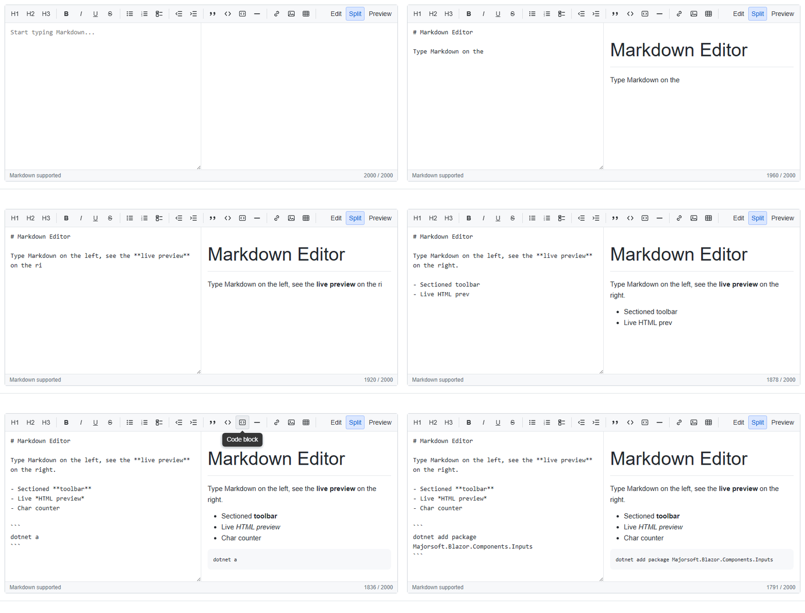
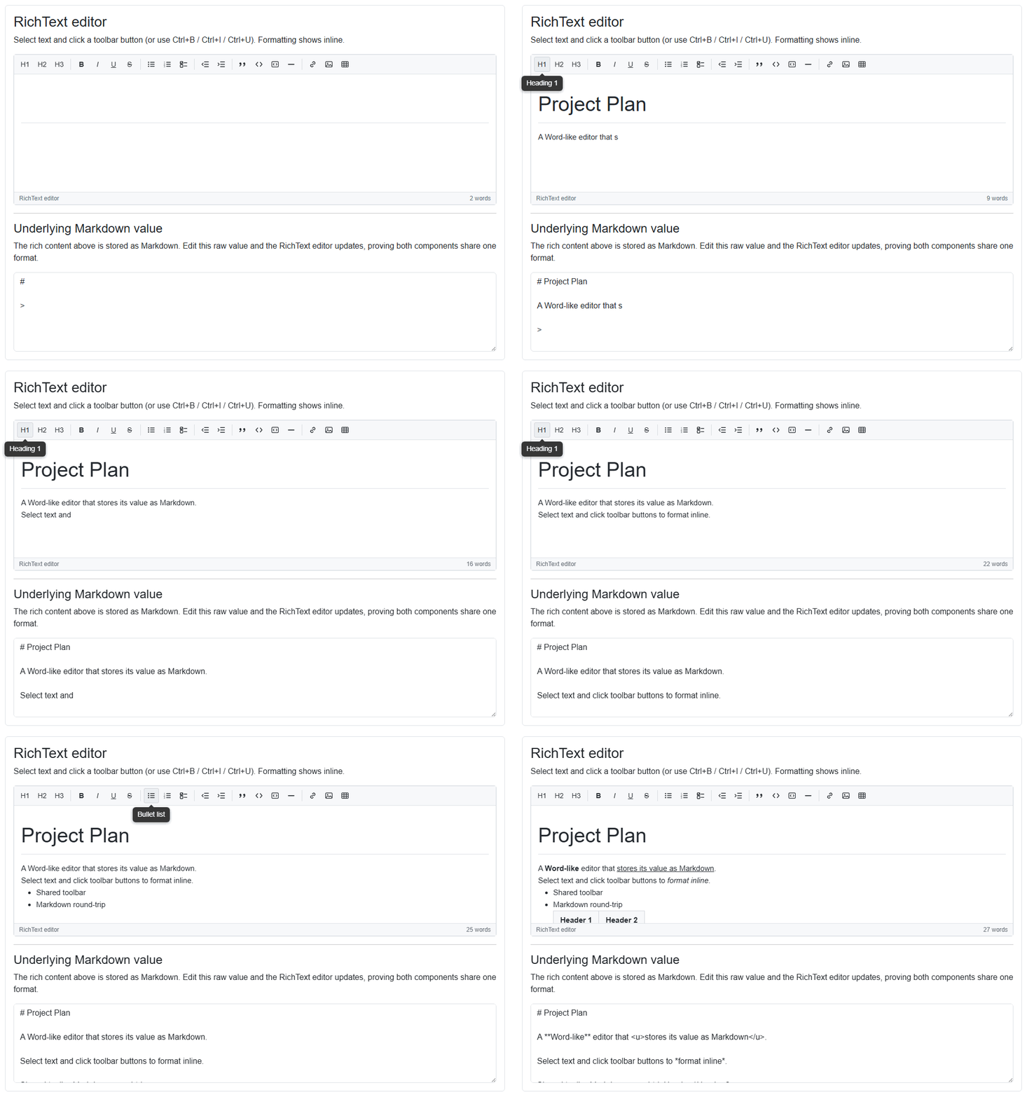
Two editors that share one sectioned, Tooltip-powered toolbar and a dependency-free Markdown engine, so
content round-trips cleanly between them. The MarkdownEditor edits Markdown source with a live
preview; the RichTextEditor is a Word-like WYSIWYG surface whose bound Value is always Markdown.
The toolbar is split into independently toggleable sections: Headings, Text style (bold, italic,
underline, strikethrough), Lists (bullet, numbered, task), Indentation (decrease / increase),
Blocks (quote, inline code, code block, horizontal rule) and Insert (link, image, table). In the
RichTextEditor the Insert buttons open a small Popover (anchored under the icon) to enter the link
text/URL, image URL or table dimensions; pressing Enter accepts and Esc closes it.
* Note: the editors render the
Popoverfrom the Tooltips package, which relies on the JS interop services. Register them once in your host app(s):services.AddJsInteropExtensions();
Styles
The editor CSS ships in the package; link it once (e.g. in index.html / App.razor / _Host.cshtml):
<link rel="stylesheet" href="_content/Majorsoft.Blazor.Components.Inputs/editor.css" />
Shared properties
Both editors expose the same set of common properties:
Value:string? { get; set; }— the Markdown text. Supports two-way binding via@bind-Value.Placeholder:string { get; set; }— hint shown when the editor is empty.Disabled:bool { get; set; }(default: false) — disables input and all toolbar actions.ReadOnly:bool { get; set; }(default: false) — content is read only (toolbar actions disabled too).SpellCheck:bool { get; set; }(default: true) — toggles the browser native spellchecker.ShowToolbar:bool { get; set; }(default: true) — shows/hides the whole toolbar.ShowHeadingSection/ShowTextStyleSection/ShowListSection/ShowIndentSection/ShowBlockSection/ShowInsertSection:bool { get; set; }(default: true) — show/hide individual toolbar sections.ShowFooter:bool { get; set; }(default: true) — shows/hides the footer (hint + counter).ShowButtonTooltips:bool { get; set; }(default: true) — each button shows a Tooltip; otherwise a nativetitle.CustomToolbarContent:RenderFragment? { get; set; }— extra toolbar content rendered as an additional section.FooterText:string { get; set; }— text shown on the left side of the footer.Class/Style/ToolbarClass/EditorClass:string? { get; set; }— custom CSS class(es) / inline style for the root, toolbar and editing surface.InnerElementReference:ElementReference { get; }— the wrapped editing element (the<textarea>for Markdown, thecontenteditablefor RichText).
Shared events and functions:
ValueChanged:EventCallback<string?>— enables@bind-Value.OnInput:EventCallback<string?>— invoked on every edit with the new Markdown value.OnHtmlChanged:EventCallback<string>— invoked with the rendered HTML whenever the value changes.GetHtml():string— returns the rendered HTML of the current value.FocusAsync():Task— sets focus to the editing surface.
MarkdownEditor specific properties
View:MarkdownEditorView { get; set; }(default:Edit) — which pane(s) are visible:Edit,SplitorPreview. Supports two-way binding via@bind-View(ViewChanged).ShowViewSection:bool { get; set; }(default: true) — shows/hides the Edit / Split / Preview switch.VisibleRows:int { get; set; }(default: 8) — number of visible text rows of the source<textarea>(itsrowsattribute).MaxAllowedChars:int { get; set; }(default: 0) — when greater than 0 amaxlengthis applied and a remaining-characters counter is shown.TabIndents:bool { get; set; }(default: true) andTabIndent:string { get; set; }(default: two spaces) — pressing Tab insertsTabIndentinstead of moving focus.PreviewClass:string? { get; set; }— custom CSS class(es) for the rendered preview pane.
RichTextEditor specific properties
Height:int { get; set; }(default: 0) — fixed editor height in pixels (toolbar + content + footer). When greater than 0 the content area scrolls once it overflows; when 0 the height is auto and grows with the content.Width:int { get; set; }(default: 0) — fixed editor width in pixels. When 0 the width is auto (it fills its container).
Usage
@using Majorsoft.Blazor.Components.Inputs

@* Link the editor stylesheet once in your app, e.g. in index.html / App.razor. *@
<link rel="stylesheet" href="_content/Majorsoft.Blazor.Components.Inputs/editor.css" />

<MarkdownEditor @bind-Value="_markdown"
                View="MarkdownEditorView.Split"
                VisibleRows="14"
                MaxAllowedChars="2000"
                Placeholder="Start typing Markdown..." />

<RichTextEditor @bind-Value="_markdown"
                Height="300"
                Placeholder="Start writing..." />

@code {
    private string _markdown = "# Hello\n\nThis is **shared** Markdown.";
}
Both editors are bound to the same _markdown value above, demonstrating that the WYSIWYG and Markdown
representations share one format.
PasswordInput component
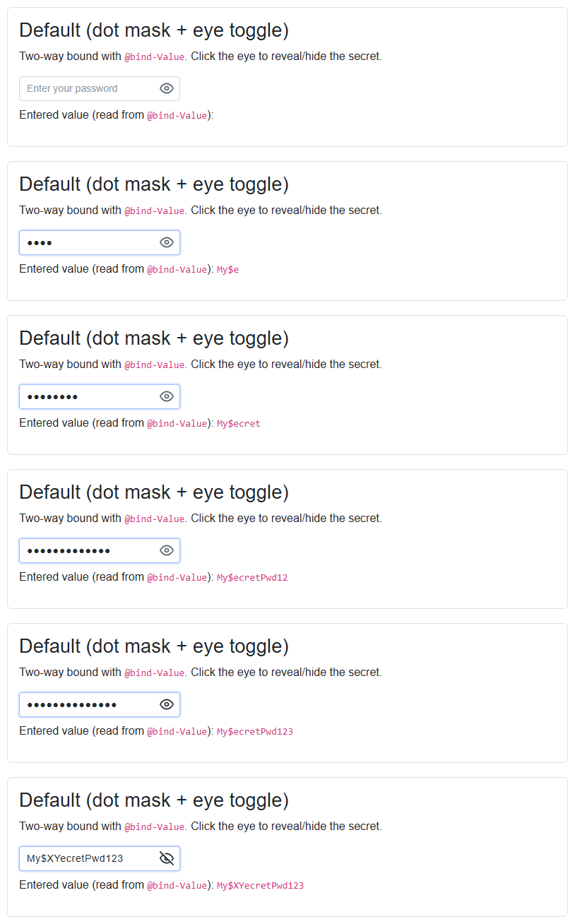
Blazor component that renders a secret text <input> with a customizable mask character, a customizable layout
and a reveal (eye) button to show or hide the entered value. The real value is always kept in C# and exposed via
@bind-Value (reading it always returns the plain text); while masked the input shows a run of the chosen mask
character. Editing in the middle of the value, text selection, paste and delete are all supported because the real
value is reconstructed from the caret position after each input.
Styles
PasswordInput ships a stylesheet in the package. Link it once in your app (e.g. index.html / App.razor):
<link rel="stylesheet" href="_content/Majorsoft.Blazor.Components.Inputs/passwordInput.css" />
All class names are prefixed with bpwd and every part is overridable via the Class, InputClass and
RevealButtonClass parameters.
Properties
Value:string? { get; set; }<br /> The secret value. Supports two-way binding via@bind-Value; reading it always returns the plain text.MaskCharacter:char { get; set; }(default:'●') <br /> Character used to mask the value while hidden, e.g.'●','*'or'•'. Set to'\0'to disable masking.ShowPassword:bool { get; set; }(default: false) <br /> Whether the value is currently revealed (plain text) or masked. Supports two-way binding via@bind-ShowPassword.ShowRevealButton:bool { get; set; }(default: true) <br /> Whether the reveal (eye) button is rendered.ShowTitle/HideTitle:string { get; set; }<br /> Tooltip/aria-label shown on the reveal button while masked / revealed.Placeholder:string? { get; set; }<br /> Placeholder text shown when the input is empty.MaxLength:int { get; set; }(default: 0) <br /> Maximum allowed characters.0means unlimited.Disabled/ReadOnly:bool { get; set; }<br /> Standard disabled / read only states.AutoComplete:string { get; set; }(default: "new-password") <br /> Value of the renderedautocompleteattribute.Class/Style/InputClass/RevealButtonClass:string? { get; set; }<br /> CSS hooks to customize the wrapper, the<input>and the reveal button.ShowIconContent/HideIconContent:RenderFragment?<br /> Optional custom content for the reveal button replacing the default eye icons (masked / revealed state).AdditionalAttributes:Dictionary<string, object>?<br /> Arbitrary HTML attributes splatted onto the inner<input>.
Events
ValueChanged:EventCallback<string?>— enables@bind-Value.OnInput:EventCallback<string?>— invoked on every input with the new plain value.ShowPasswordChanged:EventCallback<bool>— enables@bind-ShowPassword.
Functions
FocusAsync()— sets focus to the inner<input>.TogglePasswordVisibilityAsync()— toggles between the masked and revealed states.
Usage
@using Majorsoft.Blazor.Components.Inputs

@* Link the stylesheet once in your app, e.g. in index.html / App.razor. *@
<link rel="stylesheet" href="_content/Majorsoft.Blazor.Components.Inputs/passwordInput.css" />

<PasswordInput @bind-Value="_password"
               MaskCharacter="*"
               MaxLength="20"
               Placeholder="Enter your password" />

@code {
    private string? _password;
}
DateTimePicker component
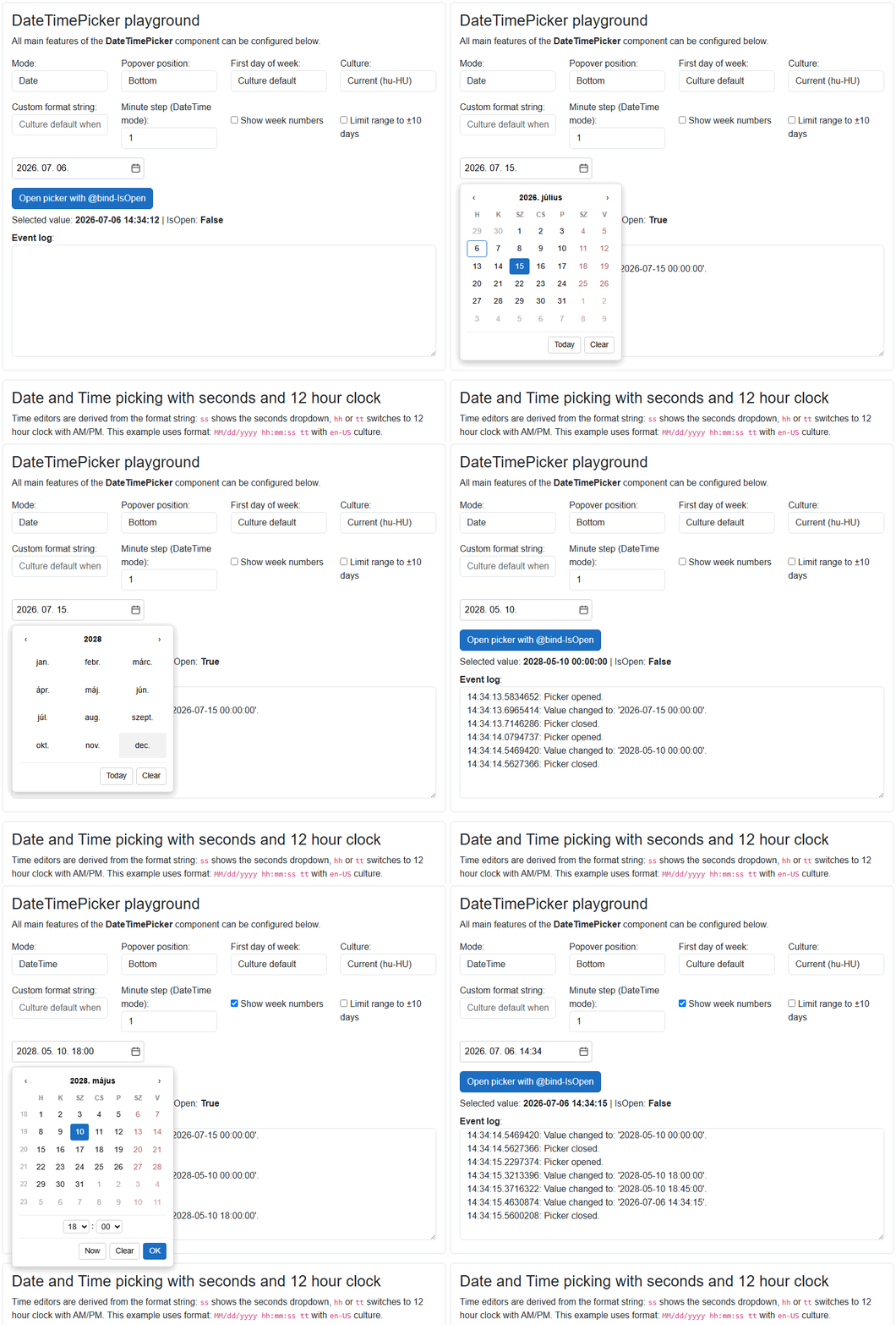
Blazor component that renders a text <input> with a calendar (and optional time) editor shown in a Popover.
The value can be picked in the calendar or typed into the input; typed text is parsed with the effective
format/culture and invalid entries are discarded. Clicking the calendar header drills up to month and year
selection views. Formatting and parsing use DateFormat when set, otherwise the short date (and time) pattern of
the given Culture (or the current culture). In DateTime mode a 12/24 hour clock and the visibility of the
seconds editor are derived from the effective format string (hh or tt → 12 hour clock with AM/PM,
ss → seconds dropdown).
* Note: the picker renders a
Popoverfrom the Tooltips package, which relies on the JS interop services. Register them once in your host app(s):services.AddJsInteropExtensions();
Component CSS is scoped and ships with the package, no stylesheet link is required. All panel parts expose
bdtp-* prefixed CSS classes which can be targeted via the Class, InputClass and PickerClass parameters
for full customization.
Properties
Value:DateTime? { get; set; }<br /> The picked date (and time). Supports two-way binding via@bind-Value. InDatemode the time part is always midnight.Mode:DateTimePickerMode { get; set; }(default:Date) <br /> Whether the component picks a Date only or a Date with Time (DateorDateTime).Position:TooltipPositions { get; set; }(default:Bottom) <br /> Position of the picker Popover relative to the input (Top,Bottom,Left,Right).FirstDayOfWeek:DayOfWeek? { get; set; }(default: null) <br /> First day of week shown in the calendar. When null the first day of week of the effective culture is used.DateFormat:string? { get; set; }(default: null) <br /> Custom .NET date/time format string used for formatting and parsing, e.g."yyyy-MM-dd"or"dd/MM/yyyy HH:mm". When not set the short date (and short time in DateTime mode) pattern of the effective culture is used.Culture:CultureInfo? { get; set; }(default: null) <br /> Culture used for formatting, parsing, day/month names and calendar rules. When nullCultureInfo.CurrentCultureis used.MinDate/MaxDate:DateTime? { get; set; }(default: null) <br /> Minimum / maximum selectable date (inclusive). Out of range days are disabled in the calendar and typed values are clamped.MinuteStep:int { get; set; }(default: 1) <br /> Step of the minutes dropdown in DateTime mode, e.g. 5, 15, 30. The current value's minute is always offered even when it is off-step.AllowTextInput:bool { get; set; }(default: true) <br /> When true the value can also be typed into the input. When false the input is read only and the value can only be picked.CloseOnOutsideClick:bool { get; set; }(default: true) <br /> When true the picker Popover closes when the user clicks outside of it.IsOpen:bool { get; set; }(default: false) <br /> Whether the picker Popover is open. Supports two-way binding via@bind-IsOpen, set it to open/close the picker programmatically.Disabled/ReadOnly:bool { get; set; }(default: false) <br /> Standard disabled / read only states (both block typing and picking).Placeholder:string? { get; set; }<br /> Placeholder text shown when the input is empty.ShowWeekNumbers:bool { get; set; }(default: false) <br /> Whether the week number column is rendered in the calendar.ShowTodayButton/ShowClearButton:bool { get; set; }(default: true) <br /> Whether the Today (Date mode) / Now (DateTime mode) and Clear footer buttons are rendered.TodayButtonText/NowButtonText/ClearButtonText/OkButtonText:string { get; set; }<br /> Footer button texts to change or localize (defaults: "Today", "Now", "Clear", "OK").Class/Style/InputClass/PickerClass:string? { get; set; }<br /> CSS hooks to customize the root element, the<input>and the picker Popover panel.CalendarIconContent:RenderFragment? { get; set; }<br /> Optional custom content for the calendar toggle button replacing the default calendar icon.AdditionalAttributes:Dictionary<string, object>?<br /> Arbitrary HTML attributes splatted onto the inner<input>.InnerElementReference:ElementReference { get; }<br /> Exposes a BlazorElementReferenceof the inner<input>element. It can be used e.g. for JS interop, focus, etc.
Events
ValueChanged:EventCallback<DateTime?>— enables@bind-Value, invoked whenever the value changes (picked, typed, cleared).IsOpenChanged:EventCallback<bool>— enables@bind-IsOpen, invoked whenever the picker opens or closes.OnOpen:EventCallback— callback function called when the picker Popover is opening.OnClose:EventCallback— callback function called when the picker Popover is closing.
Usage
@using Majorsoft.Blazor.Components.Inputs
@using System.Globalization

<DateTimePicker @bind-Value="_date"
                Mode="DateTimePickerMode.Date"
                Placeholder="Pick or type a date..." />

<DateTimePicker @bind-Value="_meeting"
                Mode="DateTimePickerMode.DateTime"
                DateFormat="MM/dd/yyyy hh:mm:ss tt"
                Culture="@CultureInfo.GetCultureInfo("en-US")"
                MinuteStep="5"
                MinDate="@DateTime.Today"
                ShowWeekNumbers="true" />

@code {
    private DateTime? _date = DateTime.Today;
    private DateTime? _meeting;
}
Configuration
Installation
Majorsoft.Blazor.Components.Inputs is available on NuGet.
dotnet add package Majorsoft.Blazor.Components.Inputs
Use the --version option to specify a preview version to install.
Usage
Add using statement to your Blazor <component/page>.razor file. Or globally reference it into _Imports.razor file.
@using Majorsoft.Blazor.Components.Inputs
MaxLengthInput and MaxLengthTextarea usage
Following code example shows how to use MaxLengthInput component in your Blazor App with model binding
on specific OnInput event. So it will enable two way binding between components. You can omit it and use Value directly for one way binding.
Note: using MaxLengthTextarea component basically the same but it will render HTML <textarea>.
<style>
	.countDownText {
		font-size: small;
		color: gray;
	}
	.countDownText.red {
		color: red;
	}
	.countDownText.right {
		width: 100%;
		text-align: right;
	}
</style>

<div class="row pb-2">
	<div class="col-12 col-lg-8 col-xl-5">
		<MaxLengthInput id="maxInput1" class="form-control w-100" placeholder="@($"You can type maximum: {_maxLengthInputAllowed} char(s)")"
						@bind-Value="@_maxLengthInputValue" @bind-Value:event="OnInput"
						MaxAllowedChars="@_maxLengthInputAllowed"
						CountdownTextClass="@_maxLengthInputTextClass"
						OnRemainingCharsChanged="MaxLengthInputRemainingCharsChanged" />
	</div>
</div>

<div>Actual value: @_maxLengthInputValue</div>

@code {
	//MaxLengthInput
	private int _maxLengthInputAllowed = 10;
	private string _maxLengthInputValue = "";
	private string _maxLengthInputTextClass = "countDownText";

	private void MaxLengthInputRemainingCharsChanged(int remainingChars)
	{
		_maxLengthInputTextClass = "countDownText";

		if (_maxLengthInputAllowed * 0.2 >= remainingChars)
		{
			_maxLengthInputTextClass = "countDownText red";
		}
	}
}
MaxLengthInputText and MaxLengthInputTextArea usage
Following code example shows how to use DebounceInputText component with model binding and form validation in your Blazor App.
Note: using MaxLengthInputTextArea component basically the same but it will render HTML <textarea>.
<style>
	.countDownText {
		font-size: small;
		color: gray;
	}
	.countDownText.red {
		color: red;
	}
	.countDownText.right {
		width: 100%;
		text-align: right;
	}
</style>

<EditForm Model="@exampleModel">
	<DataAnnotationsValidator />
	<ValidationSummary />
	<div class="row pb-2">
		<div class="col-12 col-lg-8 col-xl-5">
			<MaxLengthInputText id="maxInput2" class="form-control w-100" placeholder="@($"You can type maximum: {_maxLengthInputTextAllowed} char(s)")"
								@bind-Value="exampleModel.Name"
								MaxAllowedChars="@_maxLengthInputTextAllowed"
								CountdownTextClass="@_maxLengthInputTextTextClass"
								OnRemainingCharsChanged="MaxLengthInputTextRemainingCharsChanged" />
		</div>
	</div>
	<div class="pb-2">
		<button class="btn btn-primary" type="submit">Submit</button>
	</div>
</EditForm>

<div>Actual value: @(exampleModel.Name)</div>

@code {
	//MaxLengthInputText
	private int _maxLengthInputTextAllowed = 10;
	private string _maxLengthInputTextTextClass = "countDownText";

	private void MaxLengthInputTextRemainingCharsChanged(int remainingChars)
	{
		_maxLengthInputTextTextClass = "countDownText";

		if (_maxLengthInputTextAllowed * 0.2 >= remainingChars)
		{
			_maxLengthInputTextTextClass = "countDownText red";
		}
	}

	//Form model
	private ExampleModel exampleModel = new ExampleModel() { Name = "" };
	public class ExampleModel
	{
		[Required]
		[StringLength(10, ErrorMessage = "Name is too long.")]
		public string Name { get; set; }
	}
}
| Product | Versions Compatible and additional computed target framework versions. |
|---|---|
| .NET | net8.0 is compatible. net8.0-android was computed. net8.0-browser was computed. net8.0-ios was computed. net8.0-maccatalyst was computed. net8.0-macos was computed. net8.0-tvos was computed. net8.0-windows was computed. net9.0 is compatible. net9.0-android was computed. net9.0-browser was computed. net9.0-ios was computed. net9.0-maccatalyst was computed. net9.0-macos was computed. net9.0-tvos was computed. net9.0-windows was computed. net10.0 is compatible. net10.0-android was computed. net10.0-browser was computed. net10.0-ios was computed. net10.0-maccatalyst was computed. net10.0-macos was computed. net10.0-tvos was computed. net10.0-windows was computed. |
-
net10.0
- Majorsoft.Blazor.Components.Tooltips (>= 2.3.0)
- Microsoft.AspNetCore.Components.Web (>= 10.0.8)
-
net8.0
- Majorsoft.Blazor.Components.Tooltips (>= 2.3.0)
- Microsoft.AspNetCore.Components.Web (>= 8.0.27)
-
net9.0
- Majorsoft.Blazor.Components.Tooltips (>= 2.3.0)
- Microsoft.AspNetCore.Components.Web (>= 9.0.16)
NuGet packages
This package is not used by any NuGet packages.
GitHub repositories
This package is not used by any popular GitHub repositories.
See Releases here: https://github.com/majorimi/blazor-components/releases