C1.WPF.Input
9.0.20251.1069
See the version list below for details.
dotnet add package C1.WPF.Input --version 9.0.20251.1069
NuGet\Install-Package C1.WPF.Input -Version 9.0.20251.1069
<PackageReference Include="C1.WPF.Input" Version="9.0.20251.1069" />
<PackageVersion Include="C1.WPF.Input" Version="9.0.20251.1069" />
<PackageReference Include="C1.WPF.Input" />
paket add C1.WPF.Input --version 9.0.20251.1069
#r "nuget: C1.WPF.Input, 9.0.20251.1069"
#:package C1.WPF.Input@9.0.20251.1069
#addin nuget:?package=C1.WPF.Input&version=9.0.20251.1069
#tool nuget:?package=C1.WPF.Input&version=9.0.20251.1069
About
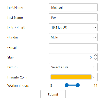
The ComponentOne WPF Input library includes several advanced editors for capturing special input including C1NumericBox, C1MaskedTextBox, C1MultiSelect, C1ComboBox, C1DropDown, C1RangeSlider, C1FilePicker, C1Rating and C1TagEditor.

Key Features:
- Format and parse numbers and masked text
- Select multiple items from a checklist
- Type or select items like a tag editor
- Edit a numeric range visually using a two-thumb slider
- Design a custom drop-down UI with ease
- Create a custom shape rating control (five stars) to let users provide feedback
Note: Date, time and color input controls are in separate libraries. Learn more at developer.mescius.com/componentone/wpf-ui-controls/custom-input-controls-wpf.
Resources
| Product | Versions Compatible and additional computed target framework versions. |
|---|---|
| .NET | net6.0-windows7.0 is compatible. net7.0-windows was computed. net8.0-windows was computed. net9.0-windows was computed. net10.0-windows was computed. |
-
net6.0-windows7.0
- C1.WPF.Core (= 9.0.20251.1069)
- C1.WPF.ListView (= 9.0.20251.1069)
NuGet packages (17)
Showing the top 5 NuGet packages that depend on C1.WPF.Input:
| Package | Downloads |
|---|---|
|
C1.WPF.Menu
ComponentOne Menu for WPF. |
|
|
C1.WPF.TabControl
Easily organize and navigate content with ComponentOne TabControl™ for WPF. |
|
|
C1.WPF.Docking
Upgrade your static interface to a multi-tabbed docking interface with ComponentOne DockControl™ for WPF. Inspired by the docking system in Microsoft Visual Studio®, DockControl delivers customizable workspaces to your users, complete with resizing, persisting, and auto-hiding capabilities. |
|
|
C1.WPF.DateTimeEditors
The DateTimePicker control provides a single, intuitive UI for selecting date and time values. The TimeEditor control provides a simple masked editor for time values only. You can edit your date and time values by using the spin buttons, using the keyboard arrows, or by typing in fields. |
|
|
C1.WPF.TreeView
Though it's similar to the TreeView control available in the box, ComponentOne TreeView for WPF provides more powerful features like autosearch, drag-and-drop, and hierarchical templates. |
GitHub repositories
This package is not used by any popular GitHub repositories.
| Version | Downloads | Last Updated |
|---|---|---|
| 9.0.20251.1102 | 330 | 7/11/2025 |
| 9.0.20251.1069 | 452 | 5/16/2025 |
| 8.0.20242.1051 | 633 | 3/3/2025 |
| 8.0.20242.1032 | 179 | 2/26/2025 |
| 8.0.20242.1005 | 470 | 12/27/2024 |
| 8.0.20242.966 | 487 | 11/12/2024 |
| 8.0.20241.921 | 611 | 9/3/2024 |
| 8.0.20241.854 | 414 | 7/8/2024 |
| 8.0.20241.795 | 830 | 5/29/2024 |
| 8.0.20233.731 | 4,273 | 3/12/2024 |
| 8.0.20233.702 | 383 | 1/19/2024 |
| 8.0.20233.681 | 511 | 11/29/2023 |
| 8.0.20233.668 | 669 | 11/8/2023 |
| 7.0.20233.662 | 360 | 11/10/2023 |
| 6.0.20232.624 | 568 | 9/11/2023 |
| 6.0.20232.591 | 2,590 | 7/17/2023 |
| 6.0.20231.533 | 751 | 5/11/2023 |
| 6.0.20231.514 | 656 | 3/24/2023 |
| 6.0.20223.392 | 1,233 | 1/17/2023 |
| 6.0.20223.376 | 1,165 | 11/30/2022 |
| 6.0.20222.302 | 5,167 | 8/31/2022 |
| 6.0.20222.263 | 3,827 | 7/27/2022 |
| 6.0.20221.222 | 3,481 | 5/10/2022 |
| 6.0.20221.209 | 3,513 | 3/25/2022 |
| 6.0.20221.205 | 3,349 | 3/23/2022 |
| 6.0.20213.167 | 1,765 | 1/7/2022 |
| 6.0.20213.156 | 1,750 | 12/3/2021 |
| 6.0.20213.140-beta | 1,037 | 11/5/2021 |
| 5.0.20221.207 | 3,748 | 7/27/2022 |
| 5.0.20221.205 | 3,898 | 3/23/2022 |
| 5.0.20213.166 | 2,015 | 1/7/2022 |
| 5.0.20213.155 | 2,163 | 12/3/2021 |
| 5.0.20212.112 | 3,737 | 8/19/2021 |
| 5.0.20212.100 | 3,600 | 8/5/2021 |
| 5.0.20211.76 | 3,537 | 4/23/2021 |
| 5.0.20211.57 | 3,483 | 4/6/2021 |
| 5.0.20203.40 | 3,344 | 12/23/2020 |
| 5.0.20203.34 | 3,190 | 12/1/2020 |
| 5.0.20203.29 | 3,631 | 11/10/2020 |
| 5.0.20203.5-beta | 1,670 | 8/6/2020 |
| 5.0.20202.4-beta | 1,844 | 7/29/2020 |