Bluent.UI.Diagrams
1.0.367
dotnet add package Bluent.UI.Diagrams --version 1.0.367
NuGet\Install-Package Bluent.UI.Diagrams -Version 1.0.367
<PackageReference Include="Bluent.UI.Diagrams" Version="1.0.367" />
<PackageVersion Include="Bluent.UI.Diagrams" Version="1.0.367" />
<PackageReference Include="Bluent.UI.Diagrams" />
paket add Bluent.UI.Diagrams --version 1.0.367
#r "nuget: Bluent.UI.Diagrams, 1.0.367"
#:package Bluent.UI.Diagrams@1.0.367
#addin nuget:?package=Bluent.UI.Diagrams&version=1.0.367
#tool nuget:?package=Bluent.UI.Diagrams&version=1.0.367
Bluent
Fluent-inspired Blazor components for building modern, component-rich business applications.




Bluent is a Blazor UI toolkit designed for developers building real-world web applications with a Fluent look and feel. It combines everyday form and navigation components with more advanced building blocks such as charts, diagrams, overlays, dialogs, and desktop-style application patterns.
Bluent is independently developed and is not affiliated with or endorsed by Microsoft.
Demo at a glance
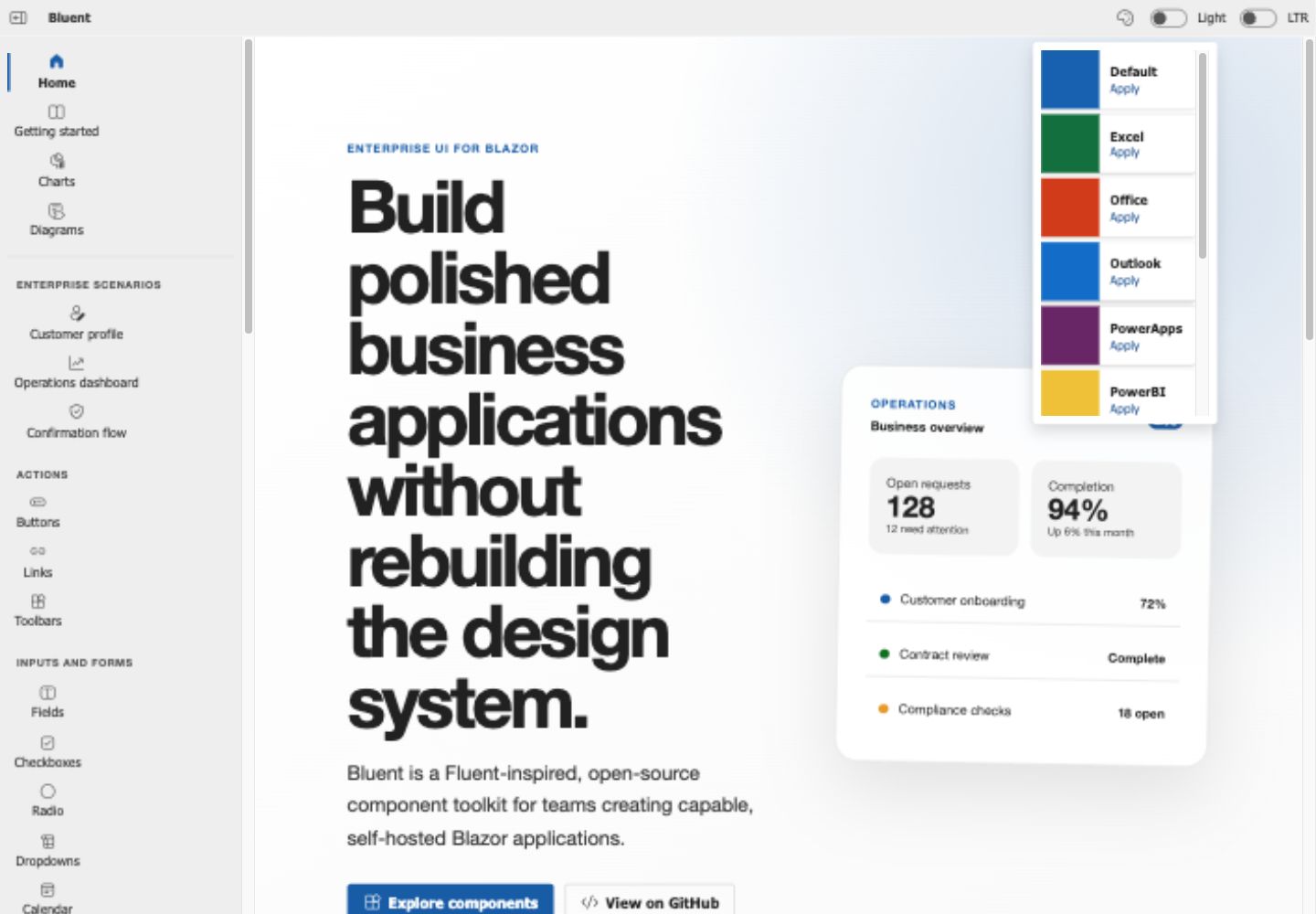
The demo combines component references with runnable business workflows such as the operations dashboard. See the Sprint 2 visual gallery for the component showcase and validated dark/RTL presentation.
Why Bluent?
- Built for Blazor — Razor components and .NET APIs without wrapping another application framework.
- Business-application focused — forms, navigation, feedback, overlays, data presentation, charts, and diagrams.
- Fluent-inspired design — a familiar, clean visual language suitable for productivity software.
- Modular packages — use the core component library and add specialized packages when needed.
- Actively developed — the library continues to receive component improvements and fixes.
Packages
| Package | Purpose |
|---|---|
Bluent.UI |
Main component library |
Bluent.UI.Charts |
Chart components |
Bluent.UI.Diagrams |
Diagramming components |
Bluent.UI.Utilities |
Shared UI utilities |
Component areas
Bluent includes components for common application needs, including:
- Buttons and actions
- Text, numeric, date, and time input
- Dropdowns and selection controls
- Dialogs, message boxes, popovers, and tooltips
- Navigation, tabs, lists, and menus
- Cards, layout, and feedback components
- File selection
- Charts
- Diagramming
- MDI-style application interfaces
Explore the available components in the live demo.
Installation
For the complete, source-verified setup and troubleshooting path, see the Getting Started guide.
Install the main package:
dotnet add package Bluent.UI
Import the component and extension namespaces in _Imports.razor:
@using Bluent.UI.Components
@using Bluent.UI.Extensions
Register Bluent services in Program.cs:
builder.Services.AddBluentUI();
Add the shared containers near the end of your application layout:
<Containers />
Reference the packaged stylesheets:
<link href="_content/Bluent.UI/bluent.ui.theme.default.min.css" rel="stylesheet" />
<link href="_content/Bluent.UI/bluent.ui.components.min.css" rel="stylesheet" />
You can now use Bluent components in your Razor pages.
Quick example
<Button Appearance="Appearance.Primary">
    Save changes
</Button>
For complete examples and component behavior, see the demo application and the source under src/Bluent.UI.Demo.Pages.
Repository structure
src/
├── Bluent.Core
├── Bluent.UI
├── Bluent.UI.Charts
├── Bluent.UI.Diagrams
├── Bluent.UI.Utilities
├── Bluent.UI.Demo
└── Bluent.UI.Demo.Pages
Project direction
The current focus is to make Bluent easier to evaluate, adopt, and contribute to:
- Improve component documentation and runnable examples.
- Clarify package boundaries and supported application models.
- Strengthen release notes, versioning, and upgrade guidance.
- Expand automated testing and accessibility checks.
- Build a welcoming contributor workflow and public roadmap.
Project documents
- Vision — what Bluent is, who it serves, and its product principles.
- Roadmap — current phases, outcomes, and exit criteria.
- Changelog — notable changes and release history.
- Versioning and releases — compatibility and release policy.
- Contributing — development setup and contribution workflow.
- Code of Conduct — community participation standards.
Contributing
Issues, examples, documentation improvements, and pull requests are welcome. Please read CONTRIBUTING.md before submitting a change.
Support the project
The most useful ways to help Bluent grow are:
- Star the repository if the project is useful to you.
- Try the library and report reproducible issues.
- Share screenshots or links to applications built with Bluent.
- Improve an example or document an existing component.
License
Bluent is licensed under the Apache License 2.0.
| Product | Versions Compatible and additional computed target framework versions. |
|---|---|
| .NET | net10.0 is compatible. net10.0-android was computed. net10.0-browser was computed. net10.0-ios was computed. net10.0-maccatalyst was computed. net10.0-macos was computed. net10.0-tvos was computed. net10.0-windows was computed. |
-
net10.0
- Bluent.UI.Core (>= 1.0.367)
- BuildBundlerMinifier2022 (>= 2.9.11)
- Microsoft.AspNetCore.Components.Web (>= 10.0.7)
NuGet packages (1)
Showing the top 1 NuGet packages that depend on Bluent.UI.Diagrams:
| Package | Downloads |
|---|---|
|
Bluent.UI.Demo.Pages
Package Description |
GitHub repositories
This package is not used by any popular GitHub repositories.
| Version | Downloads | Last Updated |
|---|---|---|
| 1.0.367 | 38 | 7/26/2026 |
| 1.0.366 | 47 | 7/25/2026 |
| 1.0.365 | 116 | 7/20/2026 |
| 1.0.364 | 137 | 7/4/2026 |
| 1.0.363 | 151 | 6/18/2026 |
| 1.0.362 | 170 | 6/16/2026 |
| 1.0.361 | 119 | 6/16/2026 |
| 1.0.360 | 117 | 6/15/2026 |
| 1.0.359 | 126 | 6/12/2026 |
| 1.0.358 | 143 | 6/10/2026 |
| 1.0.357 | 125 | 6/10/2026 |
| 1.0.356 | 125 | 6/9/2026 |
| 1.0.355 | 119 | 6/8/2026 |
| 1.0.354 | 115 | 6/8/2026 |
| 1.0.353 | 140 | 6/3/2026 |
| 1.0.352 | 112 | 6/3/2026 |
| 1.0.351 | 124 | 6/1/2026 |
| 1.0.350 | 153 | 5/28/2026 |
| 1.0.349 | 129 | 5/28/2026 |
| 1.0.348 | 122 | 5/28/2026 |