UXDivers.Popups.Maui
0.9.4
Prefix Reserved
dotnet add package UXDivers.Popups.Maui --version 0.9.4
NuGet\Install-Package UXDivers.Popups.Maui -Version 0.9.4
<PackageReference Include="UXDivers.Popups.Maui" Version="0.9.4" />
<PackageVersion Include="UXDivers.Popups.Maui" Version="0.9.4" />
<PackageReference Include="UXDivers.Popups.Maui" />
paket add UXDivers.Popups.Maui --version 0.9.4
#r "nuget: UXDivers.Popups.Maui, 0.9.4"
#:package UXDivers.Popups.Maui@0.9.4
#addin nuget:?package=UXDivers.Popups.Maui&version=0.9.4
#tool nuget:?package=UXDivers.Popups.Maui&version=0.9.4
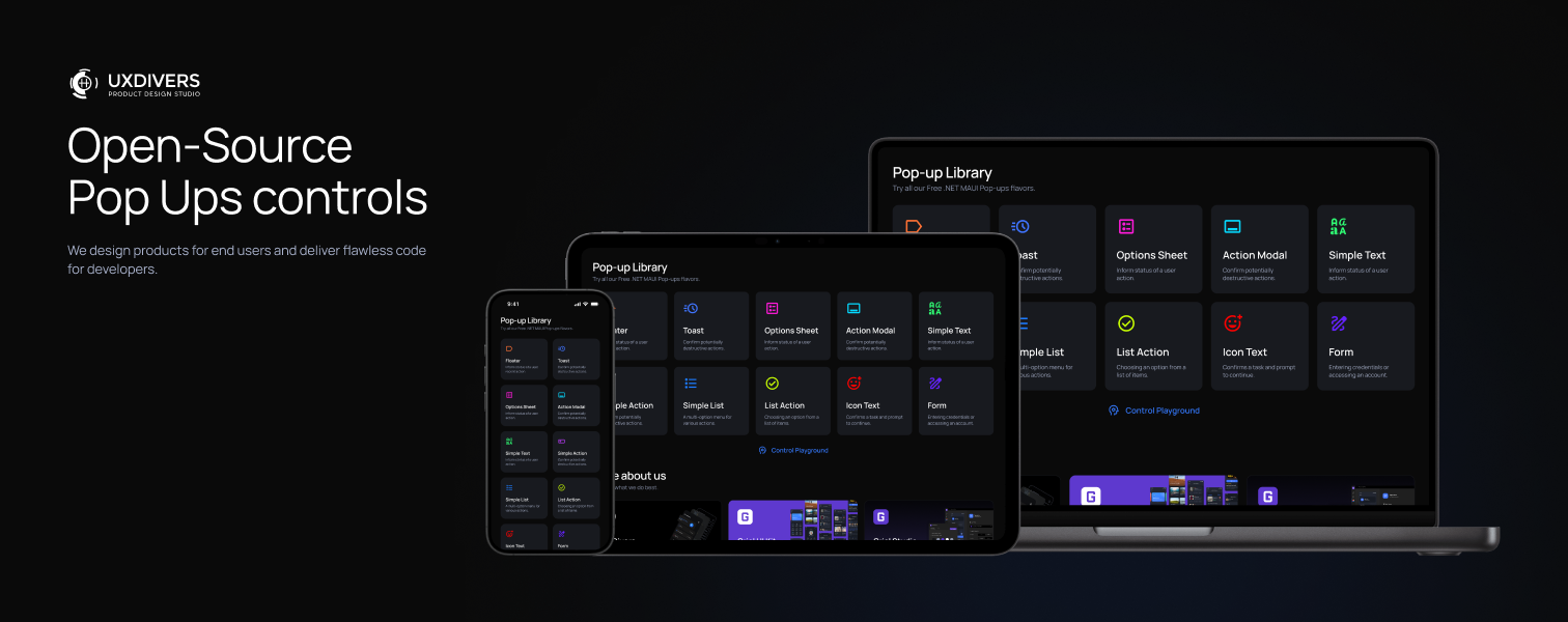
UXDivers Popups for .NET MAUI


Introduction
- 🎨 9 Ready-to-Use Popups — Toast, Floater, ActionModal, SimpleText, SimpleAction, IconText, ListAction, OptionSheet, Form
- 🎬 14 Animation Types — Fade, Scale, Move, Rotate, and Storyboard Combinations
- 📱 Cross-Platform — iOS, Android, Windows, macOS
- 🎯 MVVM Ready — Full ViewModel and data binding support
- 💉 Dependency Injection — Seamless DI integration
- 🎭 Themeable — Dark theme included, fully customizable
- ⚡ Lightweight — Minimal footprint, maximum performance
🚀 Setup
Follow these steps to start using the library in your project:
1. Install the NuGet Package
dotnet add package UXDivers.Popups.Maui
2. Configure MauiProgram.cs
Call the UseUXDiversPopups extension method in your MauiProgram.cs:
using UXDivers.Popups.Maui.Controls;

public static class MauiProgram
{
    public static MauiApp CreateMauiApp()
    {
        var builder = MauiApp.CreateBuilder();
        builder
            .UseMauiApp<App>()
            .UseUXDiversPopups();  // 👈 Add this line

        return builder.Build();
    }
}
Android Back Button: By default, pressing the Android back button closes the topmost popup. To disable this behavior, pass
closePopupOnBackAndroid: falsetoUseUXDiversPopups(). See Navigation - Android Back Button for details.
3. Add Theme Resources to App.xaml
Add the DarkTheme and PopupStyles resource dictionaries to your App.xaml:
<Application xmlns="http://schemas.microsoft.com/dotnet/2021/maui"
             xmlns:x="http://schemas.microsoft.com/winfx/2009/xaml"
             xmlns:uxd="clr-namespace:UXDivers.Popups.Maui.Controls;assembly=UXDivers.Popups.Maui"
             x:Class="YourApp.App">
    <Application.Resources>
        <ResourceDictionary>
            <ResourceDictionary.MergedDictionaries>
                <uxd:DarkTheme />
                <uxd:PopupStyles />
            </ResourceDictionary.MergedDictionaries>
        </ResourceDictionary>
    </Application.Resources>
</Application>
4. Optional: Customize Resources
Override these resource keys in your App.xaml to customize the popups:
| Resource Key | Description |
|---|---|
IconsFontFamily |
The name of the icons font family |
AppFontFamily |
The name of the main font family |
AppSemiBoldFamily |
The name of the semi-bold font family |
UXDPopupsCloseIconButton |
The glyph for close icons in popups |
UXDPopupsCheckCircleIconButton |
The glyph for circled check icons in popups |
<Application.Resources>
<ResourceDictionary>
<ResourceDictionary.MergedDictionaries>
<uxd:DarkTheme />
<uxd:PopupStyles />
</ResourceDictionary.MergedDictionaries>
<x:String x:Key="IconsFontFamily">MaterialIcons</x:String>
<x:String x:Key="AppFontFamily">OpenSans-Regular</x:String>
<x:String x:Key="AppSemiBoldFamily">OpenSans-SemiBold</x:String>
<x:String x:Key="UXDPopupsCloseIconButton"></x:String>
<x:String x:Key="UXDPopupsCheckCircleIconButton"></x:String>
</ResourceDictionary>
</Application.Resources>
📲 Showing a Popup
Create an instance of a popup and show it using the IPopupService:
using UXDivers.Popups.Maui.Controls;

public async void OnShowPopupClicked()
{
    var popup = new Toast()
    {
        Title = "Update Success"
    };

    await IPopupService.Current.PushAsync(popup);
}
Available Popup Types
| Popup | Description |
|---|---|
Toast |
Brief notification with icon and title |
SimpleTextPopup |
Informational popup with title and text |
SimpleActionPopup |
Confirmation dialog with two buttons |
IconTextPopup |
Prominent icon with title, text, and action |
FloaterPopup |
Floating alert with icon and message |
ActionModalPopup |
Modal with close button and action area |
ListActionPopup |
Scrollable list with action button |
OptionSheetPopup |
Bottom sheet with selectable options |
FormPopup |
User input form returning results |
🎨 Custom Popup
Create your own popup by extending PopupPage:
<?xml version="1.0" encoding="utf-8" ?>
<uxd:PopupPage
    xmlns="http://schemas.microsoft.com/dotnet/2021/maui"
    xmlns:x="http://schemas.microsoft.com/winfx/2009/xaml"
    xmlns:uxd="clr-namespace:UXDivers.Popups.Maui;assembly=UXDivers.Popups.Maui"
    x:Class="YourNamespace.MyCustomPopup"
    BackgroundColor="{DynamicResource PopupBackdropColor}"
    AppearingAnimation="{uxd:FadeInPopupAnimation Duration=300}"
    DisappearingAnimation="{uxd:FadeOutPopupAnimation Duration=300}"
    CloseWhenBackgroundIsClicked="True"
    >
    <Border
        VerticalOptions="Center"
        HorizontalOptions="Center"
        BackgroundColor="{DynamicResource PopupBorderColor}"
        Stroke="{DynamicResource PopupBorderColor}"
        StrokeThickness="1">
        <Border.StrokeShape>
            <RoundRectangle CornerRadius="16" />
        </Border.StrokeShape>

        <VerticalStackLayout Padding="24" Spacing="16">
            <Label
                Text="Welcome!"
                FontSize="24"
                HorizontalOptions="Center"
                TextColor="{DynamicResource TextColor}"
                />

            <Label
                Text="This is your custom popup!"
                HorizontalOptions="Center"
                TextColor="{DynamicResource TextColor}" />
        </VerticalStackLayout>
    </Border>
</uxd:PopupPage>
using UXDivers.Popups.Maui;

namespace YourApp.Popups;

public partial class MyCustomPopup : PopupPage
{
    public MyCustomPopup()
    {
        InitializeComponent();
    }

    private async void OnCloseClicked(object sender, EventArgs e)
    {
        await IPopupService.Current.PopAsync(this);
    }
}
📚 Learn the Advanced
For detailed documentation on advanced features, explore these resources:
Documentation
| Topic | Description |
|---|---|
| Popup Class | Core popup classes, lifecycle, and customization |
| Custom Popups | Create your own popups with custom styling |
| Popup Controls | All 9 pre-built popup controls explained |
| Navigation | How to show, close, and pass data to popups |
| Dependency Injection | Register popups and ViewModels with DI |
| MVVM | ViewModel integration and patterns |
| Animations | Animation system and customization |
| API Reference | Complete reference for all public types and methods |
Popup Controls Reference
| Control | Docs Link |
|---|---|
| Toast | Toast |
| FloaterPopup | FloaterPopup |
| SimpleTextPopup | SimpleTextPopup |
| SimpleActionPopup | SimpleActionPopup |
| IconTextPopup | IconTextPopup |
| ActionModalPopup | ActionModalPopup |
| ListActionPopup | ListActionPopup |
| OptionSheetPopup | OptionSheetPopup |
| FormPopup | FormPopup |
Additional Resources
- DemoApp - Working examples of all popup types, custom styles, and animations
License
This project is licensed under the Apache License 2.0 - see the LICENSE file for details.
Made with ❤️ by UXDivers
| Product | Versions Compatible and additional computed target framework versions. |
|---|---|
| .NET | net9.0 is compatible. net9.0-android was computed. net9.0-android35.0 is compatible. net9.0-browser was computed. net9.0-ios was computed. net9.0-ios18.0 is compatible. net9.0-maccatalyst was computed. net9.0-maccatalyst18.0 is compatible. net9.0-macos was computed. net9.0-tvos was computed. net9.0-windows was computed. net9.0-windows10.0.19041 is compatible. net10.0 is compatible. net10.0-android was computed. net10.0-android36.0 is compatible. net10.0-browser was computed. net10.0-ios was computed. net10.0-ios26.0 is compatible. net10.0-maccatalyst was computed. net10.0-maccatalyst26.0 is compatible. net10.0-macos was computed. net10.0-tvos was computed. net10.0-windows was computed. net10.0-windows10.0.19041 is compatible. |
-
net10.0
- Microsoft.Maui.Controls (>= 10.0.10)
-
net10.0-android36.0
- Microsoft.Maui.Controls (>= 10.0.10)
-
net10.0-ios26.0
- Microsoft.Maui.Controls (>= 10.0.10)
-
net10.0-maccatalyst26.0
- Microsoft.Maui.Controls (>= 10.0.10)
-
net10.0-windows10.0.19041
- Microsoft.Maui.Controls (>= 10.0.10)
-
net9.0
- Microsoft.Maui.Controls (>= 9.0.50)
-
net9.0-android35.0
- Microsoft.Maui.Controls (>= 9.0.50)
-
net9.0-ios18.0
- Microsoft.Maui.Controls (>= 9.0.50)
-
net9.0-maccatalyst18.0
- Microsoft.Maui.Controls (>= 9.0.50)
-
net9.0-windows10.0.19041
- Microsoft.Maui.Controls (>= 9.0.50)
NuGet packages (1)
Showing the top 1 NuGet packages that depend on UXDivers.Popups.Maui:
| Package | Downloads |
|---|---|
|
Shiny.Maui.Shell.UxDiversDialogs
Shiny MAUI Shell - Make .NET MAUI shell a pleasant experience |
GitHub repositories
This package is not used by any popular GitHub repositories.