TermuiX 2.0.1
dotnet add package TermuiX --version 2.0.1
NuGet\Install-Package TermuiX -Version 2.0.1
This command is intended to be used within the Package Manager Console in Visual Studio, as it uses the NuGet module's version of Install-Package.
<PackageReference Include="TermuiX" Version="2.0.1" />
For projects that support PackageReference, copy this XML node into the project file to reference the package.
<PackageVersion Include="TermuiX" Version="2.0.1" />
<PackageReference Include="TermuiX" />
For projects that support Central Package Management (CPM), copy this XML node into the solution Directory.Packages.props file to version the package.
paket add TermuiX --version 2.0.1
The NuGet Team does not provide support for this client. Please contact its maintainers for support.
#r "nuget: TermuiX, 2.0.1"
#r directive can be used in F# Interactive and Polyglot Notebooks. Copy this into the interactive tool or source code of the script to reference the package.
#:package TermuiX@2.0.1
#:package directive can be used in C# file-based apps starting in .NET 10 preview 4. Copy this into a .cs file before any lines of code to reference the package.
#addin nuget:?package=TermuiX&version=2.0.1
#tool nuget:?package=TermuiX&version=2.0.1
The NuGet Team does not provide support for this client. Please contact its maintainers for support.
TermuiX
A declarative terminal UI library for .NET. Define your interface in XML, style with TrueColor, handle mouse and keyboard input, and build real applications.
Changelog
v2.0.1
- Fix ScrollToWidget position calculation for nested widgets (now walks the widget tree to compute cumulative Y-offset up to the scroll container)
v2.0.0
- Cross-platform mouse input (Windows P/Invoke, Unix ANSI SGR)
- Click-to-focus, scroll wheel, hover, drag support
- Right-click events on Button
- StackPanel layout engine with Direction, Justify, Align, Wrap
- Fill sizing for flexible layouts (distributes remaining space)
- StackPanel margin support in layout calculation
- Percentage rounding fix for gap-free cumulative layouts
- Color.Inherit for cascading colors through the widget tree
- TrueColor RGB support (#RRGGBB, #RGB, rgb(R,G,B))
- Min/Max width and height constraints (MinWidth, MaxWidth, MinHeight, MaxHeight)
- TreeView widget with expand/collapse, keyboard navigation, mouse, SelectNode API
- Style element for bulk property application (name and group matching, like CSS)
- Markdown rendering in Text widget (bold, italic, code, strikethrough, fenced code blocks)
- ANSI SGR text styles (rendered via escape sequences instead of Unicode substitution)
- ScrollX/ScrollY per-axis scroll control (Scrollable remains as convenience for both)
- Insert API on Container (Insert at specific index)
- Ctrl+Wheel horizontal scroll, auto-detect scroll direction for horizontal-only containers
- Zero-width character support in GetRuneDisplayWidth (combining marks, variation selectors)
- Fixed UTF-8 multi-byte decoding in Unix mouse input
- Fixed StackPanel cross-axis sizing, auto-size with margins, shrink-wrap with MaxWidth
- AiChat sample: AI chat interface with markdown rendering and streaming
- FileManager2 sample: modern TUI file manager with TreeView, tabs, context menu, file operations
v1.1.0
- Custom widget and component registration for XML parser
- Disabled state for all interactive widgets with DisabledBackgroundColor/DisabledForegroundColor
- .NET 10.0 multi-targeting and Native AOT support
- Emoji and Unicode support with proper display width calculation (East Asian, zero-width characters)
- Widget cloning (deep and shallow)
- Reusable component model (BuildXml + Initialize pattern)
- FileManager sample with file operations, filter, sort, dropdowns, confirmation dialogs
- Focus improvements and auto-scroll to keep focused widget visible
- Multiline Input navigation fix
- Fixed clipping and relative positioning bugs
v1.0.0
- Initial release with XML-based declarative UI
- Widgets: Container, Button, Text, Input, Checkbox, RadioButton, Slider, ProgressBar, Chart, Table, Line
- XML parser for widget tree construction
- Keyboard navigation (Tab/Shift+Tab)
- Scrollable containers with scroll wheel support
- Text formatting (Bold, Italic, Underline, Strikethrough)
- Horizontal scrolling and Slider widget
- Border styles (Single, Double, RoundedCorners)
- Percentage and character unit sizing
- Padding on all widgets
- GetWidget/GetWidgetsByGroup for widget lookup by name or group
Installation
dotnet add package TermuiX
Quick Start
using TermuiXLib = TermuiX.TermuiX;
using TermuiX.Widgets;

var termui = TermuiXLib.Init();
try
{
    termui.LoadXml(@"
    <StackPanel Direction='Vertical' Width='100%' Height='100%'
        BackgroundColor='#1e1e2e' PaddingLeft='2ch' PaddingTop='1ch'>
        <Text ForegroundColor='#cdd6f4' Style='Bold'>Hello, TermuiX!</Text>
        <Button Name='btn' Width='15ch' MarginTop='1ch'
            BackgroundColor='#313244' FocusBackgroundColor='#45475a'
            TextColor='#cdd6f4' FocusTextColor='#ffffff'
            BorderColor='#45475a' FocusBorderColor='#89b4fa'
            BorderStyle='Single' RoundedCorners='true'>Click Me</Button>
        <Text Name='output' ForegroundColor='#a6adc8' MarginTop='1ch' />
    </StackPanel>");

    var btn = termui.GetWidget<Button>("btn");
    var output = termui.GetWidget<Text>("output");
    btn!.Click += (_, _) => output!.Content = "Button clicked!";

    while (true)
    {
        termui.Render();
        await Task.Delay(16);
    }
}
finally
{
    TermuiXLib.DeInit();
}
Documentation
Full documentation is available in the docs/ directory:
- Introduction and API Reference
- Layout System - Container, StackPanel, sizing (ch, %, fill, auto), margins, padding
- Widget Reference - Every widget with all properties, events, and behaviors
- Styling - Colors, borders, focus states, text styles, Style element
- Events and Input - Mouse, keyboard, focus system, shortcuts
- XML Reference - Parser syntax, dynamic Add/Remove, custom widgets
- Best Practices - Known behaviors, layout quirks, patterns
- Examples - Complete working examples
Widgets
| Widget | Description | Focusable |
|---|---|---|
| Container | Base container with absolute positioning, borders, scrolling | No |
| StackPanel | Directional layout with justify, align, wrap | No |
| Button | Clickable with border, focus states, right-click | Yes |
| Text | Static display with markdown, alignment, styles | No |
| Input | Text input with cursor, placeholder, multiline | Yes |
| Checkbox | Toggle (checked/unchecked) | Yes |
| RadioButton | Single-selection with auto-deselect siblings | Yes |
| Slider | Numeric range with keyboard and mouse | Yes |
| TreeView | Hierarchical tree with expand/collapse | Yes |
| Line | Horizontal/vertical separator | No |
| ProgressBar | Determinate progress or marquee animation | No |
| Chart | Data visualization with multiple series | No |
| Table | Data table with borders and styled cells | No |
Requirements
- .NET 9.0 or .NET 10.0
- Terminal with Unicode and ANSI color support
- Full Native AOT compatibility
Samples
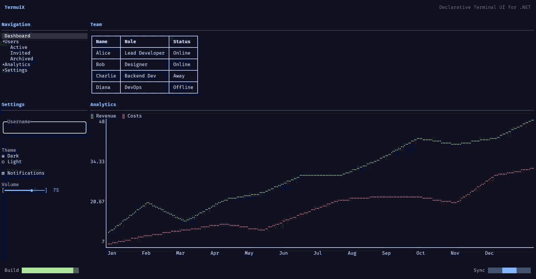
- TermuiX.Demo16 - Modern dashboard with all widgets (the README screenshot)
- TermuiX.FileManager2 - Modern TUI file manager with TreeView, tabs, context menu, file operations
- TermuiX.AiChat - AI chat interface with markdown rendering
Run a sample:
dotnet run --project samples/TermuiX.Demo16
License
MIT License - see LICENSE file for details.
| Product | Versions Compatible and additional computed target framework versions. |
|---|---|
| .NET | net9.0 is compatible. net9.0-android was computed. net9.0-browser was computed. net9.0-ios was computed. net9.0-maccatalyst was computed. net9.0-macos was computed. net9.0-tvos was computed. net9.0-windows was computed. net10.0 is compatible. net10.0-android was computed. net10.0-browser was computed. net10.0-ios was computed. net10.0-maccatalyst was computed. net10.0-macos was computed. net10.0-tvos was computed. net10.0-windows was computed. |
Compatible target framework(s)
Included target framework(s) (in package)
Learn more about Target Frameworks and .NET Standard.
-
net10.0
- No dependencies.
-
net9.0
- No dependencies.
NuGet packages
This package is not used by any NuGet packages.
GitHub repositories
This package is not used by any popular GitHub repositories.
Fix ScrollToWidget position calculation for nested widgets.