Syncfusion.Blazor.Layouts
33.2.5
Prefix Reserved
dotnet add package Syncfusion.Blazor.Layouts --version 33.2.5
NuGet\Install-Package Syncfusion.Blazor.Layouts -Version 33.2.5
<PackageReference Include="Syncfusion.Blazor.Layouts" Version="33.2.5" />
<PackageVersion Include="Syncfusion.Blazor.Layouts" Version="33.2.5" />
<PackageReference Include="Syncfusion.Blazor.Layouts" />
paket add Syncfusion.Blazor.Layouts --version 33.2.5
#r "nuget: Syncfusion.Blazor.Layouts, 33.2.5"
#:package Syncfusion.Blazor.Layouts@33.2.5
#addin nuget:?package=Syncfusion.Blazor.Layouts&version=33.2.5
#tool nuget:?package=Syncfusion.Blazor.Layouts&version=33.2.5
Syncfusion® Blazor Layout Components
A comprehensive suite of Blazor layout components for building dashboard grids, resizable pane layouts, and timeline visualizations. Includes Dashboard Layout, Splitter, and Timeline components.
Supported components
This package includes the following components:
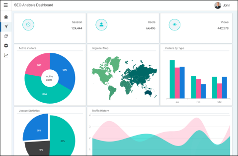
Blazor Dashboard Layout component
The Blazor Dashboard Layout component is a grid-structured layout component that helps create static and dynamic dashboard layouts with panels.
Key features:
- Grid-Based Layout: Organize dashboard panels in a flexible grid structure
- Dynamic Panels: Add, remove, and manage dashboard panels programmatically or at runtime
- Drag and Drop: Reorder and rearrange panels within the grid layout
- Resizing: Resize panels to adjust their dimensions dynamically
- Collapsible Panels: Minimize or maximize panels to save space
- Panel Persistence: Save and restore dashboard layout preferences
- Responsive Design: Adapt to different screen sizes and orientations
- Custom Templates: Rich templates for panel content rendering
Documentation:
- Getting Started with Blazor Web App
- Getting Started with Blazor WebAssembly App
- Feature Overview
- Live Demos
- API Reference
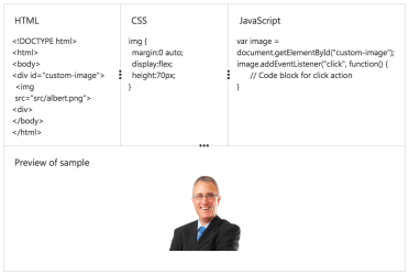
Blazor Splitter component
The Blazor Splitter component is a layout UI that provides resizable, expandable, collapsible, and nestable panes for building complex application layouts.
Key features:
- Resizable Panes: Adjust pane dimensions with a draggable splitter bar
- Expandable/Collapsible: Expand and collapse panes to manage space efficiently
- Nested Splitters: Create complex layouts with nested splitter panes
- Multiple Orientations: Support for horizontal and vertical pane layouts
- Custom Content: Embed any content or UI controls within panes
- Keyboard Navigation: Full keyboard support for accessibility
- Min/Max Sizes: Control minimum and maximum pane dimensions
- Persistence: Save and restore splitter pane state
Documentation:
- Getting Started with Blazor Web App
- Getting Started with Blazor WebAssembly App
- Feature Overview
- Live Demos
- API Reference
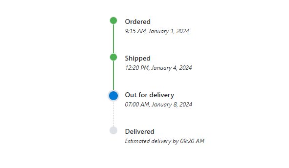
Blazor Timeline component
The Blazor Timeline component is a tool for displaying chronological information in a visually compelling way, ideal for showcasing user activities, tracking progress, or narrating historical timelines.
Key features:
- Chronological Display: Visualize events and activities in chronological order
- Vertical/Horizontal Layout: Display timeline vertically or horizontally
- Customizable Icons: Use custom icons and styles for timeline events
- Data Binding: Bind to arrays, collections, and observable data sources
- Template Support: Rich templates for rendering timeline items and content
- Alternating Items: Display timeline items on alternating sides
- Responsive Design: Adapt to different screen sizes and orientations
- Accessibility: Full keyboard navigation and ARIA support
Documentation:
- Getting Started with Blazor Web App
- Getting Started with Blazor WebAssembly App
- Feature Overview
- Live Demos
- API Reference
Add stylesheet and script references
- For Blazor Server App / Blazor Web App, add these to
Components/App.razororApp.razorfile. - For Blazor WebAssembly App, add these to
wwwroot/index.htmlfile.
<link href="_content/Syncfusion.Blazor.Themes/bootstrap5.css" rel="stylesheet" />
<script src="_content/Syncfusion.Blazor.Core/scripts/syncfusion-blazor.min.js" type="text/javascript"></script>
Quick start
Register the Syncfusion® Blazor services in the Program.cs file.
using Syncfusion.Blazor;

builder.Services.AddSyncfusionBlazor();
Dashboard Layout
@using Syncfusion.Blazor.Layouts

<SfDashboardLayout>
    <DashboardLayoutPanels>
        <DashboardLayoutPanel>
        </DashboardLayoutPanel>
    </DashboardLayoutPanels>
</SfDashboardLayout>
Splitter
<div>Horizontal Splitter</div>

<SfSplitter Height="240px" Width="100%">
    <SplitterPanes>
        <SplitterPane>
            <ContentTemplate>
                <div class="centered-content"> Left Pane </div>
            </ContentTemplate>
        </SplitterPane>
        <SplitterPane>
            <ContentTemplate>
                <div class="centered-content"> Middle Pane </div>
            </ContentTemplate>
        </SplitterPane>
        <SplitterPane>
            <ContentTemplate>
                <div class="centered-content"> Right Pane </div>
            </ContentTemplate>
        </SplitterPane>
    </SplitterPanes>
</SfSplitter>

<style>
    .centered-content {
        display: flex;
        justify-content: center;
        align-items: center;
        height: 100%;
    }
</style>
Timeline
@using Syncfusion.Blazor.Layouts

<div style="height: 250px;">
    <SfTimeline>
        <TimelineItems>
            <TimelineItem></TimelineItem>
            <TimelineItem></TimelineItem>
            <TimelineItem></TimelineItem>
            <TimelineItem></TimelineItem>
        </TimelineItems>
    </SfTimeline>
</div>
Support
License
This is a commercial product and requires a paid license for possession or use. Review the Syncfusion® EULA.
About Syncfusion®
Syncfusion® provides 1600+ UI components and frameworks for web, mobile, and desktop development across multiple platforms:
- Web: Blazor | ASP.NET Core | ASP.NET MVC | JavaScript | Angular | React | Vue
Desktop: WinForms | WPF | WinUI
Learn more at www.syncfusion.com.
sales@syncfusion.com | Toll Free: 1-888-9-DOTNET
| Product | Versions Compatible and additional computed target framework versions. |
|---|---|
| .NET | net8.0 is compatible. net8.0-android was computed. net8.0-browser was computed. net8.0-ios was computed. net8.0-maccatalyst was computed. net8.0-macos was computed. net8.0-tvos was computed. net8.0-windows was computed. net9.0 is compatible. net9.0-android was computed. net9.0-browser was computed. net9.0-ios was computed. net9.0-maccatalyst was computed. net9.0-macos was computed. net9.0-tvos was computed. net9.0-windows was computed. net10.0 is compatible. net10.0-android was computed. net10.0-browser was computed. net10.0-ios was computed. net10.0-maccatalyst was computed. net10.0-macos was computed. net10.0-tvos was computed. net10.0-windows was computed. |
-
net10.0
- Syncfusion.Blazor.Core (>= 33.2.5)
- Syncfusion.Blazor.Data (>= 33.2.5)
-
net8.0
- Syncfusion.Blazor.Core (>= 33.2.5)
- Syncfusion.Blazor.Data (>= 33.2.5)
-
net9.0
- Syncfusion.Blazor.Core (>= 33.2.5)
- Syncfusion.Blazor.Data (>= 33.2.5)
NuGet packages (7)
Showing the top 5 NuGet packages that depend on Syncfusion.Blazor.Layouts:
| Package | Downloads |
|---|---|
|
Syncfusion.Blazor.SfPdfViewer
Provides support in the Syncfusion® Blazor PDF Viewer component to load PDF documents, add and edit annotations, and add and edit form fields within the PDF. |
|
|
Syncfusion.Blazor.FileManager
This package contains the Syncfusion® Blazor FileManager component. |
|
|
Syncfusion.Blazor.Gantt
This package contains the Syncfusion® Blazor Gantt component. |
|
|
CyberFrameword10_V2
CyberFrameword10_V2 |
|
|
AutoCore.Blazor
Package Description |
GitHub repositories
This package is not used by any popular GitHub repositories.
| Version | Downloads | Last Updated |
|---|---|---|
| 33.2.5 | 343 | 5/4/2026 |
| 33.2.4 | 2,125 | 4/27/2026 |
| 33.2.3 | 4,561 | 4/21/2026 |
| 33.1.49 | 6,214 | 4/13/2026 |
| 33.1.47 | 3,688 | 4/6/2026 |
| 33.1.46 | 2,485 | 3/30/2026 |
| 33.1.45 | 4,073 | 3/23/2026 |
| 33.1.44 | 9,061 | 3/16/2026 |
| 32.2.9 | 9,241 | 3/9/2026 |
| 32.2.8 | 5,509 | 3/2/2026 |
| 32.2.7 | 6,662 | 2/23/2026 |
| 32.2.5 | 6,914 | 2/16/2026 |
| 32.2.4 | 8,109 | 2/10/2026 |
| 32.2.3 | 10,429 | 2/5/2026 |
| 32.1.25 | 8,844 | 1/26/2026 |
| 32.1.24 | 6,079 | 1/19/2026 |
| 32.1.23 | 13,311 | 1/13/2026 |
| 32.1.22 | 6,487 | 1/5/2026 |
| 32.1.21 | 4,959 | 12/29/2025 |
| 32.1.20 | 3,157 | 12/23/2025 |