Syncfusion.Blazor.DropDowns
33.2.15
Prefix Reserved
dotnet add package Syncfusion.Blazor.DropDowns --version 33.2.15
NuGet\Install-Package Syncfusion.Blazor.DropDowns -Version 33.2.15
<PackageReference Include="Syncfusion.Blazor.DropDowns" Version="33.2.15" />
<PackageVersion Include="Syncfusion.Blazor.DropDowns" Version="33.2.15" />
<PackageReference Include="Syncfusion.Blazor.DropDowns" />
paket add Syncfusion.Blazor.DropDowns --version 33.2.15
#r "nuget: Syncfusion.Blazor.DropDowns, 33.2.15"
#:package Syncfusion.Blazor.DropDowns@33.2.15
#addin nuget:?package=Syncfusion.Blazor.DropDowns&version=33.2.15
#tool nuget:?package=Syncfusion.Blazor.DropDowns&version=33.2.15
Syncfusion® Blazor DropDown Components
A comprehensive suite of Blazor dropdown and selection components for single/multi-select, autocomplete, and list-based input. Includes DropDownList, MultiSelect Dropdown, ListBox, ComboBox, AutoComplete, and Mention components.
Supported components
This package includes the following components:
- Blazor DropDownList
- Blazor MultiSelect Dropdown
- Blazor ListBox
- Blazor ComboBox
- Blazor AutoComplete
- Blazor Mention
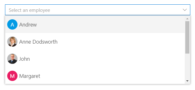
Blazor DropDownList component
The Blazor DropDownList component is a replacement for HTML select tags with rich styling and powerful data binding capabilities.
Key features:
- Data Binding: Bind to local arrays, IEnumerable, API responses, and observable collections
- Single Selection: Non-editable selection of one value from a predefined list
- Filtering: Real-time text search with highlight matching in dropdown
- Grouping: Group items by category or custom field with collapsible groups
- Templates: Custom item , header , footer and value templates for rich content rendering
- Cascading: Dependent dropdowns with hierarchical data relationships
- Keyboard Navigation: Full keyboard support (Arrow keys, Enter, Escape) for accessibility
- UI Customization: Custom CSS, themes, and styling options for seamless integration
- Virtual Scrolling: Efficiently handles large datasets by loading items on demand, ensuring smooth scrolling performance
Documentation:
- Getting Started with Blazor Web App
- Getting Started with Blazor WebAssembly App
- Feature Overview
- Live Demos
- API Reference
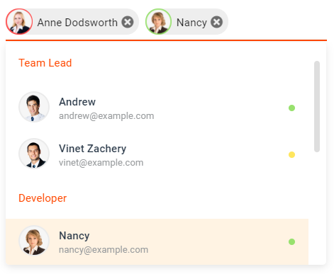
Blazor MultiSelect Dropdown component
The Blazor MultiSelect Dropdown component enables selection of multiple values with checkboxes, tags display, and text filtering.
Key features:
- Multi-Select Support: Select and deselect multiple items simultaneously
- Checkbox Mode: Visual checkboxes for clear selection state indication
- Tag Display: Selected values shown as removable tags in input area
- Text Filtering: Type to filter and search within the dropdown list
- Grouping: Organize items into collapsible category groups
- Custom Tagging: Allow users to add custom values beyond predefined options
- Select All: Bulk selection/deselection of all available items
- Accessibility: Full keyboard navigation and ARIA support for screen readers
- Virtual Scrolling: Efficiently handles large datasets by loading items on demand, ensuring smooth scrolling performance
Documentation:
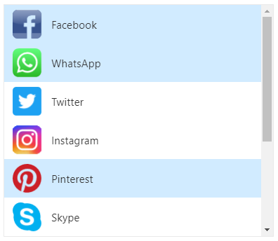
Blazor ListBox component
The Blazor ListBox component displays a scrollable list of items with multi-selection, drag-drop, and reordering capabilities.
Key features:
- Multi-Selection: Select one or multiple items with checkbox support
- Drag and Drop: Reorder items within the list or between ListBoxes
- Keyboard Navigation: Arrow keys, Shift+Click, and Ctrl+Click for multi-selection
- Sorting: Built-in ascending/descending sort functionality
- Grouping: Organize items into category groups with collapsible headers
- Reordering: Move selected items up/down with toolbar buttons
- Custom Templates: Rich templates for item rendering with HTML content
- Accessibility: Full keyboard support and ARIA labels for screen readers
Documentation:
- Getting Started with Blazor Web App
- Getting Started with Blazor WebAssembly App
- Feature Overview
- Live Demos
- API Reference
Blazor ComboBox component
The Blazor ComboBox component is an editable dropdown combining text input with a filtered suggestion list for flexible selection.
Key features:
- Editable Input: Type custom values or select from predefined options
- Filtering: Real-time search and filtering as user types in the input
- Data Binding: Support for arrays, API data, and observable collections
- Grouping: Organize dropdown items into category groups
- Cascading: Link multiple ComboBoxes for dependent data relationships
- Custom Templates: Rich item and header templates for enhanced presentation
- Keyboard Navigation: Full keyboard support with autocomplete suggestions
- Accessibility: ARIA labels, screen reader support, and keyboard-only navigation
- Virtual Scrolling: Efficiently handles large datasets by loading items on demand, ensuring smooth scrolling performance
Documentation:
- Getting Started with Blazor Web App
- Getting Started with Blazor WebAssembly App
- Feature Overview
- Live Demos
- API Reference
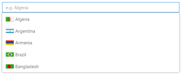
Blazor AutoComplete component
The Blazor AutoComplete Component provides intelligent suggestions as users type, streamlining data entry with predictive input.
Key features:
- Typeahead Suggestions: Display matching items as user types for faster selection
- Text Filtering: Highlight matching text with case-sensitive and case-insensitive options
- Data Binding: Bind to arrays, IEnumerable, API responses, and observables
- Grouping: Organize suggestions into category groups with headers
- Debounce Support: Optimize performance with configurable debounce intervals
- Min Characters: Require minimum characters before showing suggestions
- Custom Templates: Rich templates for suggestion rendering with HTML content
- Accessibility: Full keyboard navigation and ARIA support for screen readers
- Virtual Scrolling: Efficiently handles large datasets by loading items on demand, ensuring smooth scrolling performance
Documentation:
- Getting Started with Blazor Web App
- Getting Started with Blazor WebAssembly App
- Feature Overview
- Live Demos
- API Reference
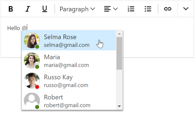
Blazor Mention component
The Blazor Mention component enables user tagging and mentions similar to social media platforms, triggered by @ or custom symbols.
Key features:
- Mention Triggers: Customize mention character (@ by default) to activate suggestions
- Tagging Support: Tag users or items with @ mention similar to Facebook and Twitter
- Suggestion List: Display filtered suggestions as user types the mention character
- Data Binding: Bind to arrays, API data, and observable collections for mentions
- Grouping: Organize mentions into category groups with collapsible headers
- Custom Patterns: Support multiple mention patterns (@ for users, # for topics, etc.)
- Rich Templates: Custom templates for rendering mention suggestions and content
- Accessibility: Full keyboard navigation and ARIA support for screen readers
Documentation:
- Getting Started with Blazor Web App
- Getting Started with Blazor WebAssembly App
- Feature Overview
- Live Demos
- API Reference
Add stylesheet and script references
- For Blazor Server App / Blazor Web App, add these to
Components/App.razororApp.razorfile. - For Blazor WebAssembly App, add these to
wwwroot/index.htmlfile.
<link href="_content/Syncfusion.Blazor.Themes/bootstrap5.css" rel="stylesheet" />
<script src="_content/Syncfusion.Blazor.Core/scripts/syncfusion-blazor.min.js" type="text/javascript"></script>
Quick start
Register the Syncfusion® Blazor services in the Program.cs file.
using Syncfusion.Blazor;

builder.Services.AddSyncfusionBlazor();
AutoComplete
<SfAutoComplete TValue="string" TItem="Country" Placeholder="e.g. Australia" DataSource="@LocalData">
    <AutoCompleteFieldSettings Value="Name" />
</SfAutoComplete>

@code {

    public class Country
    {
        public string Name { get; set; }
        public string Code { get; set; }
    }

    List<Country> LocalData = new List<Country> {
        new Country() { Name = "Australia", Code = "AU" },
        new Country() { Name = "Bermuda", Code = "BM" },
        new Country() { Name = "Canada", Code = "CA" },
        new Country() { Name = "Cameroon", Code = "CM" },
        new Country() { Name = "Denmark", Code = "DK" }
    };
}
ComboBox
<SfComboBox TValue="string" TItem="Games" Placeholder="Select a game" DataSource="@LocalData">
    <ComboBoxFieldSettings Value="ID" Text="Text"></ComboBoxFieldSettings>
</SfComboBox>

@code {
  public class Games
  {
    public string ID { get; set; }
    public string Text { get; set; }
  }
  List<Games> LocalData = new List<Games> {
    new Games() { ID= "Game1", Text= "American Football" },
    new Games() { ID= "Game2", Text= "Badminton" },
    new Games() { ID= "Game3", Text= "Basketball" },
    new Games() { ID= "Game4", Text= "Cricket" },
    new Games() { ID= "Game5", Text= "Football" },
    new Games() { ID= "Game6", Text= "Golf" },
    new Games() { ID= "Game7", Text= "Hockey" },
    new Games() { ID= "Game8", Text= "Rugby"},
    new Games() { ID= "Game9", Text= "Snooker" },
    new Games() { ID= "Game10", Text= "Tennis"},
  };
}
DropDownList
<SfDropDownList TValue="string" TItem="Games" Placeholder="Select a game" DataSource="@LocalData">
  <DropDownListFieldSettings Value="ID" Text="Text"></DropDownListFieldSettings>
</SfDropDownList>

@code {
  public class Games
  {
    public string ID { get; set; }
    public string Text { get; set; }
  }
  List<Games> LocalData = new List<Games> {
    new Games() { ID= "Game1", Text= "American Football" },
    new Games() { ID= "Game2", Text= "Badminton" },
    new Games() { ID= "Game3", Text= "Basketball" },
    new Games() { ID= "Game4", Text= "Cricket" },
    new Games() { ID= "Game5", Text= "Football" },
    new Games() { ID= "Game6", Text= "Golf" },
    new Games() { ID= "Game7", Text= "Hockey" },
    new Games() { ID= "Game8", Text= "Rugby"},
    new Games() { ID= "Game9", Text= "Snooker" },
    new Games() { ID= "Game10", Text= "Tennis"},
  };
}
ListBox
<SfListBox TValue="string[]" DataSource="@Vehicles" TItem="VehicleData">
    <ListBoxFieldSettings Text="Text" Value="Id" />
</SfListBox>
@code {
    public List<VehicleData> Vehicles = new List<VehicleData> {
        new VehicleData { Text = "Hennessey Venom", Id = "Vehicle-01" },
        new VehicleData { Text = "Bugatti Chiron", Id = "Vehicle-02" },
        new VehicleData { Text = "Bugatti Veyron Super Sport", Id = "Vehicle-03" },
        new VehicleData { Text = "SSC Ultimate Aero", Id = "Vehicle-04" },
        new VehicleData { Text = "Koenigsegg CCR", Id = "Vehicle-05" },
        new VehicleData { Text = "McLaren F1", Id = "Vehicle-06" },
        new VehicleData { Text = "Aston Martin One- 77", Id = "Vehicle-07" },
        new VehicleData { Text = "Jaguar XJ220", Id = "Vehicle-08" }
    };

    public class VehicleData {
      public string Text { get; set; }
      public string Id { get; set; }
    }
}
Mention
<SfMention TItem="PersonData" DataSource="@EmailData">
    <TargetComponent>
        <div id="commentsMention" placeHolder="Type @@ and tag user" ></div>
    </TargetComponent>
    <ChildContent>
        <MentionFieldSettings Text="Name"></MentionFieldSettings>
    </ChildContent>
</SfMention>
<style>
    #commentsMention {
        min-height: 100px;
        border: 1px solid #D7D7D7;
        border-radius: 4px;
        padding: 8px;
        font-size: 14px;
        width: 600px;
    }

    div#commentsMention[placeholder]:empty:before {
        content: attr(placeholder);
        color: #555;
    }
</style>
@code {
    public class PersonData
    {
        public string Name { get; set; }
        public string EmailId { get; set; }
        public string EmployeeImage { get; set; }
    }
    List<PersonData> EmailData = new List<PersonData> {
    new PersonData() { Name="Selma Rose", EmployeeImage="7", EmailId="selma@gmail.com" },
    new PersonData() { Name="Russo Kay", EmployeeImage="8", EmailId="russo@gmail.com" },
    new PersonData() { Name="Camden Kate", EmployeeImage="9", EmailId="camden@gmail.com" }
  };
}
MultiSelect
<SfMultiSelect TValue="string[]" TItem="Games" Placeholder="Favorite Sports" DataSource="@LocalData">
    <MultiSelectFieldSettings Text="Text" Value="ID"></MultiSelectFieldSettings>
</SfMultiSelect>

@code {

    public class Games
    {
        public string ID { get; set; }
        public string Text { get; set; }
    }
    List<Games> LocalData = new List<Games> {
    new Games() { ID= "Game1", Text= "American Football" },
    new Games() { ID= "Game2", Text= "Badminton" },
    new Games() { ID= "Game3", Text= "Basketball" },
    new Games() { ID= "Game4", Text= "Cricket" },
    new Games() { ID= "Game5", Text= "Football" },
    new Games() { ID= "Game6", Text= "Golf" },
    new Games() { ID= "Game7", Text= "Hockey" },
    new Games() { ID= "Game8", Text= "Rugby"},
    new Games() { ID= "Game9", Text= "Snooker" },
    new Games() { ID= "Game10", Text= "Tennis"},
    };
}
Support
License
This is a commercial product and requires a paid license for possession or use. Review the Syncfusion® EULA.
About Syncfusion®
Syncfusion® provides 1600+ UI components and frameworks for web, mobile, and desktop development across multiple platforms:
Web: Blazor | ASP.NET Core | ASP.NET MVC | JavaScript | Angular | React | Vue
Desktop: WinForms | WPF | WinUI
Learn more at www.syncfusion.com.
sales@syncfusion.com | Toll Free: 1-888-9-DOTNET
| Product | Versions Compatible and additional computed target framework versions. |
|---|---|
| .NET | net8.0 is compatible. net8.0-android was computed. net8.0-browser was computed. net8.0-ios was computed. net8.0-maccatalyst was computed. net8.0-macos was computed. net8.0-tvos was computed. net8.0-windows was computed. net9.0 is compatible. net9.0-android was computed. net9.0-browser was computed. net9.0-ios was computed. net9.0-maccatalyst was computed. net9.0-macos was computed. net9.0-tvos was computed. net9.0-windows was computed. net10.0 is compatible. net10.0-android was computed. net10.0-browser was computed. net10.0-ios was computed. net10.0-maccatalyst was computed. net10.0-macos was computed. net10.0-tvos was computed. net10.0-windows was computed. |
-
net10.0
- Syncfusion.Blazor.Buttons (>= 33.2.15)
- Syncfusion.Blazor.Core (>= 33.2.15)
- Syncfusion.Blazor.Data (>= 33.2.15)
- Syncfusion.Blazor.Inputs (>= 33.2.15)
- Syncfusion.Blazor.Notifications (>= 33.2.15)
- Syncfusion.Blazor.Spinner (>= 33.2.15)
-
net8.0
- Syncfusion.Blazor.Buttons (>= 33.2.15)
- Syncfusion.Blazor.Core (>= 33.2.15)
- Syncfusion.Blazor.Data (>= 33.2.15)
- Syncfusion.Blazor.Inputs (>= 33.2.15)
- Syncfusion.Blazor.Notifications (>= 33.2.15)
- Syncfusion.Blazor.Spinner (>= 33.2.15)
-
net9.0
- Syncfusion.Blazor.Buttons (>= 33.2.15)
- Syncfusion.Blazor.Core (>= 33.2.15)
- Syncfusion.Blazor.Data (>= 33.2.15)
- Syncfusion.Blazor.Inputs (>= 33.2.15)
- Syncfusion.Blazor.Notifications (>= 33.2.15)
- Syncfusion.Blazor.Spinner (>= 33.2.15)
NuGet packages (26)
Showing the top 5 NuGet packages that depend on Syncfusion.Blazor.DropDowns:
| Package | Downloads |
|---|---|
|
Syncfusion.Blazor.Navigations
Syncfusion® Provides Blazor navigation and menu components for building interactive navigation structures. Includes Accordion, Sidebar, Tabs, Menu Bar, Context Menu, Toolbar, and Tree View with support for keyboard navigation, accessibility features, and customizable templates. |
|
|
Syncfusion.Blazor.Grid
Syncfusion® Blazor DataGrid component for rendering high-performance, feature-rich tabular UI in .NET Blazor applications. Includes virtualization, paging, sorting, filtering, grouping, editing, templates, and export (Excel/PDF). |
|
|
Syncfusion.Blazor.InPlaceEditor
Provides a Syncfusion® Blazor In-Place Editor component for inline and popup editing scenarios. Supports multiple input types including TextBox, Dropdown, DatePicker, and Rich Text Editor. Optimized for seamless integration in both Blazor Server and Blazor WebAssembly applications. |
|
|
Syncfusion.Blazor.Schedule
Syncfusion® Blazor Scheduler component for managing appointments and calendars in .NET Blazor apps. Supports multiple views, recurrence, time zones, resource grouping, drag-and-drop, and export. |
|
|
Syncfusion.Blazor.WordProcessor
This package provides the functionality to utilize the features of Syncfusion® Blazor Word Processor (Document Editor) component and more. |
GitHub repositories
This package is not used by any popular GitHub repositories.
| Version | Downloads | Last Updated |
|---|---|---|
| 33.2.15 | 4,115 | 6/23/2026 |
| 33.2.13 | 5,674 | 6/16/2026 |
| 33.2.12 | 11,117 | 6/9/2026 |
| 33.2.10 | 6,561 | 6/2/2026 |
| 33.2.8 | 6,404 | 5/26/2026 |
| 33.2.7 | 8,207 | 5/19/2026 |
| 33.2.6 | 10,801 | 5/12/2026 |
| 33.2.5 | 15,605 | 5/4/2026 |
| 33.2.4 | 11,547 | 4/27/2026 |
| 33.2.3 | 19,093 | 4/21/2026 |
| 33.1.49 | 15,120 | 4/13/2026 |
| 33.1.47 | 13,959 | 4/6/2026 |
| 33.1.46 | 6,562 | 3/30/2026 |
| 33.1.45 | 10,402 | 3/23/2026 |
| 33.1.44 | 21,832 | 3/16/2026 |
| 32.2.9 | 19,171 | 3/9/2026 |
| 32.2.8 | 13,191 | 3/2/2026 |
| 32.2.7 | 20,013 | 2/23/2026 |
| 32.2.5 | 13,347 | 2/16/2026 |
| 32.2.4 | 24,509 | 2/10/2026 |