Syncfusion.Blazor.Calendars
35.1.40
Prefix Reserved
dotnet add package Syncfusion.Blazor.Calendars --version 35.1.40
NuGet\Install-Package Syncfusion.Blazor.Calendars -Version 35.1.40
<PackageReference Include="Syncfusion.Blazor.Calendars" Version="35.1.40" />
<PackageVersion Include="Syncfusion.Blazor.Calendars" Version="35.1.40" />
<PackageReference Include="Syncfusion.Blazor.Calendars" />
paket add Syncfusion.Blazor.Calendars --version 35.1.40
#r "nuget: Syncfusion.Blazor.Calendars, 35.1.40"
#:package Syncfusion.Blazor.Calendars@35.1.40
#addin nuget:?package=Syncfusion.Blazor.Calendars&version=35.1.40
#tool nuget:?package=Syncfusion.Blazor.Calendars&version=35.1.40
Syncfusion Blazor Calendar components
A comprehensive suite of Blazor date and time picker components for calendar selection, date range picking, and time input. Includes Calendar, DatePicker, DateRangePicker, DateTime Picker, and TimePicker components.
Using this package with an AI coding agent
Before generating Syncfusion code, ask your AI coding agent to run the Syncfusion setup using the following prompt:
Set up this project for Syncfusion before generating code. Fetch and follow the official instructions at https://ai.syncfusion.com, then report the detected platform, installed skill pack, MCP status, and any required licensing action.The setup detects your project's platform and loads the appropriate Syncfusion skill pack. No Syncfusion account or MCP key is required to install or read Syncfusion agent skills.
Platform reference: https://ai.syncfusion.com/blazor/llms.txt
Supported components
This package includes the following components:
Blazor Calendar component
The Blazor Calendar component displays an interactive calendar with support for month, year, and decade views for quick date navigation.
Key features
- Multiple view modes: Month, year, and decade views for flexible date navigation
- Date restriction: Minimum/maximum dates and disabled date ranges for validation
- Range selection: Highlight date ranges with custom styling
- Week numbers: Display ISO week numbers in calendar grid
- Custom formats: Flexible date formatting and localization support
- Range navigation: Efficiently navigate through large date ranges
- Weekend highlighting: Visual distinction for weekends vs. weekdays
- Accessibility: Full keyboard navigation and ARIA support for screen readers
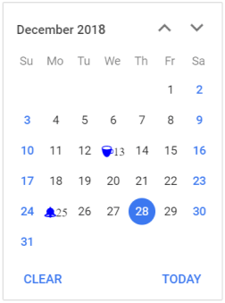
Documentation
- Getting Started with Blazor Web App
- Getting Started with Blazor WebAssembly App
- Blazor Calendar component features overview
- Blazor Calendar component demos
- API reference
- Blazor Calendar component tutorial videos
Blazor DatePicker component
The Blazor DatePicker component is a lightweight, mobile-friendly component for date selection with text input and calendar popup.
Key features
- Text input with popup: Type or select dates from interactive calendar popup
- Multiple view modes: Month, year, and decade views for quick date navigation
- Date validation: Minimum/maximum dates and disabled date ranges support
- Format customization: Multiple date format options with localization
- Placeholder support: Custom placeholder text for better UX
- Input masking: Supports masked input to enforce consistent and error‑free date/time entry.
- Keyboard navigation: Arrow keys, Enter, and Tab support for hands-free input
- Mobile optimization: Touch-friendly interface for mobile and tablet devices
- Accessibility: ARIA labels and screen reader compatibility
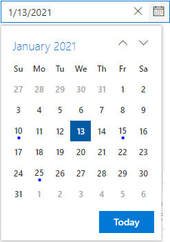
Documentation
- Getting Started with Blazor Web App
- Getting Started with Blazor WebAssembly App
- Blazor DatePicker component features overview
- Blazor DatePicker component demos
- API reference
- Blazor DatePicker component tutorial videos
Blazor DateRangePicker component
The Blazor DateRangePicker component allows users to select start and end dates as a continuous range from dual calendars or text input.
Key features
- Dual calendar display: Side-by-side calendars for intuitive range selection
- Text input support: Enter or select dates directly in input fields
- Range highlight: Visual highlighting of selected date range
- Predefined ranges: Quick-select options for common ranges (Last 7 days, etc.)
- Date validation: Enforce minimum/maximum dates and disabled ranges
- Single calendar mode: Option to display one calendar for compact layouts
- Format flexibility: Custom date formatting with localization support
- Accessibility: Full keyboard navigation and screen reader support
- Input masking: Supports masked input to enforce consistent and error‑free date/time entry.
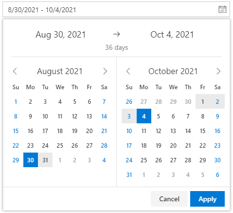
Documentation
- Getting Started with Blazor Web App
- Getting Started with Blazor WebAssembly App
- Blazor DateRangePicker component features overview
- Blazor DateRangePicker component demos
- API reference
- Blazor DateRangePicker component tutorial videos
Blazor DateTime Picker component
The Blazor DateTime Picker component is a lightweight and mobile-friendly component that allows users to enter or select date and time values from a pop-up calendar and drop-down time list.
Key features
- Combined selection: Interactive calendar popup for date selection and time picker popup for time selection
- Multiple view modes: Month, year, and decade views for date navigation
- Time dropdown: Configurable time intervals (15 min, 30 min, 1 hour, etc.)
- Date/Time validation: Enforce minimum/maximum datetime ranges
- Format customization: Custom date-time formatting with localization
- Accessibility: Complete keyboard navigation and ARIA support
- Input masking: Supports masked input to enforce consistent and error‑free date/time entry.
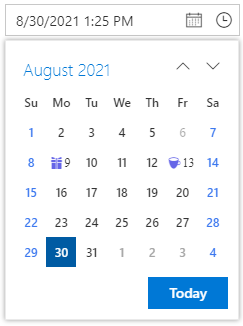
Documentation
- Getting Started with Blazor Web App
- Getting Started with Blazor WebAssembly App
- Blazor DateTime Picker component features overview
- Blazor DateTime Picker component demos
- API reference
Blazor TimePicker component
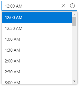
The Blazor TimePicker component is a lightweight and mobile-friendly component that allows end users to select a time value either from a pop-up time list or by entering the value directly in the text box.
Key features
- Time dropdown list: Select from predefined time intervals in dropdown
- Text input support: Type time directly with format validation
- Interval control: Configurable time intervals (15 min, 30 min, 1 hour, etc.)
- Format flexibility: Support for 12-hour and 24-hour time formats
- Time validation: Enforce minimum/maximum time constraints
- Cascading support: Coordinate with other time pickers for range selection
- Keyboard navigation: Arrow keys, Enter, and Tab support for efficient input
- Accessibility: Full ARIA support and screen reader compatibility
- Input masking: Supports masked input to enforce consistent and error‑free date/time entry.
Documentation
- Getting Started with Blazor Web App
- Getting Started with Blazor WebAssembly App
- Blazor TimePicker component features overview
- Blazor TimePicker component demos
- API reference
- Blazor TimePicker component tutorial videos
System requirements
- .NET 8.0 or later (Blazor Server App, Blazor Web App, Blazor WebAssembly App, Blazor Hybrid App)
- See full requirements: system requirements
Installation
Install the Calendars package and the themes package, which provides the stylesheets referenced below:
dotnet add package Syncfusion.Blazor.Calendars
dotnet add package Syncfusion.Blazor.Themes
Add stylesheet and script references
For Blazor Server App / Blazor Web App, add these to Components/App.razor or App.razor. For Blazor WebAssembly App, add these to wwwroot/index.html:
<link href="_content/Syncfusion.Blazor.Themes/fluent2.css" rel="stylesheet" />
<script src="_content/Syncfusion.Blazor.Core/scripts/syncfusion-blazor.min.js" type="text/javascript"></script>
Quick start
Register the Syncfusion Blazor service in Program.cs:
using Syncfusion.Blazor;

builder.Services.AddSyncfusionBlazor();
Calendar
<SfCalendar TValue="DateTime" Min='@MinDate' Value='@DateValue' Max='@MaxDate'></SfCalendar>

@code{
    public DateTime MinDate {get;set;} = new DateTime(DateTime.Now.Year, DateTime.Now.Month, 05);
    public DateTime MaxDate {get;set;} = new DateTime(DateTime.Now.Year, DateTime.Now.Month, 27);
    public DateTime DateValue {get;set;} = new DateTime(DateTime.Now.Year, DateTime.Now.Month, 15);
}
DatePicker
<SfDatePicker TValue="DateTime?" Value='@DateValue' Min='@MinDate' Max='@MaxDate'></SfDatePicker>

@code {
    public DateTime? DateValue {get;set;} = new DateTime(DateTime.Now.Year,DateTime.Now.Month,10);
    public DateTime MinDate {get;set;} = new DateTime(DateTime.Now.Year,DateTime.Now.Month,05);
    public DateTime MaxDate {get;set;} = new DateTime(DateTime.Now.Year, DateTime.Now.Month, 27);
}
DateRangePicker
<SfDateRangePicker TValue="DateTime?" Placeholder="Choose a Range" Min="@MinDate" Max="@MaxDate"></SfDateRangePicker>

@code {
    public DateTime MinDate {get;set;} = new DateTime(2017, 01, 05);
    public DateTime MaxDate {get;set;} = new DateTime(2017, 12, 20);
}
DateTimePicker
<SfDateTimePicker TValue="DateTime?" Value="@DateValue" Min="@MinDate" Max="@MaxDate"></SfDateTimePicker>

@code{
    public DateTime? DateValue {get;set;} = new DateTime(DateTime.Now.Year,DateTime.Now.Month,10);
    public DateTime MinDate {get;set;} = new DateTime(DateTime.Now.Year,DateTime.Now.Month,05);
    public DateTime MaxDate {get;set;} = new DateTime(DateTime.Now.Year, DateTime.Now.Month, 27);
}
TimePicker
<SfTimePicker TValue="DateTime?" Value="@TimeValue" Step=60 Format="HH:mm"></SfTimePicker>

@code {
    public DateTime TimeValue { get; set; } = DateTime.Now;
}
Support and feedback
- For queries, reach our Syncfusion support team or post them through the community forums.
- Request new features through the Syncfusion feedback portal.
Other popular Blazor components
Explore other popular Syncfusion Blazor components curated from UI components, standalone SDKs, and document solution suites.
| UI components | Standalone UI SDK's | Document processing |
|---|---|---|
| Blazor DataGrid | Blazor Gantt Chart | Blazor DOCX Editor |
| Blazor TreeGrid | Blazor Diagram | Blazor Document |
| Blazor Map | Blazor Scheduler | Blazor PDF Viewer |
| Blazor File Manager | Blazor RichTextEditor | Blazor Spreadsheet Editor |
License
This is a commercial product and requires a paid license for possession or use. Syncfusion licensed software, including this component, is subject to the terms and conditions of the Syncfusion EULA. You can purchase a license here or start a free 30-day trial here.
About Syncfusion
Founded in 2001 and headquartered in Research Triangle Park, N.C., Syncfusion has more than 29,000 customers and more than 1 million users, including large financial institutions, Fortune 500 companies, and global IT consultancies.
Today, we provide 1800+ components and frameworks for web, mobile, and desktop development across multiple platforms:
Web: Blazor | ASP.NET Core | ASP.NET MVC | JavaScript | Angular | React | Vue
Desktop: WinForms | WPF | WinUI
Learn more at www.syncfusion.com.
sales@syncfusion.com | Toll Free: 1-888-9-DOTNET
| Product | Versions Compatible and additional computed target framework versions. |
|---|---|
| .NET | net8.0 is compatible. net8.0-android was computed. net8.0-browser was computed. net8.0-ios was computed. net8.0-maccatalyst was computed. net8.0-macos was computed. net8.0-tvos was computed. net8.0-windows was computed. net9.0 is compatible. net9.0-android was computed. net9.0-browser was computed. net9.0-ios was computed. net9.0-maccatalyst was computed. net9.0-macos was computed. net9.0-tvos was computed. net9.0-windows was computed. net10.0 is compatible. net10.0-android was computed. net10.0-browser was computed. net10.0-ios was computed. net10.0-maccatalyst was computed. net10.0-macos was computed. net10.0-tvos was computed. net10.0-windows was computed. |
-
net10.0
- Syncfusion.Blazor.Buttons (>= 35.1.40)
- Syncfusion.Blazor.Core (>= 35.1.40)
- Syncfusion.Blazor.Inputs (>= 35.1.40)
- Syncfusion.Blazor.Lists (>= 35.1.40)
-
net8.0
- Syncfusion.Blazor.Buttons (>= 35.1.40)
- Syncfusion.Blazor.Core (>= 35.1.40)
- Syncfusion.Blazor.Inputs (>= 35.1.40)
- Syncfusion.Blazor.Lists (>= 35.1.40)
-
net9.0
- Syncfusion.Blazor.Buttons (>= 35.1.40)
- Syncfusion.Blazor.Core (>= 35.1.40)
- Syncfusion.Blazor.Inputs (>= 35.1.40)
- Syncfusion.Blazor.Lists (>= 35.1.40)
NuGet packages (23)
Showing the top 5 NuGet packages that depend on Syncfusion.Blazor.Calendars:
| Package | Downloads |
|---|---|
|
Syncfusion.Blazor.Grid
Syncfusion® Blazor DataGrid component for rendering high-performance, feature-rich tabular UI in .NET Blazor applications. Includes virtualization, paging, sorting, filtering, grouping, editing, templates, and export (Excel/PDF). |
|
|
Syncfusion.Blazor.InPlaceEditor
Provides a Syncfusion® Blazor In-Place Editor component for inline and popup editing scenarios. Supports multiple input types including TextBox, Dropdown, DatePicker, and Rich Text Editor. Optimized for seamless integration in both Blazor Server and Blazor WebAssembly applications. |
|
|
Syncfusion.Blazor.Schedule
Syncfusion® Blazor Scheduler component for managing appointments and calendars in .NET Blazor apps. Supports multiple views, recurrence, time zones, resource grouping, drag-and-drop, and export. |
|
|
Syncfusion.Blazor.TreeGrid
Syncfusion® Blazor TreeGrid component for displaying hierarchical tabular data in .NET Blazor apps. Supports row hierarchy, sorting, filtering, paging, editing, virtualization, and export. |
|
|
Syncfusion.Blazor.WordProcessor
This package provides the functionality to utilize the features of Syncfusion® Blazor Word Processor (Document Editor) component and more. |
GitHub repositories
This package is not used by any popular GitHub repositories.
| Version | Downloads | Last Updated |
|---|---|---|
| 35.1.40 | 1,783 | 10/13/2026 |
| 35.1.39 | 2,896 | 10/6/2026 |
| 35.1.37 | 7,202 | 9/29/2026 |
| 34.2.9 | 10,096 | 9/21/2026 |
| 34.2.8 | 9,752 | 9/14/2026 |
| 34.2.7 | 8,021 | 9/8/2026 |
| 34.2.6 | 11,739 | 8/31/2026 |
| 34.2.5 | 7,846 | 8/25/2026 |
| 34.2.4 | 17,192 | 8/17/2026 |
| 34.2.3 | 13,579 | 8/11/2026 |
| 34.2.2 | 19,271 | 8/5/2026 |
| 34.1.33 | 17,164 | 7/27/2026 |
| 34.1.32 | 16,745 | 7/21/2026 |
| 34.1.31 | 16,126 | 7/14/2026 |
| 34.1.30 | 5,069 | 7/9/2026 |
| 34.1.29 | 23,514 | 7/6/2026 |
| 33.2.15 | 33,700 | 6/23/2026 |
| 33.2.13 | 12,639 | 6/16/2026 |
| 33.2.12 | 17,514 | 6/9/2026 |
| 33.2.10 | 7,507 | 6/2/2026 |