Plugin.Maui.NativeContextMenus
1.2.0
dotnet add package Plugin.Maui.NativeContextMenus --version 1.2.0
NuGet\Install-Package Plugin.Maui.NativeContextMenus -Version 1.2.0
<PackageReference Include="Plugin.Maui.NativeContextMenus" Version="1.2.0" />
<PackageVersion Include="Plugin.Maui.NativeContextMenus" Version="1.2.0" />
<PackageReference Include="Plugin.Maui.NativeContextMenus" />
paket add Plugin.Maui.NativeContextMenus --version 1.2.0
#r "nuget: Plugin.Maui.NativeContextMenus, 1.2.0"
#:package Plugin.Maui.NativeContextMenus@1.2.0
#addin nuget:?package=Plugin.Maui.NativeContextMenus&version=1.2.0
#tool nuget:?package=Plugin.Maui.NativeContextMenus&version=1.2.0
Plugin.Maui.NativeContextMenus

Plugin.Maui.NativeContextMenus adds native menus to views and to toolbar items in a .NET MAUI app.
.NET MAUI has a context menu (FlyoutBase.ContextFlyout) only on Windows and Mac Catalyst. This plugin gives the same function on iOS and Android.
Menu Types
The plugin has two types of menu. The two types use the same MenuNode items.
| Type | Where the menu opens | How to add it | Section |
|---|---|---|---|
| View context menu | On a view, on a long press or a tap | The NativeContextMenus.ContextMenu property |
View Context Menus |
| Toolbar menu | On a toolbar button of the page, on a tap | A NativeContextMenuToolbarItem in ToolbarItems |
Toolbar Menus |
Screenshots
These screenshots show the sample app. The same XAML makes the menus on the two platforms.
| Menu with sections | Submenu with a radio group | Menu on a list item | Menu on a tap | |
|---|---|---|---|---|
| iOS | 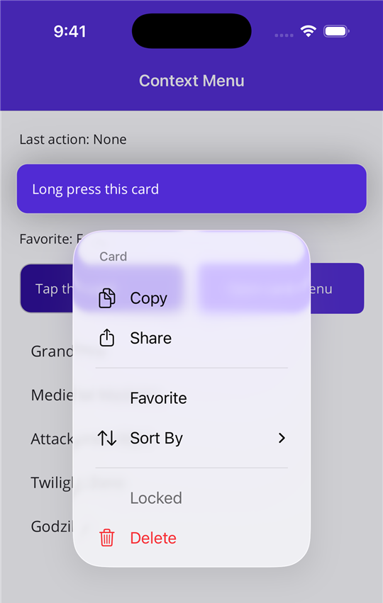 |
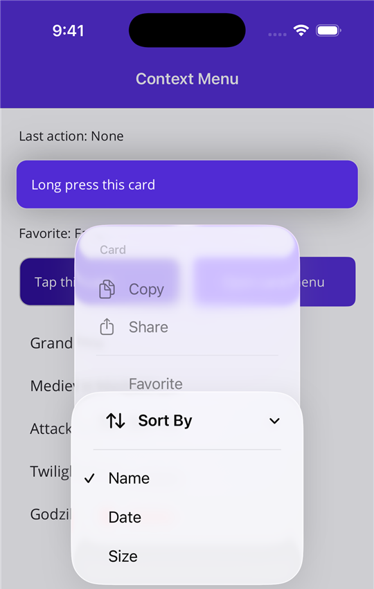 |
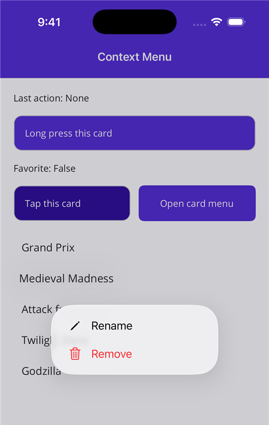 |
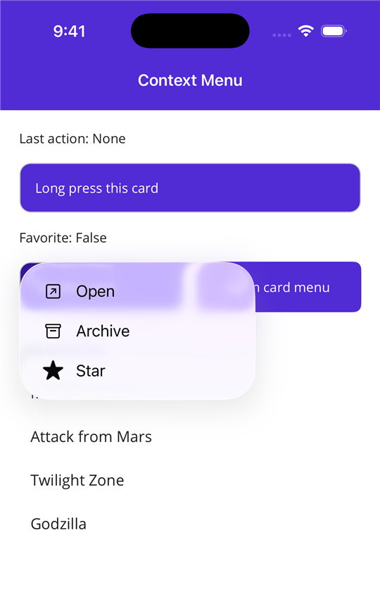 |
| Android | 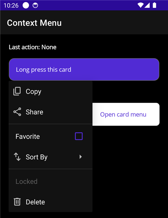 |
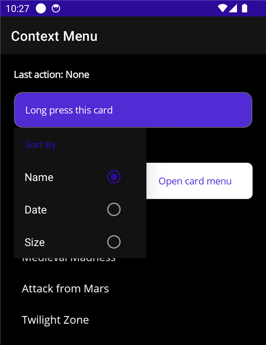 |
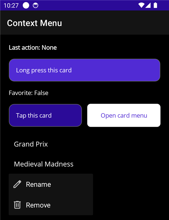 |
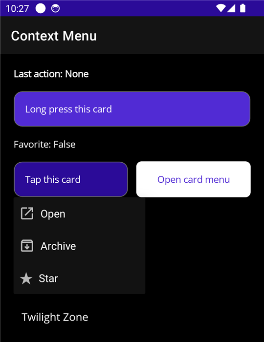 |
Supported Platforms
| Platform | Minimum version | Native control | Gesture |
|---|---|---|---|
| iOS | 17.4 | UIContextMenuInteraction with a UIMenu |
Long press or tap |
| Mac Catalyst | 17.4 | UIContextMenuInteraction with a UIMenu |
Secondary click or click |
| Android | API 21 | PopupMenu anchored to the view |
Long press or tap |
| Windows | Not supported | Use FlyoutBase.ContextFlyout |
On Windows, use the .NET MAUI context menu.
Supported .NET Versions
The package has assemblies for .NET 9 and .NET 10.
| App target | Minimum .NET MAUI version |
|---|---|
| .NET 9 | 9.0.0 |
| .NET 10 | 10.0.0 |
Installation
<PackageReference Include="Plugin.Maui.NativeContextMenus" Version="1.2.0" />
The menus do not need a registration call in MauiProgram.cs.
View Context Menus
Add the XML namespace to the page:
xmlns:cm="clr-namespace:Plugin.Maui.NativeContextMenus;assembly=Plugin.Maui.NativeContextMenus"
Set the NativeContextMenus.ContextMenu attached property on a view:
<Border>
    <Label Text="Long press this card" />

    <cm:NativeContextMenus.ContextMenu>
        <cm:NativeContextMenu Title="Card">
            <cm:MenuNode Title="Copy" SystemIcon="Copy" Command="{Binding CopyCommand}" />
            <cm:MenuNode Title="Share" SystemIcon="Share" Command="{Binding ShareCommand}" />


            <cm:MenuNode>
                <cm:MenuNode Title="Favorite" IsCheckable="True" IsChecked="{Binding IsFavorite, Mode=TwoWay}" />


                <cm:MenuNode Title="Sort By">
                    <cm:MenuNode Title="Name" GroupKey="sort" IsCheckable="True" IsChecked="True" />
                    <cm:MenuNode Title="Date" GroupKey="sort" IsCheckable="True" />
                </cm:MenuNode>
            </cm:MenuNode>

            <cm:MenuNode Title="Delete" SystemIcon="Delete" Destructive="True" Command="{Binding DeleteCommand}" />
        </cm:NativeContextMenu>
    </cm:NativeContextMenus.ContextMenu>
</Border>
The menu gets the BindingContext of the view. Thus bindings in a MenuNode work the same as bindings in the view.
List items
In an item template, the BindingContext is the item. Use a RelativeSource binding to get a command from the page view model. Send the item as the parameter.
<CollectionView ItemsSource="{Binding Machines}">
    <CollectionView.ItemTemplate>
        <DataTemplate>
            <Grid Padding="12">
                <Label Text="{Binding Name}" />

                <cm:NativeContextMenus.ContextMenu>
                    <cm:NativeContextMenu>
                        <cm:MenuNode Title="Remove"
                                     Destructive="True"
                                     Command="{Binding RemoveCommand, Source={RelativeSource AncestorType={x:Type local:MachinesViewModel}}}"
                                     CommandParameter="{Binding .}" />
                    </cm:NativeContextMenu>
                </cm:NativeContextMenus.ContextMenu>
            </Grid>
        </DataTemplate>
    </CollectionView.ItemTemplate>
</CollectionView>
Open the menu on a tap
Set Trigger to Tap. The default is LongPress.
<cm:NativeContextMenu Trigger="Tap">
    <cm:MenuNode Title="Open" SystemIcon="Open" Command="{Binding OpenCommand}" />
</cm:NativeContextMenu>
On iOS, a menu that opens on a tap does not show the preview of the view.
Open the menu from code
Give the menu a name and call Show. This works with the two triggers.
<cm:NativeContextMenu x:Name="CardMenu">
CardMenu.Show();
NativeContextMenus.Show(view) opens the menu of a view.
C#
var menu = new NativeContextMenu();
menu.Items.Add(new MenuNode { Title = "Copy", Command = copyCommand });
menu.Items.Add(new MenuNode { Title = "Delete", Destructive = true, Command = deleteCommand });

NativeContextMenus.SetContextMenu(label, menu);
Set the property to null to remove the menu.
API
NativeContextMenu
| Member | Description |
|---|---|
Items |
The top-level MenuNode items. This is the XAML content property. |
Title |
Header text. iOS and Mac Catalyst only. |
Trigger |
The gesture that opens the menu: LongPress (default) or Tap. |
Show() |
Opens the menu from code. |
ItemTapped |
Event. Occurs after the user taps a leaf node and its command runs. |
MenuNode
| Member | Description |
|---|---|
Title |
The text of the item. |
SystemIcon |
A system icon from the SystemIcon enum. Refer to Icons. |
SymbolName |
An SF Symbol name, for a symbol that SystemIcon does not have. |
Icon |
An image of your own. It has priority over SystemIcon. Refer to Icons. |
Command |
The command that runs when the user taps the item. |
CommandParameter |
The parameter for Command. |
IsEnabled |
false shows the item as disabled. |
IsVisible |
false removes the item from the menu. |
Destructive |
true shows the item in red. iOS and Mac Catalyst only. |
IsCheckable |
true gives the item a check mark state. |
IsChecked |
The check mark state. A tap changes this value before the command runs. |
GroupKey |
Checkable items with the same key are a radio group. A tap on one item clears the others. |
SelectedValue |
The Value of the checked child. Refer to Radio groups with a binding. |
Value |
The value of the item in the radio group of its parent. |
KeepMenuOpen |
true keeps the menu open after a tap. iOS and Mac Catalyst only. |
Children |
Child items. This is the XAML content property. |
Tapped |
Event. Occurs after the user taps the item. |
A node with Children and a Title is a submenu. A node with Children and no Title is an inline section.
The plugin builds the native menu each time the menu opens. As a result, the menu always shows the current property values.
Radio groups with a binding
Set SelectedValue on a node and Value on its children. The children that have a Value are a radio group. The child with a Value equal to SelectedValue has the check mark.
<cm:MenuNode Title="Sort By" SelectedValue="{Binding SortMode}">
    <cm:MenuNode Title="Name" Value="Name" />
    <cm:MenuNode Title="Date" Value="Date" />
</cm:MenuNode>
A tap on a child sets SelectedValue to the Value of that child. The binding is two-way, thus the view model gets the new value. If the view model changes the value, the menu shows the new selection the next time it opens.
SelectedValue can be a string, a number, or an enum. The plugin compares the text of the two values, thus Value="Date" is equal to an enum value Date, and Value="50" is equal to the number 50. When SelectedValue has a value, the plugin changes the Value of the tapped child to the same type.
For a radio group with no submenu, use a node with no Title. That node is an inline section.
Do not set IsCheckable, IsChecked, or GroupKey on a child that has a Value. The plugin sets them.
Bindings for the menu state
The plugin builds the native menu each time the menu opens. Thus a binding on IsVisible, IsEnabled, Title, or IsChecked controls what the menu shows.
<cm:MenuNode Title="Clear All" Command="{Binding ClearCommand}" IsVisible="{Binding HasItems}" />
<cm:MenuNode Title="Show Favorites" IsCheckable="True" IsChecked="{Binding ShowFavorites}" />
A binding on IsChecked and on SelectedValue is two-way by default.
Icons
SystemIcon is the easiest way to set an icon. It is an enum, thus the editor shows the values (Copy, Share, Delete, Edit, and more).
<cm:MenuNode Title="Delete" SystemIcon="Delete" />
| Property | iOS and Mac Catalyst | Android |
|---|---|---|
SystemIcon |
The SF Symbol for the value. | The Material Symbols icon for the value. The package includes these icons. |
SymbolName |
The SF Symbol with that name. | No icon. |
Icon |
FileImageSource (an image in the app bundle) or FontImageSource. |
FileImageSource (a drawable resource, which includes MauiImage files) or FontImageSource. |
To use an icon of your own, set Icon. It has priority over SystemIcon on all platforms. To show no icon, do not set an icon property.
Android shows menu icons on API 29 or later.
Known Limits
- Android shows a
PopupMenu. It does not show the lifted preview of the view that iOS shows. - On Android, the plugin sets the long click listener of the platform view (the click listener when
TriggerisTap). A view cannot have a different listener of that type at the same time. - On iOS, the plugin adds a clear button to the platform view. The button gets touches only when
TriggerisTap. - The menu of a parent view does not open from a child view that handles touch input itself (for example a
Button).
Toolbar Menus
NativeContextMenuToolbarItem is a ToolbarItem that opens a native menu on a tap. Add MenuNode items to it the same as for a context menu.
<ContentPage.ToolbarItems>
    <cm:NativeContextMenuToolbarItem Text="Filter">
        <cm:MenuNode Title="Sort By">
            <cm:MenuNode Title="Name" GroupKey="sort" IsCheckable="True" IsChecked="True"
                         Command="{Binding SortCommand}" CommandParameter="Name" />
            <cm:MenuNode Title="Date" GroupKey="sort" IsCheckable="True"
                         Command="{Binding SortCommand}" CommandParameter="Date" />
        </cm:MenuNode>

        <cm:MenuNode Title="Show Favorites" IsCheckable="True" IsChecked="{Binding ShowFavorites, Mode=TwoWay}" />
    </cm:NativeContextMenuToolbarItem>
</ContentPage.ToolbarItems>
The toolbar item does not need a registration call or platform code. The nodes get the BindingContext of the page.
| Platform | Native control |
|---|---|
| iOS and Mac Catalyst | The UIMenu of the bar button |
| Android | A PopupMenu anchored to the toolbar button |
NativeContextMenuToolbarItem
The item has all the members of ToolbarItem (Text, IconImageSource, IsEnabled, and more) and these members:
| Member | Description |
|---|---|
Items |
The top-level MenuNode items. This is the XAML content property. |
ItemsSource |
Nodes that you make in code. When you set it, the menu shows these nodes and not Items. |
ItemTapped |
Event. Occurs after the user taps a leaf node and its command runs. |
The plugin builds the native menu each time the menu opens. As a result, the menu always shows the current property values.
Toolbar menu limits
- Do not use the
Commandproperty or theClickedevent of the toolbar item. Use the commands of the nodes. - Use the default
Order. An item withOrder="Secondary"is in the overflow menu, and its menu opens at the end of the toolbar. - On Android, the plugin finds the toolbar button by its
Text. Give each toolbar item a differentText. - On iOS and Mac Catalyst, the plugin finds the bar button by its
AutomationId. If the item has noAutomationId, the plugin sets one.
Sample App
The sample app has a page for the view context menu and a page for the toolbar menu.
License
MIT. Refer to LICENSE.
The Android icons are from Material Symbols (Apache License 2.0). Refer to THIRD-PARTY-NOTICES.md.
| Product | Versions Compatible and additional computed target framework versions. |
|---|---|
| .NET | net9.0 is compatible. net9.0-android was computed. net9.0-android35.0 is compatible. net9.0-browser was computed. net9.0-ios was computed. net9.0-ios18.0 is compatible. net9.0-maccatalyst was computed. net9.0-maccatalyst18.0 is compatible. net9.0-macos was computed. net9.0-tvos was computed. net9.0-windows was computed. net10.0 is compatible. net10.0-android was computed. net10.0-android36.0 is compatible. net10.0-browser was computed. net10.0-ios was computed. net10.0-ios26.0 is compatible. net10.0-maccatalyst was computed. net10.0-maccatalyst26.0 is compatible. net10.0-macos was computed. net10.0-tvos was computed. net10.0-windows was computed. |
-
net10.0
- Microsoft.Maui.Controls (>= 10.0.0)
-
net10.0-android36.0
- Microsoft.Maui.Controls (>= 10.0.0)
-
net10.0-ios26.0
- Microsoft.Maui.Controls (>= 10.0.0)
-
net10.0-maccatalyst26.0
- Microsoft.Maui.Controls (>= 10.0.0)
-
net9.0
- Microsoft.Maui.Controls (>= 9.0.0)
-
net9.0-android35.0
- Microsoft.Maui.Controls (>= 9.0.0)
-
net9.0-ios18.0
- Microsoft.Maui.Controls (>= 9.0.0)
-
net9.0-maccatalyst18.0
- Microsoft.Maui.Controls (>= 9.0.0)
NuGet packages
This package is not used by any NuGet packages.
GitHub repositories
This package is not used by any popular GitHub repositories.