Material.Icons.Avalonia
3.0.2
See the version list below for details.
dotnet add package Material.Icons.Avalonia --version 3.0.2
NuGet\Install-Package Material.Icons.Avalonia -Version 3.0.2
<PackageReference Include="Material.Icons.Avalonia" Version="3.0.2" />
<PackageVersion Include="Material.Icons.Avalonia" Version="3.0.2" />
<PackageReference Include="Material.Icons.Avalonia" />
paket add Material.Icons.Avalonia --version 3.0.2
#r "nuget: Material.Icons.Avalonia, 3.0.2"
#:package Material.Icons.Avalonia@3.0.2
#addin nuget:?package=Material.Icons.Avalonia&version=3.0.2
#tool nuget:?package=Material.Icons.Avalonia&version=3.0.2
Material.Icons
Parsed icons set from materialdesignicons.com and display control implementations for different GUI frameworks.
- All icons are always up-to-date because automatically updated every 6 hours.
- Small package size because icons are graphically encoded via SVG Path.
- Icon types are strongly typed enum, so your IDE will suggest available variants:
Structure
This project consists of 3 parts:
contains info about the icons
contains controls for AvaloniaUI
contains controls for WPF
contains controls for WinUI3
FAQ - frequently asked questions
Community maintained
contains controls for WinUI/UNO (separate repository)
Avalonia
Getting started
- Install Material.Icons.Avalonia nuget package:
dotnet add package Material.Icons.Avalonia - Include styles in
App.xaml(for2.0.0version and higher):<Application xmlns:materialIcons="clr-namespace:Material.Icons.Avalonia;assembly=Material.Icons.Avalonia" ...> <Application.Styles> ... <materialIcons:MaterialIconStyles /> </Application.Styles> </Application>
Using
Add Material.Icons.Avalonia namespace to the root element of your file (your IDE can suggest it or do it automatically):
xmlns:materialIcons="clr-namespace:Material.Icons.Avalonia;assembly=Material.Icons.Avalonia"
Use MaterialIcon control:
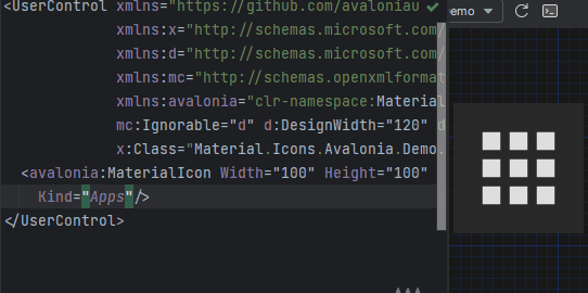
<materialIcons:MaterialIcon Kind="Abacus" />
The Foreground property controls the color of the icon.
Also, there is MaterialIconExt which allows you to use is as the markup extension:
<Button Content="{materialIcons:MaterialIconExt Kind=Abacus}" />
Or with a text via MaterialIconTextExt:
<Button Content="{materialIcons:MaterialIconTextExt Kind=Play, Text=Play}" />
The MaterialIcon implements IImage interface, to allow to use as an Image source:
<Image>
    <materialIcons:MaterialIcon Foreground="DeepPink" Kind="Abacus" />
</Image>


<Image Source="{materialIcons:MaterialIconExt Kind=Abacus, IconForeground=DeepPink}" />
Note that when using MaterialIcon as an Image source, the Width and Height properties must be defined under <Image>,
any size definition on MaterialIcon have no impact. Also, animation are not supported in this use case.
Classes
- Fill: Fits to size within the parent control
- collapse-null:
{x:Null}(Default) icons will not reserve space for it in layout.
Avalonia FuncUI (F#)
Getting started
- Install Material.Icons.Avalonia nuget package:
dotnet add package Material.Icons.Avalonia - Import styles in Application (or if you use XAML check instructions for plain Avalonia)
type App() = inherit Application() override this.Initialize() = .. this.Styles.Add(MaterialIconStyles(null)) .. - Create bindings for
MaterialIconnamespace Avalonia.FuncUI.DSL [<AutoOpen>] module MaterialIcon = open Material.Icons open Material.Icons.Avalonia open Avalonia.FuncUI.Types open Avalonia.FuncUI.Builder let create (attrs: IAttr<MaterialIcon> list): IView<MaterialIcon> = ViewBuilder.Create<MaterialIcon>(attrs) type MaterialIcon with static member kind<'t when 't :> MaterialIcon>(value: MaterialIconKind) : IAttr<'t> = AttrBuilder<'t>.CreateProperty<MaterialIconKind>(MaterialIcon.KindProperty, value, ValueNone) - Use
Button.create [
     Button.content (
         MaterialIcon.create [
             MaterialIcon.kind MaterialIconKind.Export
        ]
    )
]
WPF
Getting started
Install Material.Icons.WPF nuget package:
dotnet add package Material.Icons.WPF
Using
Add Material.Icons.WPF namespace to the root element of your file (your IDE can suggest it or do it automatically):
xmlns:materialIcons="clr-namespace:Material.Icons.WPF;assembly=Material.Icons.WPF"
Use MaterialIcon control:
<materialIcons:MaterialIcon Kind="Abacus" />
The Foreground property controls the color of the icon.
Also, there is MaterialIconExt which allows you to use is as the markup extension:
<Button Content="{materialIcons:MaterialIconExt Kind=Abacus}" />
WinUI3
Getting started
Install Material.Icons.WinUI3 nuget package:
dotnet add package Material.Icons.WinUI3
Using
Add Material.Icons.WinUI3 namespace to the root element of your file (your IDE can suggest it or do it automatically):
xmlns:materialIcons="using:Material.Icons.WinUI3"
Use MaterialIcon control:
<materialIcons:MaterialIcon Kind="Abacus" />
The Foreground property controls the color of the icon.
Also, there is MaterialIconExt which allows you to use is as the markup extension:
<Button Content="{materialIcons:MaterialIconExt Kind=Abacus}" />
Meta
Getting started
Install Material.Icons nuget package:
dotnet add package Material.Icons


Using
Icon types stored in Material.Icons.MaterialIconKind enum.
We can resolve an icon path by using Material.Icons.MaterialIconDataProvider.GetData().
Adding your own icons
Currently, there is no way to add your own icons, as icons are enum and cannot be modified.
But you can override some existing icons to use your own data:
public class CustomIconProvider : MaterialIconDataProvider
{
    public override string ProvideData(MaterialIconKind kind)
    {
        return kind switch
        {
            MaterialIconKind.TrophyVariant => "some SVG code",
            _ => base.ProvideData(kind)
        };
    }
}

// When your application starts (e.g. in the Main method) replace MaterialIconDataProvider with your own
public static int Main(string[] args)
{
    MaterialIconDataProvider.Instance = new CustomIconProvider(); // Settings custom provider

    // Application startup code
    // return BuildAvaloniaApp().StartWithClassicDesktopLifetime(args);
}
Animations
MaterialIcon and it extensions supports pre-defined animations:
- None
- Spin (Circular spinning)
- SpinCcw (Circular spinning in CCW)
- Pulse (Step circular spinning)
- PulseCcw (Step circular spinning in CCW)
- FadeOutIn (Fade out and in)
- FadeInOut (Fade in and out)
<MaterialIcons:MaterialIcon Kind="Refresh" Animation="Spin" />
<MaterialIcons:MaterialIcon Kind="Heart" Foreground="DeepPink" Animation="FadeInOut" />
FAQ
How to change icon color?
- Change
Foregroundproperty.
How to change size?
- If you are using
MaterialIconcontrol - useWidthor/andHeightproperties. - If you are using
MaterialIconExt- useSizeproperty.
How to update icons?
- You can manually set
Material.Iconspackage version in your project file.
What about versioning policy?
- We use semver.
Any package with identical major and minor versions is compatible.
For example,1.0.0and1.0.1are compatible, but1.0.0and1.1.0might not be.
| Product | Versions Compatible and additional computed target framework versions. |
|---|---|
| .NET | net8.0 is compatible. net8.0-android was computed. net8.0-browser was computed. net8.0-ios was computed. net8.0-maccatalyst was computed. net8.0-macos was computed. net8.0-tvos was computed. net8.0-windows was computed. net9.0 was computed. net9.0-android was computed. net9.0-browser was computed. net9.0-ios was computed. net9.0-maccatalyst was computed. net9.0-macos was computed. net9.0-tvos was computed. net9.0-windows was computed. net10.0 was computed. net10.0-android was computed. net10.0-browser was computed. net10.0-ios was computed. net10.0-maccatalyst was computed. net10.0-macos was computed. net10.0-tvos was computed. net10.0-windows was computed. |
-
net8.0
- Avalonia (>= 12.0.0)
- Material.Icons (>= 3.0.2)
NuGet packages (38)
Showing the top 5 NuGet packages that depend on Material.Icons.Avalonia:
| Package | Downloads |
|---|---|
|
Ahsoka.DeveloperTools.Core
Package Description |
|
|
ArtemisRGB.UI.Shared
Package Description |
|
|
Ahsoka.Extensions.AudioManager.UX
Package Description |
|
|
M56X.AvaloniaCore
Package Description |
|
|
MattEqualsCoder.AvaloniaControls
Package Description |
GitHub repositories (24)
Showing the top 20 popular GitHub repositories that depend on Material.Icons.Avalonia:
| Repository | Stars |
|---|---|
|
Tyrrrz/YoutubeDownloader
Downloads videos and playlists from YouTube
|
|
|
Tyrrrz/DiscordChatExporter
Saves Discord chat logs to a file
|
|
|
Tyrrrz/YoutubeExplode
Abstraction layer over YouTube's internal API
|
|
|
Tyrrrz/LightBulb
Reduces eye strain by adjusting screen gamma based on the current time
|
|
|
kikipoulet/SukiUI
UI Theme for AvaloniaUI
|
|
|
Uotan-Dev/UotanToolboxNT
现代化 Android & OpenHarmony 工具箱 | A Modern Toolbox for Android & OpenHarmony Devices
|
|
|
sn4k3/NetSonar
Network pings and other utilities
|
|
|
Artemis-RGB/Artemis
Provides advanced unified lighting across many different brands RGB peripherals
|
|
|
AvaloniaCommunity/Material.Avalonia
Material design in AvaloniaUI
|
|
|
SwaggyMacro/LottieViewConvert
A powerful cross-platform desktop application for converting TGS (Telegram Stickers), Discord animmated stickers and Lottie animations to various formats including GIF, WebP, APNG, MP4, MKV, AVIF, and WebM. Support download telegram sticker from sticker link. 电报、Discord、Lottie动画转换工具,支持 Gif、WebP、APNG、MP4 等常见格式,支持直接下载电报、Discord贴纸包。
|
|
|
bcssov/IronyModManager
Mod Manager for Paradox Games. Official Discord: https://discord.gg/t9JmY8KFrV
|
|
|
PXDiv/Div-Acer-Manager-Max
Div Acer Manager Max is a Linux GUI for Acer laptops using Linuwu Sense drivers. It replicates NitroSense functionality with fan control, performance modes, battery limiter, and more. Built with Avalonia, it offers a clean, easy-to-use interface for managing system performance and cooling.
|
|
|
flarive/Neumorphism.Avalonia
Neumorphism UI theme for .net Avalonia UI apps
|
|
|
DeltaJordan/BotW-Save-Manager
BOTW Save Manager for Switch and Wii U
|
|
|
h4lfheart/FortnitePorting
The quickest and most efficient way to extract assets from Fortnite
|
|
|
AvaloniaUtils/DialogHost.Avalonia
AvaloniaUI control that provides a simple way to display a dialog with information or prompt the user when information is needed
|
|
|
center2055/OnionHop
Privacy-first Desktop app that routes your traffic through Tor - Anonymous browsing made simple
|
|
|
the-database/VideoJaNai
GUI for upscaling ONNX models with NVIDIA TensorRT and Vapoursynth
|
|
|
qiuqiuqiu131/SukiChat.Client
|
|
|
MeltyPlayer/MeltyTool
Multitool for viewing/extracting assets from various N64/GCN/3DS/PC games en-masse.
|
| Version | Downloads | Last Updated |
|---|---|---|
| 3.0.3-nightly.0.2 | 99 | 4/13/2026 |
| 3.0.3-nightly.0.1 | 42 | 4/13/2026 |
| 3.0.2 | 1,607 | 4/13/2026 |
| 3.0.1 | 1,333 | 4/7/2026 |
| 3.0.0 | 17,548 | 2/19/2026 |
| 3.0.0-preview7.5 | 60 | 2/19/2026 |
| 3.0.0-preview7.4 | 56 | 2/19/2026 |
| 3.0.0-preview7 | 1,313 | 2/7/2026 |
| 3.0.0-preview6 | 1,253 | 1/17/2026 |
| 3.0.0-preview5 | 913 | 12/25/2025 |
| 3.0.0-avalonia12 | 599 | 2/19/2026 |
| 2.4.3 | 220 | 4/13/2026 |
## What's Changed
* Fix icons being bigger in 3.0.0 by @SKProCH in https://github.com/SKProCH/Material.Icons/pull/73
**Full Changelog**: https://github.com/SKProCH/Material.Icons/compare/v2.4.2...v3.0.2