AvaloniaTimeLineControl 1.0.1
dotnet add package AvaloniaTimeLineControl --version 1.0.1
NuGet\Install-Package AvaloniaTimeLineControl -Version 1.0.1
<PackageReference Include="AvaloniaTimeLineControl" Version="1.0.1" />
<PackageVersion Include="AvaloniaTimeLineControl" Version="1.0.1" />
<PackageReference Include="AvaloniaTimeLineControl" />
paket add AvaloniaTimeLineControl --version 1.0.1
#r "nuget: AvaloniaTimeLineControl, 1.0.1"
#:package AvaloniaTimeLineControl@1.0.1
#addin nuget:?package=AvaloniaTimeLineControl&version=1.0.1
#tool nuget:?package=AvaloniaTimeLineControl&version=1.0.1
Avalonia Timeline Control
A powerful timeline visualization control for Avalonia applications, ported from the TypeScript Timeline.ts component.
Features
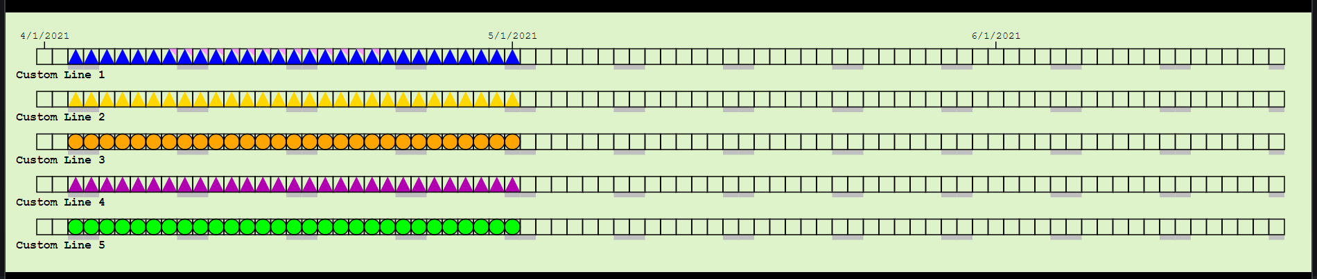
- Multiple Timeline Rows: Display 1-10 parallel timeline rows with customizable labels
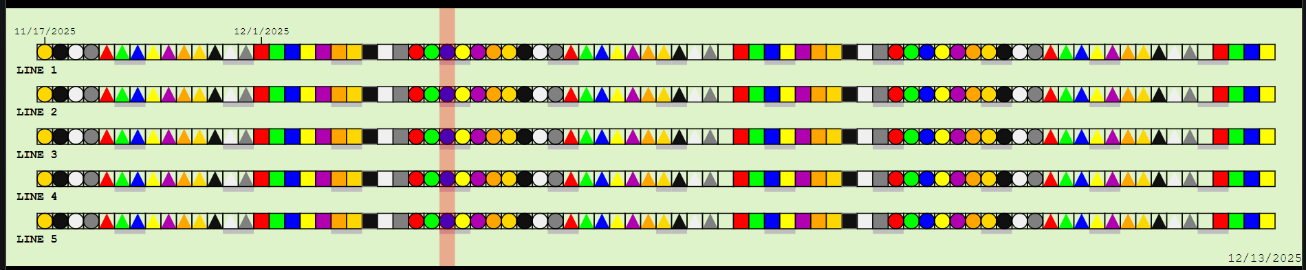
- 30 Chicklet Styles: Combine 10 colors with 3 shapes (Box, Circle, Triangle)
- Date-based Navigation: Mouse wheel and keyboard support for scrolling through dates
- Interactive Events: Click and hover events with metadata support
- Weekend Highlighting: Visual indicators for weekends
- Month Transitions: Automatic labeling of month boundaries
- Overlap Detection: Dog-ear indicators when multiple items occupy the same date
- Test Render Mode: Built-in visualization for all chicklet styles
- Fully Customizable: Adjust day size, margins, colors, spacing, and more
- Color Customization: Customize background, line, and dog ear colors
- Font Styling: Bold or normal font weight for line labels
Project Structure
AvaloniaTimeLineControl/
├── TimeLineControl/              # Control library
│   ├── Models/
│   │   ├── ChickletStyles.cs
│   │   ├── TimeLineDataItem.cs
│   │   ├── DateClickedEventArgs.cs
│   │   └── DateHoveredEventArgs.cs
│   ├── TimeLineControl.axaml
│   ├── TimeLineControl.axaml.cs
│   └── TimeLineControl.csproj
├── TimeLineControl.Demo/         # Demo application
│   ├── MainWindow.axaml
│   ├── MainWindow.axaml.cs
│   ├── App.axaml
│   ├── App.axaml.cs
│   ├── Program.cs
│   └── TimeLineControl.Demo.csproj
└── TimeLineControl.sln
Getting Started
Prerequisites
- .NET 8.0 SDK or later
- Avalonia 11.2.2 or later
Building the Project
cd AvaloniaTimeLineControl
dotnet restore
dotnet build
Running the Demo
cd TimeLineControl.Demo
dotnet run
Usage
Basic Setup
- Add a reference to the TimeLineControl library in your Avalonia project:
<ItemGroup>
  <ProjectReference Include="..\TimeLineControl\TimeLineControl.csproj" />
</ItemGroup>
- Add the namespace in your XAML:
xmlns:tl="clr-namespace:TimeLineControl;assembly=TimeLineControl"
- Add the control to your window:
<tl:TimeLineControl x:Name="Timeline" Height="250" />
Adding Data
using TimeLineControl.Models;

// Create a data item
var item = new TimeLineDataItem(
    lineId: 1,                                    // Line/row number (1-based)
    renderStyle: ChickletStyles.Chicklet_BlueBox, // Visual style
    beginDate: new DateTime(2021, 4, 1),          // Start date
    endDate: new DateTime(2021, 4, 30),           // End date
    metaData: "Project Alpha"                     // Tooltip/metadata
);

// Add to timeline
Timeline.AddDataItem(item);
Handling Events
// Subscribe to events
Timeline.DateClicked += OnDateClicked;
Timeline.DateHovered += OnDateHovered;

private void OnDateClicked(object? sender, DateClickedEventArgs e)
{
    Console.WriteLine($"Clicked: {e.DateClicked:yyyy-MM-dd} on Line {e.LineClicked}");
    Console.WriteLine($"Metadata: {e.MetaData}");
}

private void OnDateHovered(object? sender, DateHoveredEventArgs e)
{
    Console.WriteLine($"Hovering: {e.DateHovered:yyyy-MM-dd} on Line {e.LineHovered}");
}
Customizing the Timeline
// Configure appearance
Timeline.NumRows = 5;              // Number of timeline rows (1-10)
Timeline.DaySize = 15;             // Width of each day in pixels
Timeline.Margin = 30;              // Border margin
Timeline.MarginScale = 1.5;        // Top margin scale factor
Timeline.StartDate = DateTime.Now; // Visible start date
Timeline.DateHeaderHeight = 25;    // Space above first line for date labels
Timeline.DateLabelLeftMargin = 20; // Left margin for date labels

// Customize colors
Timeline.BackgroundColor = Color.Parse("#DEF3C9");  // Background color
Timeline.LineColor = Color.Parse("#000000");        // Main line color (black)
Timeline.LineColorLight = Color.Parse("#7f7f7f");   // Light line color (gray)
Timeline.DogEarColor = Color.Parse("#ff99ff");      // Dog ear overlap indicator

// Customize line labels
Timeline.SetLineLabel(0, "Project A");
Timeline.SetLineLabel(1, "Project B");
Timeline.SetLineLabel(2, "Project C");
Timeline.LineLabelsBold = true;    // Render line labels in bold font

// Enable test render mode (shows all chicklet styles)
Timeline.TestRender = true;
Available Chicklet Styles
The control supports 30 different visual styles:
Boxes: RedBox, GreenBox, BlueBox, YellowBox, PurpleBox, OrangeBox, GoldBox, BlackBox, WhiteBox, GreyBox
Circles: RedCircle, GreenCircle, BlueCircle, YellowCircle, PurpleCircle, OrangeCircle, GoldCircle, BlackCircle, WhiteCircle, GreyCircle
Triangles: RedTriangle, GreenTriangle, BlueTriangle, YellowTriangle, PurpleTriangle, OrangeTriangle, GoldTriangle, BlackTriangle, WhiteTriangle, GreyTriangle
Managing Data
// Clear all data
Timeline.ClearAllDataItems();

// Clear specific line
Timeline.ClearSpecificLine(lineId: 1);

// Navigate dates
Timeline.StartDate = Timeline.StartDate.AddDays(7); // Forward 1 week
API Reference
Properties
| Property | Type | Default | Description |
|---|---|---|---|
| NumRows | int | 5 | Number of timeline rows (1-10) |
| DaySize | double | 15 | Width of each day cell in pixels |
| Margin | double | 30 | Border margin around the control |
| MarginScale | double | 1.5 | Scale factor for top margin |
| DateHeaderHeight | double | 25 | Space above first line for date labels |
| DateLabelLeftMargin | double | 20 | Left margin to make room for date labels |
| StartDate | DateTime | DateTime.Now | First visible date on the timeline |
| TestRender | bool | false | Enable test mode showing all styles |
| LineLabelsBold | bool | true | Render line labels in bold font |
| BackgroundColor | Color | #DEF3C9 | Background color of the control |
| LineColor | Color | #000000 | Main line color (black) |
| LineColorLight | Color | #7f7f7f | Light line color used for borders (gray) |
| DogEarColor | Color | #ff99ff | Color of dog ear overlap indicators |
| LineLabels | IReadOnlyList<string> | - | Read-only list of line labels |
Methods
| Method | Description |
|---|---|
| AddDataItem(TimeLineDataItem) | Add a data item to the timeline |
| ClearAllDataItems() | Remove all data items |
| ClearSpecificLine(int lineId) | Remove all items from a specific line |
| SetLineLabel(int lineId, string label) | Set the label for a line |
| GetLineLabel(int lineId) | Get the label for a line |
Events
| Event | EventArgs | Description |
|---|---|---|
| DateClicked | DateClickedEventArgs | Fires when a date cell is clicked |
| DateHovered | DateHoveredEventArgs | Fires when hovering over a date cell |
Differences from Original TypeScript Version
- Uses Avalonia's DrawingContext instead of HTML Canvas
- DateTime instead of JavaScript Date
- Routed events instead of DOM events
- Strongly typed with C# enums and classes
- XAML-based control definition
- Native .NET event handling
License
This control is ported from the original Timeline.ts implementation.
Contributing
Contributions are welcome! Please feel free to submit issues or pull requests.
| Product | Versions Compatible and additional computed target framework versions. |
|---|---|
| .NET | net8.0 is compatible. net8.0-android was computed. net8.0-browser was computed. net8.0-ios was computed. net8.0-maccatalyst was computed. net8.0-macos was computed. net8.0-tvos was computed. net8.0-windows was computed. net9.0 was computed. net9.0-android was computed. net9.0-browser was computed. net9.0-ios was computed. net9.0-maccatalyst was computed. net9.0-macos was computed. net9.0-tvos was computed. net9.0-windows was computed. net10.0 was computed. net10.0-android was computed. net10.0-browser was computed. net10.0-ios was computed. net10.0-maccatalyst was computed. net10.0-macos was computed. net10.0-tvos was computed. net10.0-windows was computed. |
-
net8.0
- Avalonia (>= 11.2.2)
NuGet packages
This package is not used by any NuGet packages.
GitHub repositories
This package is not used by any popular GitHub repositories.